eRegistrations User Manual
Administration site (BPA) · User site (DS) · Generic Database (GDB)
Introduction#
The purpose of this user manual is to provide an overview of the main functions and features of the eRegistrations system and to explain how to create online services.
Description of eRegistrations#
- eRegistrations is a no-code development platform allowing to create online services without programming.
- An online service is a succession of online screens and actions through which:
- an applicant can fill a form, upload documents, pay and send his request (application file)
- one or more operators can review the file and approve or reject an application (processing)
- The applicant data is sent to an online registry
- A registration certificate is issued
- Online services are visible on the “public site”, also called “user site” or “DS” (Display System)
- They are created through an “administrative site”, also called “BPA” (Business Process Analyzer)
I. ADMINISTRATIVE SITE#
Video tutorial - Entry page overview
The administrative site, also called BPA (Business Process Analyzer) is the site where online services are created. The BPA requires no programming. Services are built by configuring a succession of screens.
A.Description of the entry page#
This is what you see when you first enter the BPA
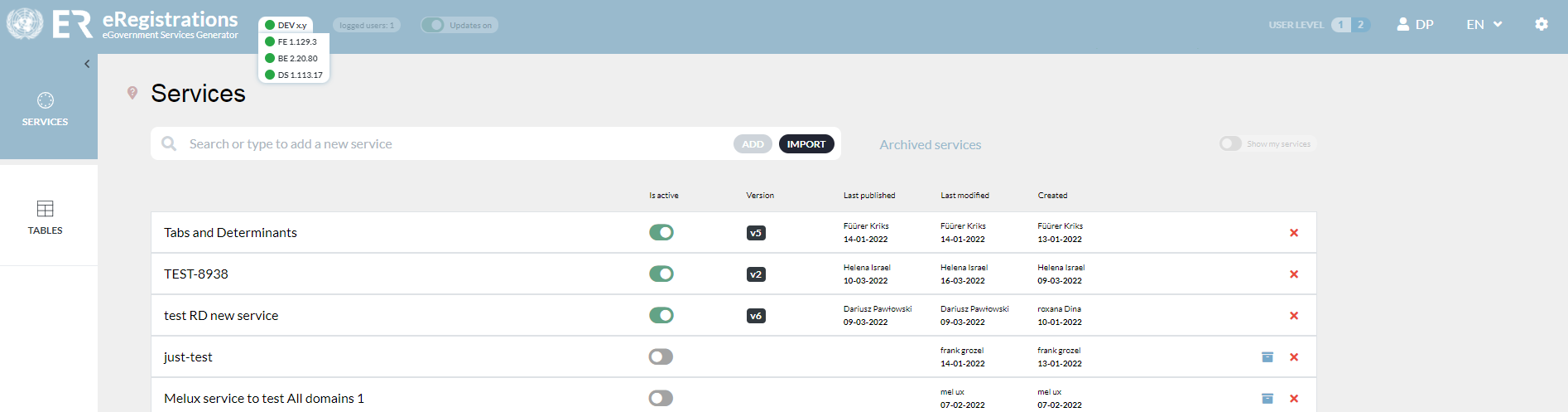
The BPA entry page has 3 main sections
- “Header” also called “instance bar” (the blue bar at the top)
- Side menu (on the left)
- Work space (in grey)
1 The header or “instance bar”#

It consists sequentially of:
| UNCTAD and eRegistrations logo |
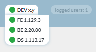
| You see 3 buttons FE (front end), BE (back end) and DS (display system). When they are red, it means the corresponding component (FE, BE and DS are components of eRegistrations) is getting updated. We can work on the system only when all buttons are green. When you put the cursor over the components name (FE, BE or DS) you will see the version number currently running in the instance. Versioning is made according to semantic versioning rules. ‘Logged users’ show the number of administrators logged into BPA at that moment. |
| When the toggle is switched on, new feature/bug fixes are allowed to come automatically to the applications in the system |
| User level 1 and 2 is a toggle button that minimizes and expands display of elements on the side menu bar |
| User ID of the administrator logged in |
| Choice of language |
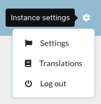
| Instance settings icon
|





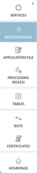
2 Side menu#
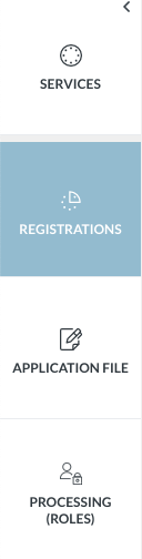
This view is accessible only after you have created and entered a service.
User level 1 Displays only a limited number of elements on the left side menu | User level 2 Displays more elements, including Tables and Certificate builder | |
|
|
3 Work space#
This is the gray area which displays the contents of the elements on the side bar, and where services are built.
B. Services#
A service is a succession of screens allowing the applicant to obtain one or more registrations.
A registration is any authorization (certificate, permit, clearance, document) issued by a government agency that an applicant wants to obtain.
1. Create a service#
Video tutorial - create a service
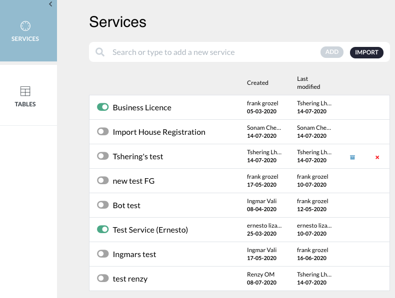
A new service can be created by clicking on the ‘add’ button.

Then a slider opens, where you can type the name of the service and click save.

To activate the service, click on the toggle next to the service name. Green indicates that the service is active. Inactive services will not be available on the public interface.

An inactive service can be archived in the system by clicking on the archive button.

Archived services can be restored by clicking on “archived services”

And clicking on the unarchive button

A service can be removed from the system by clicking on the cross.

Once a service has been created, one or more registrations must be created and assigned to the service.
2. The Service bar#
This is the service bar, just below the instance (blue) bar: This appears when you click on a service from the list of services in the work space.

The service bar consists of
| The name of the service, that can be edited by clicking on the edit button next to it |
| The “preview service” button: this displays the application file as seen from the user interface |
| The “publish service” button: when a service is published, it becomes available on the public interface. Every time a change is made in the BPA that needs to be reflected on the public interface (DS), the service has to be (re)published. |
| The “see service” button. This opens the service in the public interface (DS), in a new tab |
| Service settings icon |




C. Registration(s)#
Registrations are at the core of the eRegistrations system.
A registration is any type of authorization (license, permit, registration number, clearance, certificate, etc.) issued by a government institution, for which an applicant will usually need to provide data, documents and fee.
1 Create a registration#
Video tutorial - create a registration and add it to a service
Once a service has been created, one or more registrations must be created and assigned to the service.
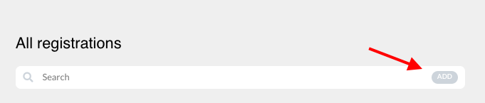
When you create a new registration, it will automatically be added to the service under which it has been created.
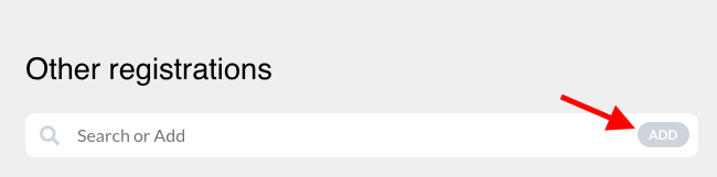
Click on the “add” button on the search bar |
|
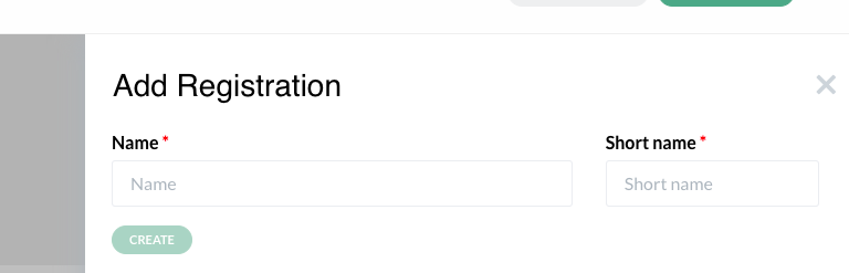
A slider opens. Enter registration name → enter short name (a short name is proposed automatically but you can modify it) → create |
|
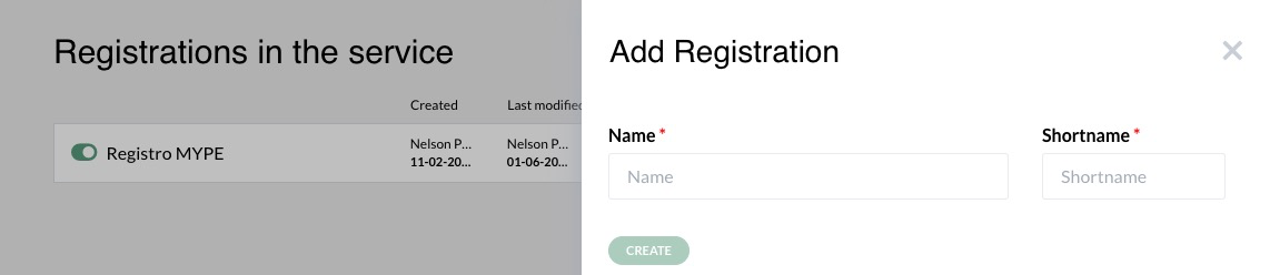
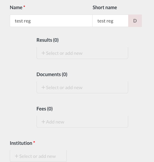
A registration is defined by the following elements:
- Name
- Result
- Data required
- Documents required
- Fees
- Institution in charge
The “Registrations” menu tab will allow us to define all elements except the “data required”, which will be defined in the application file tab, in the applicant form. Fields marked with a red asterisk are required.
Result | |
To add a result, click on “+ Select or add new” under Results |
|
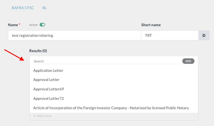
Then click on the “add” button on the search bar |
|
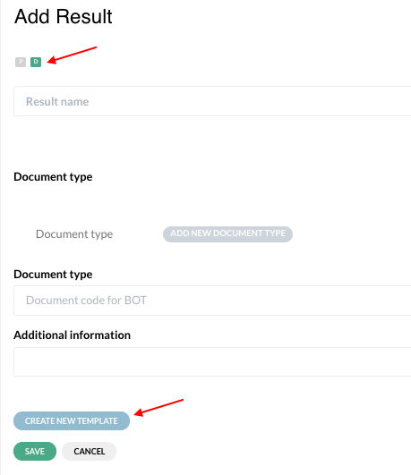
A slider opens. Enter the result name (required) → choose whether the result is physical or digital at the top represented by “P” and “D” → save |
|
In case of digital result, a template for the result can be built in the system (see build certificates) |
|
To add a result that has already been registered, click on “+ Select or add new” under Results → select the result from the drop down list |
|
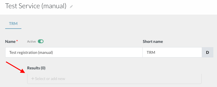
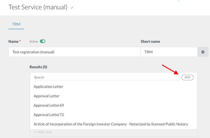
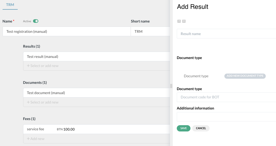
Documents | |
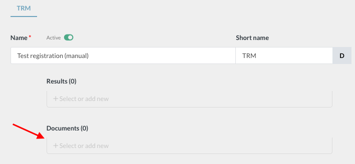
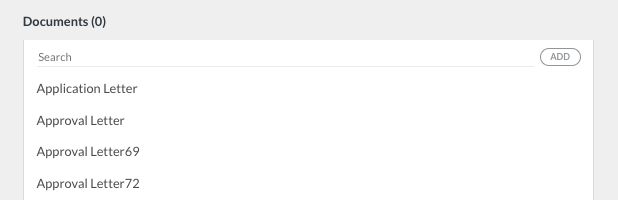
To add documents required, click on “+ Select or add new” under Documents |
|
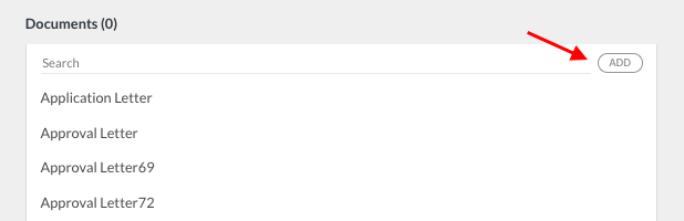
Then click on the “add” button on the search bar |
|
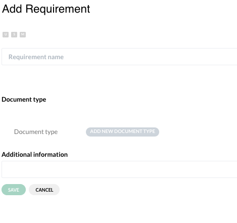
A slider opens. Enter the document name → choose what is expected with this document (“U” - must be uploaded, “S” - must be shown at front desk when the applicant comes to collect the certificates, “M” - must be signed at collection) → save |
|
To add a document that has already been registered, click on “+ Select or add new” under Documents → select the document from the drop down list |
|
Fees | |
To add applicable fees, click on “+ Add new” under Fees |
|
Fixed fees | |
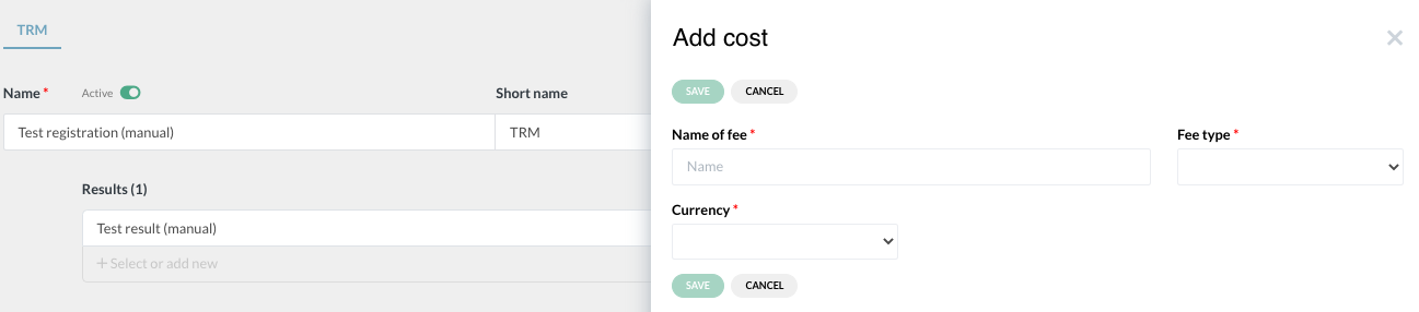
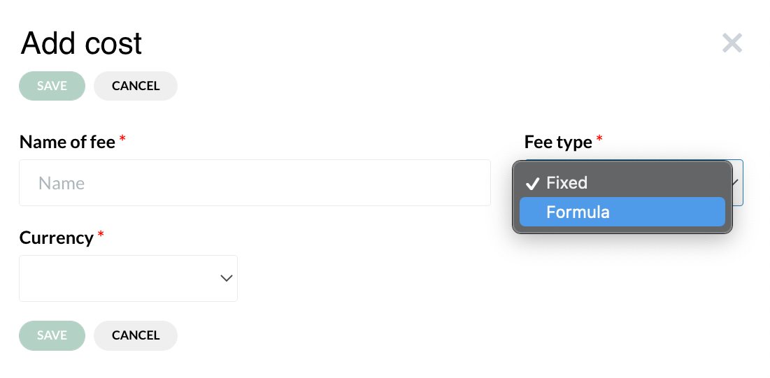
A slider opens. Enter name of fee → select “fixed fee” under Fee Type → select currency → enter the value → save |
|
Formula fees | |
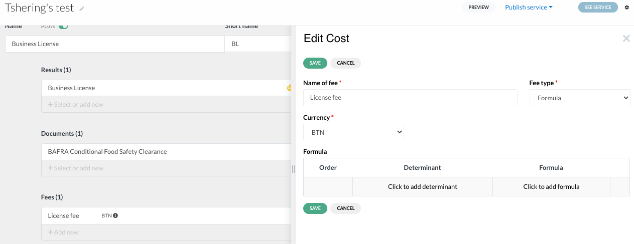
To use a formula in fees you need to select “Formula” in the fee type and save the fee |
|
In the fees list, click on the fee to open it |
|
A slider will open |
|
Click on “click to add formula” under Formula |
|
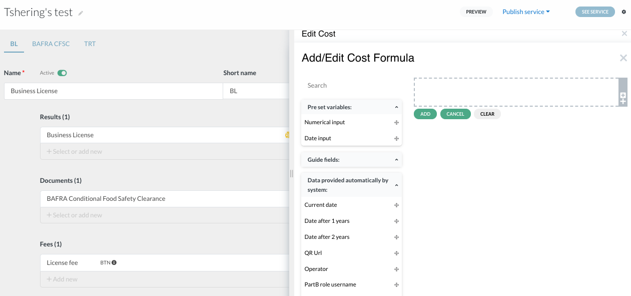
A slider will open |
|
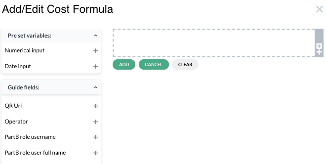
To add the cost formula, drag and drop any two applicable variables from the left side to the space on the right side |
|
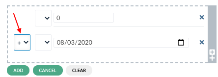
Select the applicable arithmetic symbol from the little drop down list → add |
|
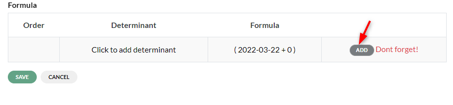
Once the formula is created, now click on the ‘add’ button to add created formula to the fee → save |
|



Institution | |
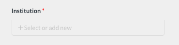
To add the institution involved, click on “+ Select or add new” under Institutions |
|
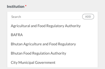
Then click on the “add” button on the search bar |
|
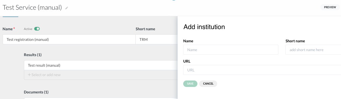
A slider opens. Enter the name of the institution → enter URL (if available) → save |
|
To add a Unit involved, click on “Add new” under Involved Unit. |
|
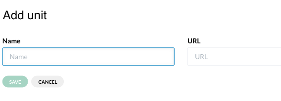
A slider opens. Enter the name of the unit → enter URL → save |
|
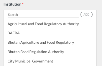
To add an institution that has already been registered, click on “+ Select or add new” under Institutions → select the Institution from the drop down list |
|

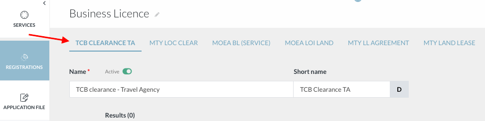
Registrations in the service will be displayed across the top menu by the short names given to them
2 Add registration(s) to a service #
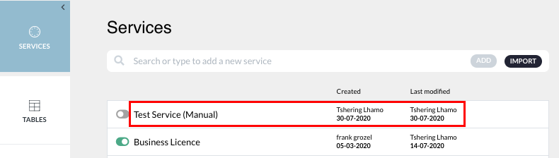
To add a new registration to a service, click on the service name or anywhere within the marked area |
|
Click on the ‘Add’ button |
|
A slider will open. Enter the name of the registration and click on ‘Create’ |
|
Under that registration, define the result, documents required, fees applied and institution |
|
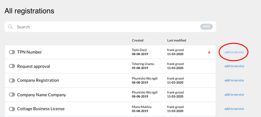
To add a registration that was already created to a service, click on the “add to service” from the “all registrations” list |
|
D. Application file #
Video tutorial - overview of application file and the guide page.
- It is composed of pages/screens through which the applicant will provide the required data, the documents and the fees.
- In general, the application file is composed of the following pages:
- Guide: a page where the applicant has to answer questions that will allow the system to determine the registrations s/he needs to apply for and, according to the registrations selected, the required data, documents and fees.
- Form: to enter the required data
- Documents upload: to upload the required document
- Payment: a page explaining how and when the required fees can be made, or allowing to pay online
- Send: a page giving details about the processing of the file once submitted by the applicant
- A very important notion, called “determinant” is also explained. Determinants allow us to take into account the specific case of each applicant and, in particular, to generate an adapted applicant file format for each user.
1. The Guide#
Questions can be created in the guide to help determine, for each specific user, which documents, fees and data are required.
The guide is defined by three elements
Description: name of the guide question
Form: where guide questions are developed and linked to the requirements and/or application form using determinants
Status:
If your service has a Guide activate the guide toggle |
|
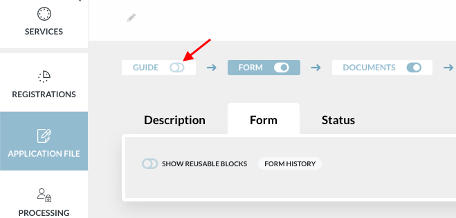
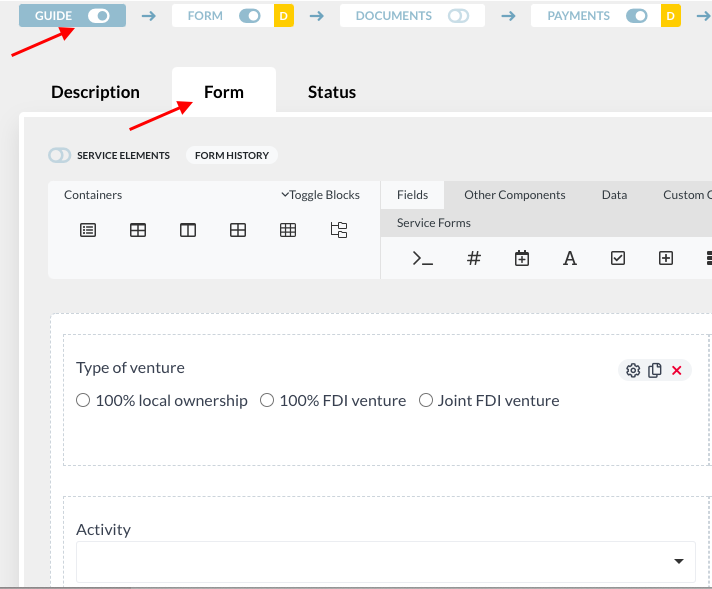
To create a question in the Guide, → click on the ‘Guide’ tab in the Application File → under the ‘Form’ tab, create questions using the form components that will filter the data, requirements and fees for specific users’ case |
|
Alternative to the guide: the shopping cart
2. Take into account each user case: create and use determinants#
A determinant is a filter allowing to take into account the particular case of each applicant in a service. It determines/triggers:
- If an applicant is subject to a registration and/or
- What requirements the applicant must provide to register (data, documents, fees).
2.1. Determinants of the registration
Video tutorial - determinants in guide and registration
For each registration, an analyst must be able to report/input in the rule engine, in clear language, rules defining who/what are the subjects of the registration.
To this end, the analyst can select one or various of the following options:
- The registration is mandatory to all
- The registration is mandatory to specific subjects
- The registration is optional to all
- The registration is optional to specific subjects
1 and 2 can’t be selected simultaneously; 3 and 4 can’t be selected simultaneously.
Specific subjects (in 2 and 4) can be defined through determinants or a combination of determinants. Determinants can be combined by “AND” and “OR” operators. Combinations can be grouped into “groups of determinants”. Group of determinants can be combined through “AND” and “OR” operators.
Examples:
- Registration is mandatory for attribute “resident” (all residents must register)
- Registration is mandatory for attribute “resident” AND attribute “foreigner” (all residents who are foreigners must register)
- Registration is mandatory for {attribute “resident”} AND {attribute “foreigner” OR attribute “have children”} (all foreign resident must register; national residents who have children must register)
2.2. Determinants of the requirements
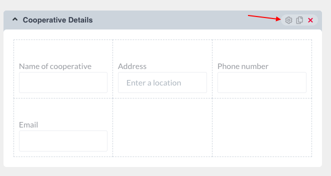
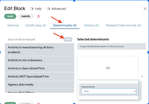
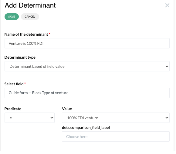
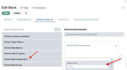
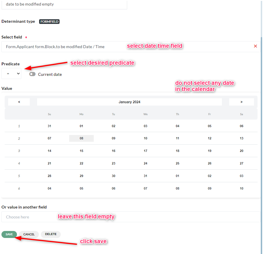
Determinants play a very important role in the application file. They allow to show or hide specific parts of the application form to adapt the form to the particular situation of each applicant. For example, if an applicant selects “Cooperative” under business ownership, the determinant will be created and applied to show only the cooperative details in the application form. This example is presented below visually.
Determinants can be created on the basis of fields/questions in the Guide or in the form and can be applied to any field/ block.
The easiest, to create a determinant, is to start on the block or field where you want to apply this determinant.
3. Applicant form#
Video tutorial -Overview of the form elements - container
- This is the section in the application file where the applicant will provide the required data
- The form can be developed and customized in any format based on an analysis of the data
To create a form, drag and drop any type of required field component from the menu bar into the space below it |
|
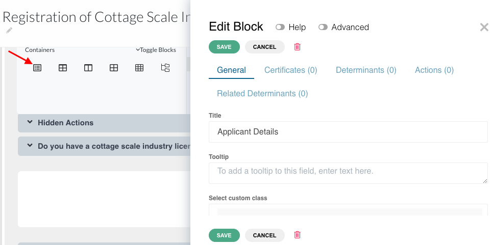
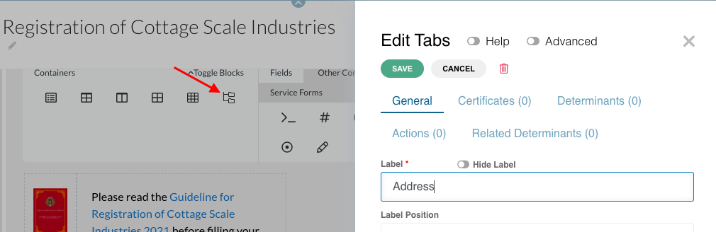
Containers menu consists of: Block Table Columns Field set Edit grid Data grid Tabs Containers are mainly used to group/ put together data that belong to the same class/ category |
|
Blocks separate/ segregate the different types of information that need to be provided To create a block, drag and drop “Block” from the Containers menu into the space below A slider will open. Enter the title of the block → save |
|
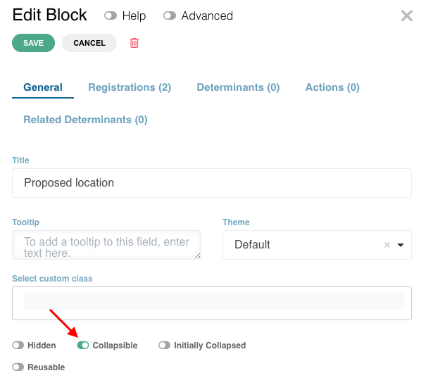
Blocks are collapsible. If you do not want your blocks to collapse, disable the ‘collapsible’ toggle under the general tab |
|
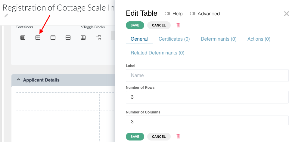
To insert a Table, drag and drop the table component inside the block A slider will open. Indicate the number of rows and columns you need as per the data required→ save |
|
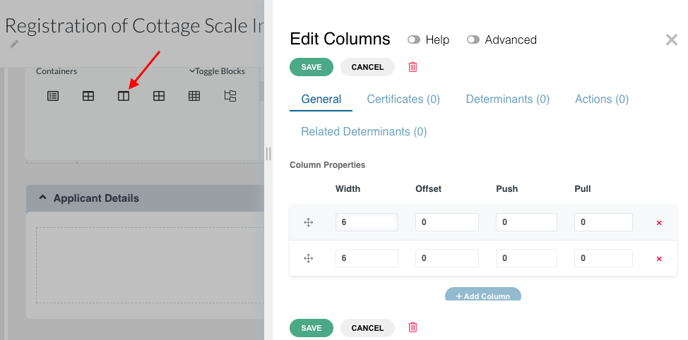
Column will help align the fields and improve the presentation of the form To insert a column, drag and drop the column button inside the block A slider will open. Indicate the properties of the column you need → save Note: Only up to 12 units are fitted in one row. For example, 6+6, 4+4+4, 3+3+3+3. If you need more rows, add multiples of the above examples. |
|
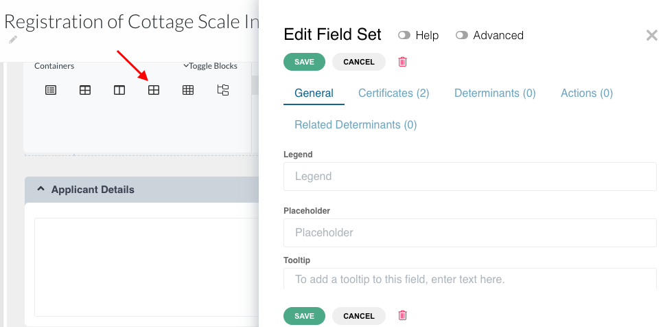
Field set groups the fields of the same category of data together to form a set of fields To insert a Field set, drag and drop the field set button inside the block A slider will open. Enter the fieldset legend → save |
|
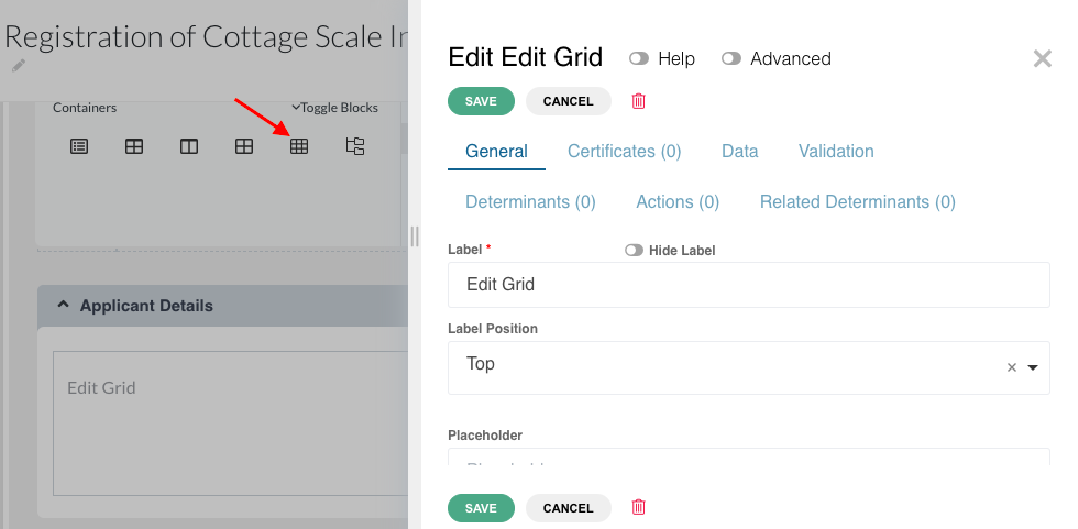
Edit grid enables replication of the same set of fields within it, and addition of multiple data for the same set of fields (example: details of more than 1 shareholder/ partner) To insert an edit grid, drag and drop the edit grid component inside the block A slider will open. Enter the Edit Grid Label → save The label can be hidden in the public interface by activating the ‘Hide Label’ toggle |
|
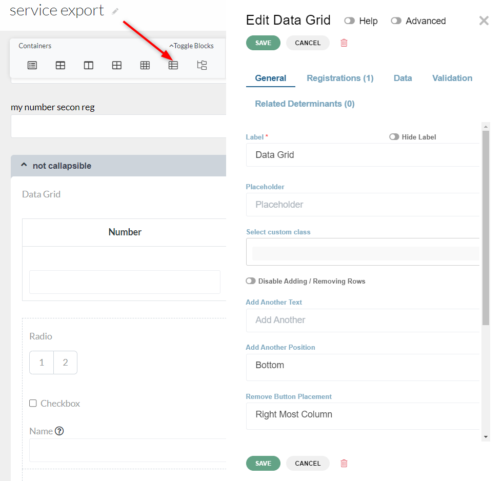
Data grid is very much like an edit grid. It enables replication of the same set of fields within it, and addition of multiple data for the same set of fields (example: details of more than 1 shareholder/ partner) To insert an data grid, drag and drop the data grid component inside the block A slider will open. Enter the Data Grid Label → save The label can be hidden in the public interface by activating the ‘Hide Label’ toggle |
|
Adding Tabs in the form can make it more organized and easy to use especially if the form is very lengthy. Tabs will reduce clutter and make it easier to work with your data To add Tabs, drag and drop the Tabs component inside the block A slider will open → Save |
|
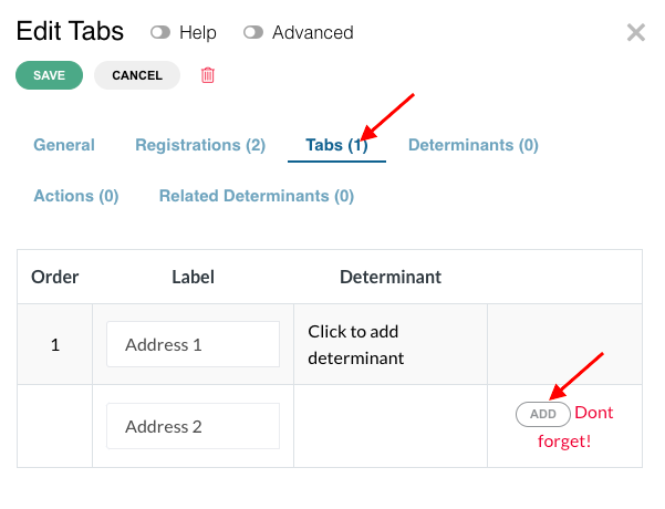
Click on edit tabs → a slider will open → Click on the Tabs tab Under Labels, type in the names of Tabs. Each time a label is added, click on the ‘Add’ button on the right. |
|
Special use case - Tabs Component as a side navigation panel | |
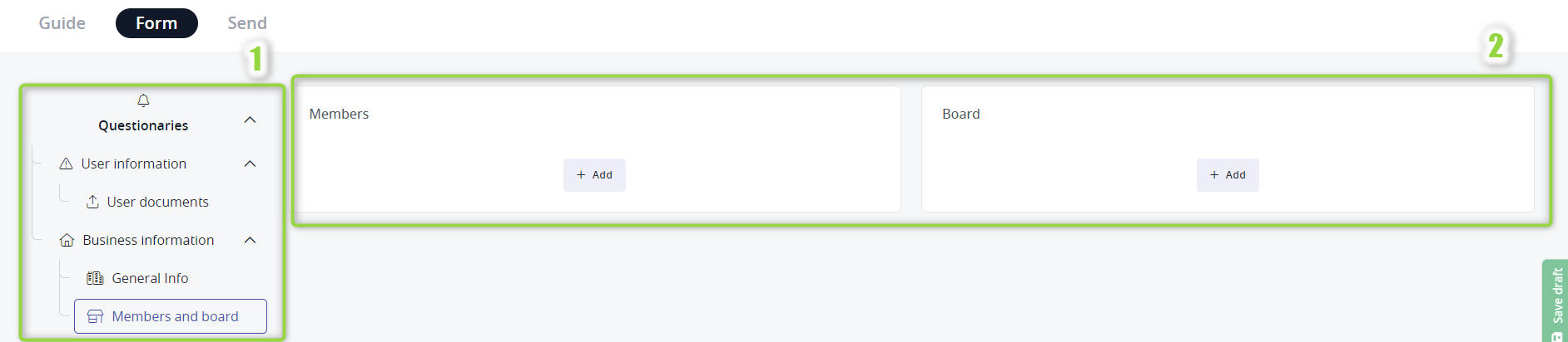
Tabs component can be now displayed as a side menu on the left (1) with the content of the currently selected tab shown on the right (2). |
|
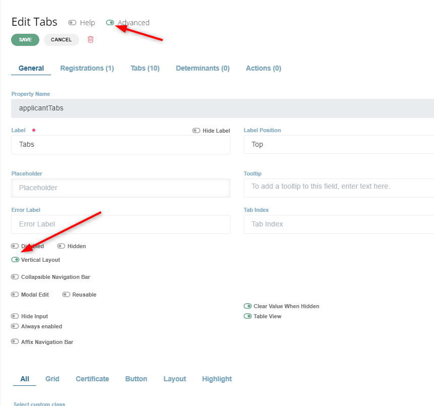
To get this layout, click on the Tabs component edit button. toggle on advanced options and switch ON vertical layout option |
|
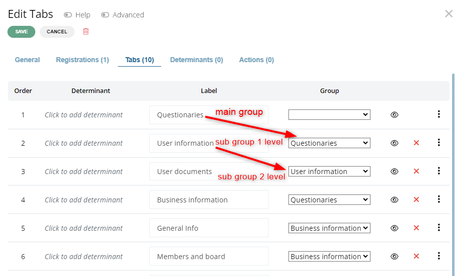
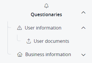
The structure can be nested. This is achieved by assigning to a particular tab the group value in which it will be displayed. In the example displayed on the left, Questionaries is the main group. User information is a sub group of Questionaries and User documents is a sub group of User information |
|
In DS it is presented as a tree like structure with the main group as a root |
|
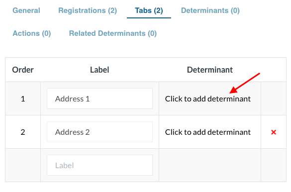
Determinants can be added for each tab by clicking on ‘click to add determinant’ corresponding to each label Video tutorial - adding and chaining determinants. Adding actions to buttons |
|
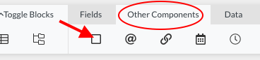
Buttons can be added to tabs and direct the user to the next tab. To add a button on the tab, drag and drop the ‘Button’ component from the ‘Other Components’ tab. |
|
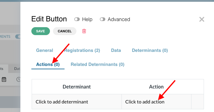
Click on edit button → Actions → Click to add action |
|
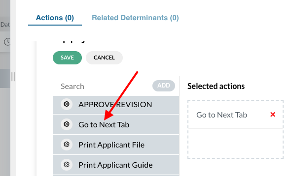
From the list of actions, apply the ‘Go to Next Tab’ action → Save → General save |
|
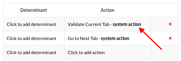
To validate a tab before going to the next tab, ‘Validate Current Tab’ action has to be applied to the same button. This action should be placed before the ‘Go to Next Tab’ action, since the actions will perform sequentially. |
|
Different kinds of data fields (text fields, number fields, date and time, etc.) can be dragged from the menu bar and dropped inside the containers within a block for data under the same category Each time, a slider will open where the title of the element has to be entered and saved |
|
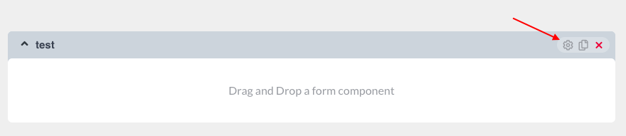
To edit any container or field, click on the gear icon on the right hand side A slider will open. Click “save” every time a change is made |
|
The layout order of Fields and Blocks can be changed by simply dragging and dropping them |



Fields used while building the form:
Catalog is used to present data in the form of a drop-down menu |
|
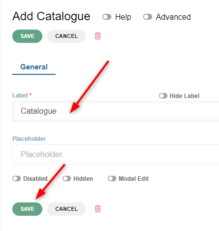
To add a catalog, drag and drop the catalog component onto the form. Then provide a label and click save |
|
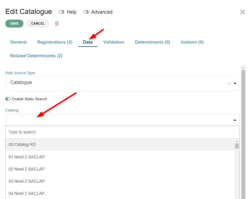
To assign values to a newly created catalog, click on Edit icon, go to Data tab, assign a catalog to the catalog field and click save |
|
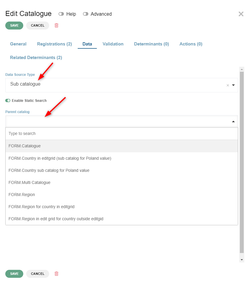
Sub Catalog is a set of values related to a single catalog value Sub catalog is created almost the same way as catalog. The difference is in filling in the Data tab. Here you need to change Data Source type to “Sub catalog” and select Parent catalog from the dropdown menu. |
|
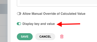
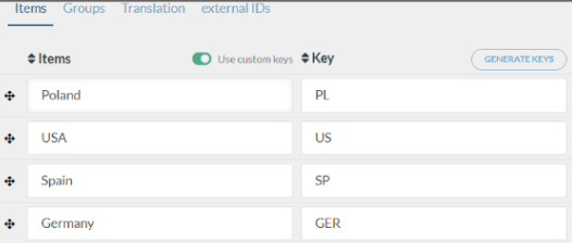
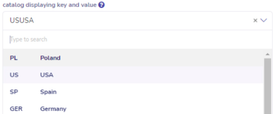
To display both keys and values of catalog in the Display System, Edit catalog → click on the Data tab→ enable the Advanced toggle at the top → and enable the ‘Display key and value’ toggle at the bottom |
|
In the catalog page, ‘Use custom keys’ toggle should be enabled |
|
This is how the values and keys will be displayed in the catalog selector in DS |
|
Button is used to perform an action on the form |
|
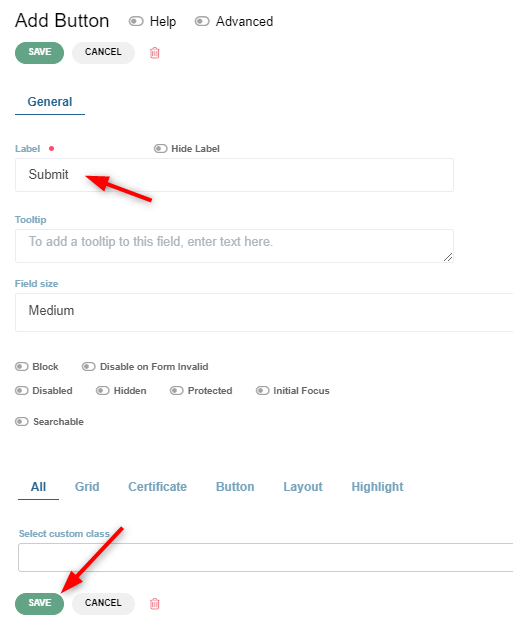
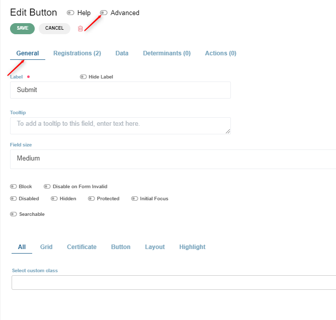
To add a Button, drag and drop the button component onto the form. Change label if needed and click save. |
|
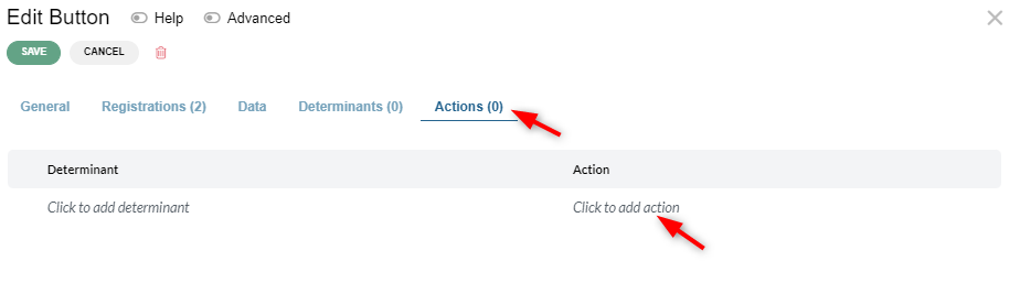
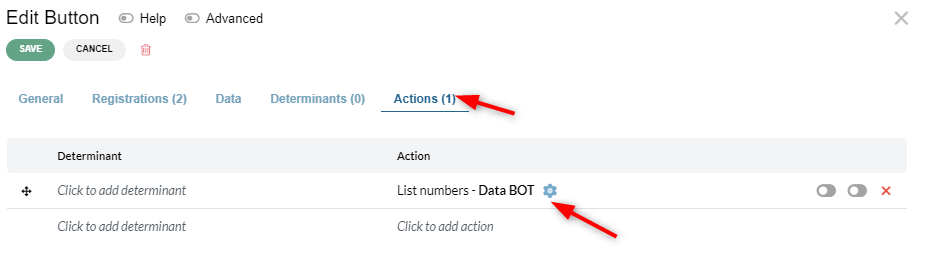
Buttons can perform various actions, but the action has to be added to the button by the analyst. There are two ways to specify the button behaviour.
|
|
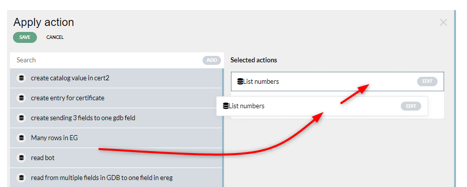
New window will be shown with already defined actions, from which you can choose the preferred action and drag and drop it on the right side of the table |
|
After clicking save you will see the action added to the list of actions assigned to the button and the counter of cations incremented in the actions tab |
|
|
|
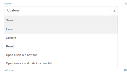
This will show actions dropdown menu in which we have few choices to select |
|
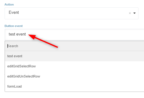
Button action “event” - this will emit an event specified in the button event dropdown menu. Some other component in the form might use this event to show itself |
|
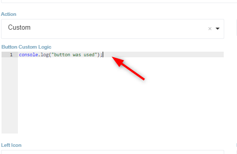
Button action “custom” - this enables the operator to write a javascript code that will execute when the button is used |
|
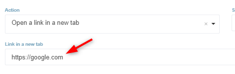
Button action “Open a link in a new tab” - this will show a field in which we can provide a link. When button is clicked it will open this link in a new browser tab |
|
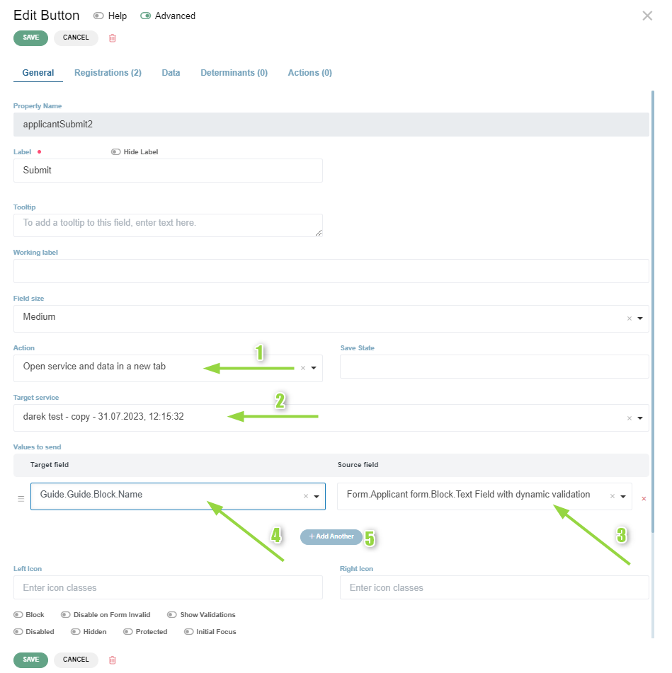
Button action “Open service and data in a new tab” - This action allows us to open another service in a new browser tab and transfer the field values between those services. Example: Drop a button component onto the form and open the buttons edit modal. 1. In the “Action” dropdown menu select ““ 2. In target service dropdown menu select the service you want to open with this button 3. In the source field dropdown menu you will see all the fields available in your first service. Choose the field that you want the value to be transferred to the service selected in point 2 4. In the target field dropdown menu you will see all the fields available in the second service. Choose the field that you want to receive the value from the field specified in point 3 5. If you need to transfer more values click Add button to add another pair of source and target fields and repeat points 3 and 4 |
|



Some commonly used properties that can be set on containers and fields are:
Video tutorial - Field features overview (copy value from, field tags, input mask)
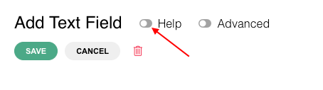
Help toggle When the Help toggle is enabled, tooltips (small question marks at the top right corners of labels) appear. Tooltips provide a description of the labels |
|
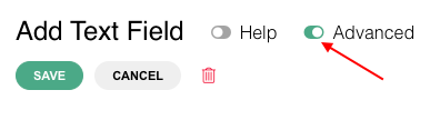
Advanced toggle When the Advanced toggle is enabled, additional features appear to edit a component |
|
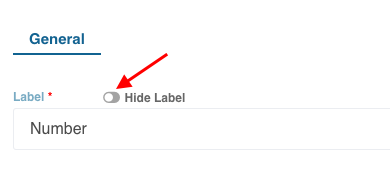
Hide Label toggle If the Hide Label toggle is enabled, the component will not be visible in the Display System |
|
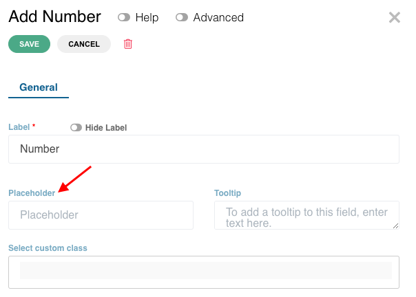
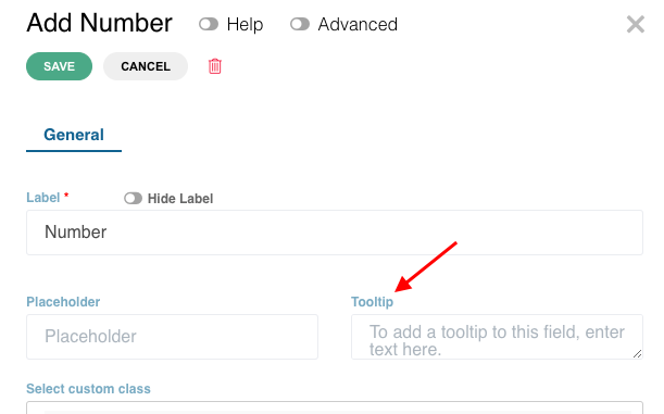
Placeholder Faint letters that appear in the field and indicates what to insert |
|
Tooltip The small question mark at the top right corner that describes or provides additional information on the field |
|
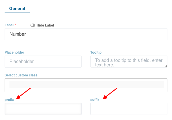
Prefix and Suffix Under the general tab for Number component, a prefix or a suffix can be added for the field value. Example; BTN (for Bhutan currency) |
|
Disabled toggle If the Disabled toggle is enabled, the field component in the Display System will be disabled for the users |
|
Hidden toggle If the hidden toggle is enabled, the component will be hidden in the Display System |
|
Reusable toggle If the Reusable toggle is enabled, the component can be reused in in other parts of the same service |
|
Listing value toggle This feature will enable the name of the company under ‘My Applications’ on the user dashboard visible Multiple fields can have listing value toggle ON. It will result in combining their values separated by space in the company column.l |
|
Allow Spellcheck If Allow spellcheck toggle is disabled the browser search engine will not be allowed to check and index the contents of this field. The purpose is to hide private data from Browser search engines. |
|
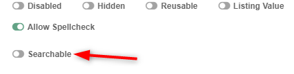
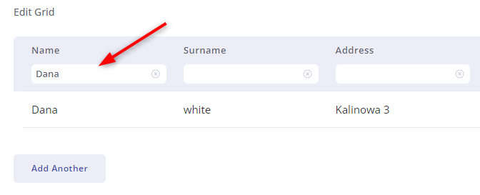
Searchable This feature will enable you to perform a search within the edit grid column. To be activated on fields within the edit grid or data grid. It creates an input field in the edit grid / data grid header with the same label as the field it was activated on. Values inputted in that field will be searched in corresponding column within the edit grid |
|





4. Documents #
Video tutorial - Documents tab - defining a document in a registration
The Documents tab under Application File should be enabled if documents are defined under registration(s) of the service |
|
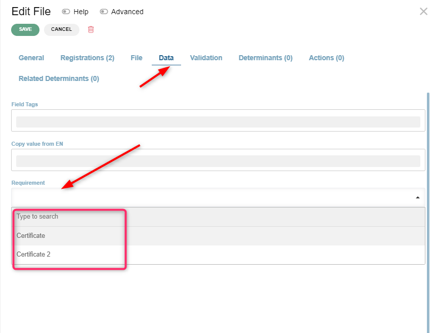
If there is a need for the required document to be visible in some other place on the form then the documents tab There is a way to achieve it with the following steps.
|
|
|
|
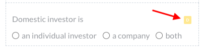
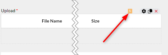
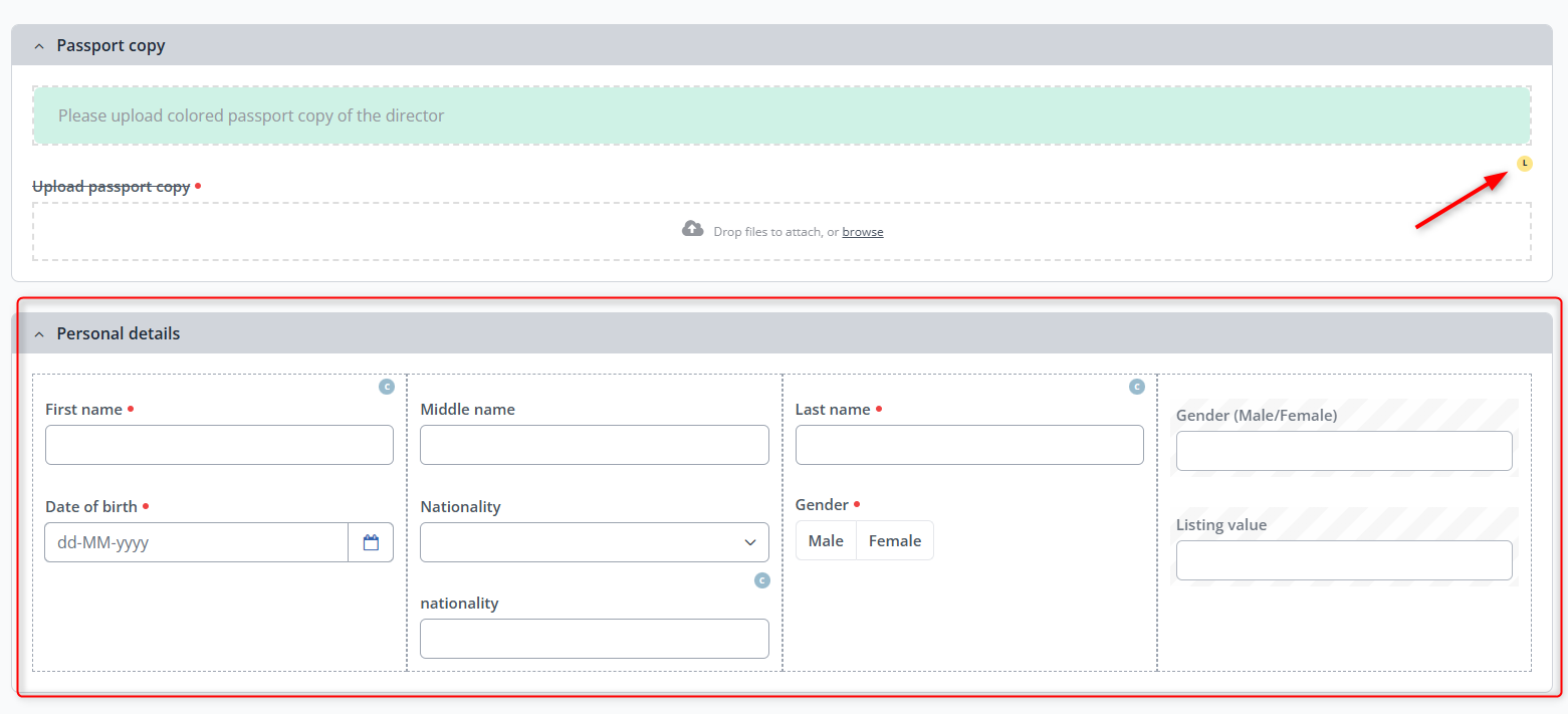
Link between the file upload component and the required document was created. Orange hint icon with L is visible in the top right corner. As of now this linked required document will be uploaded in this upload component, wherever it will be placed in the service, and not in the documents tab |
|


5. Payment#
Video tutorial - How fees connect to payments and how to add payment component
If the service has fee(s) applicable (defined under registration(s)), the Payments tab needs to be enabled. |
|
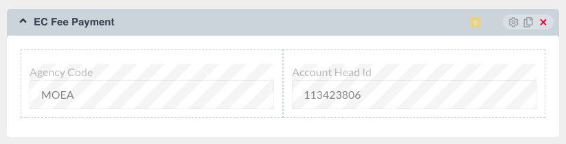
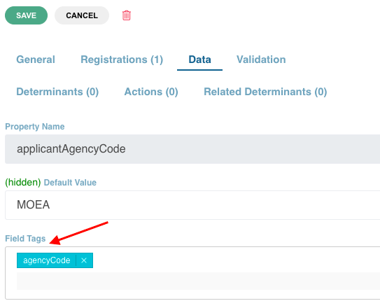
To add the payment component, click on the Form tab and create a hidden block with the Agency Code and Account Head ID components |
|
Click on edit Agency Code. Under the Data tab, select agencyCode under Field Tags → Save |
|
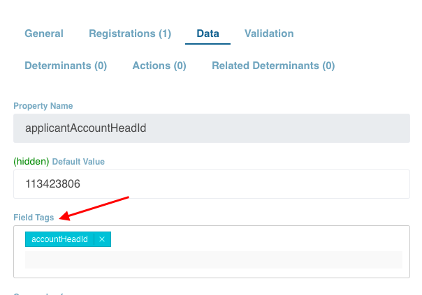
Similarly, for Account Head ID, edit Account Head ID → select accountHeadId under Field Tags under the Data tab → Save |
|
Under the Payments tab, drag and drop the Payment Providers component from the Custom components tab → A slider will open |
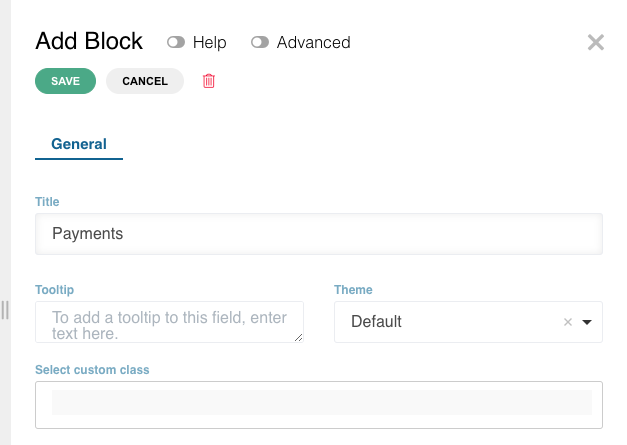
|
Edit the title → Save |
|
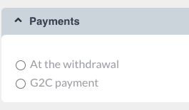
Radio buttons for online and manual payment will be automatically created inside the block |
|
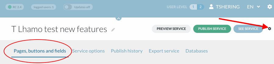
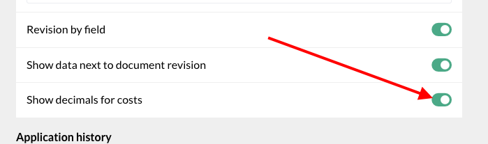
To show decimals in costs, click on the service settings → under ‘pages, buttons and field’ tab, enable the toggle for ‘Show decimals for costs’ If this toggle is on, the value displayed in DS will always have two decimals after the comma, even if they are ,00 |
|


6. Send file#
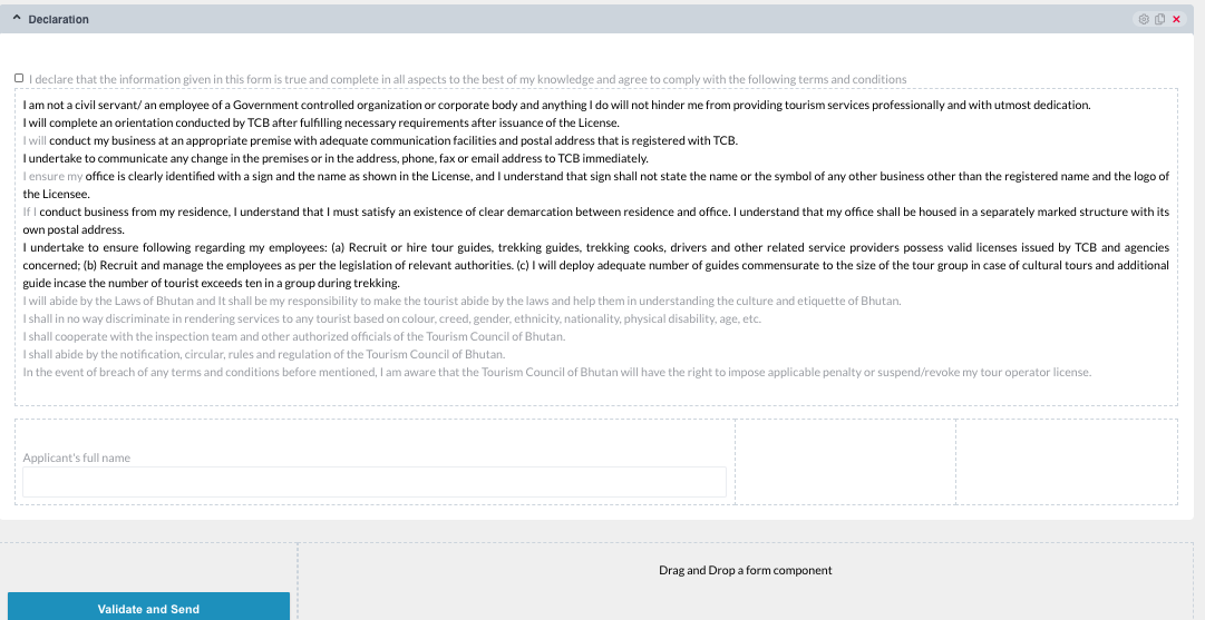
This is the declaration and signature page It can be developed the same way you develop the form |
|
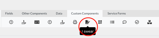
The declaration can be created using the ‘I Swear’ component under Custom Components tab |
|
7. Focus on some useful functions#
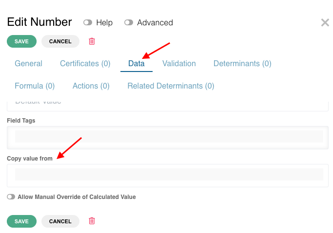
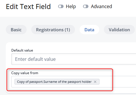
a. Copy value of a field to another (prefilling a field)#This tool is useful because the applicant does not have to provide the same details repeatedly. The fields that require data that was already provided will appear automatically To copy value from another field, → Edit text field/ number field → Data → under copy value from’, choose the element from the drop down from where you want to copy the value → Save The order of elements on the drop down list for “Copy value from” is - Name of the page, Block and Field |
|
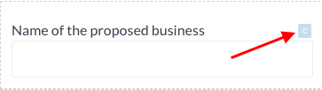
If the field configuration has the copy value setting, it will be indicated by the letter ‘C’ in blue color. CVF works only between fields of the same type (from text field to text field, number field to number field, date to date, etc. |
|
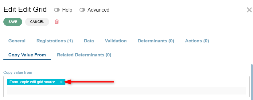
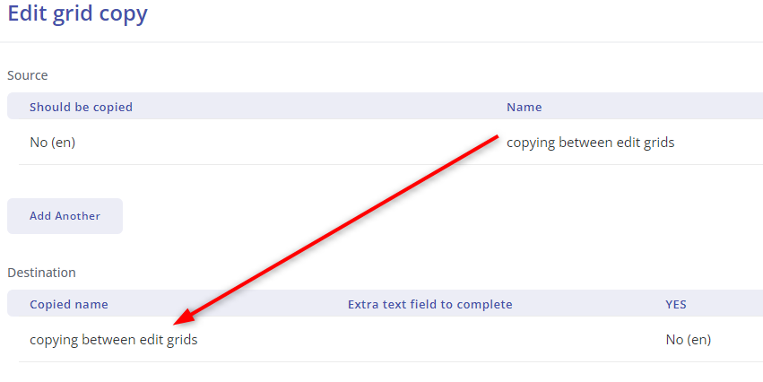
b. Copy edit grid values to another edit grid using copy value from. #To set it up we need two edit grids - source and destination. In the destination edit grid we need to specify from which edit grid the data will be copied. Open edit window on destination edit grid, go to “Copy value from tab”, select the source edit grid in the respective field and click save. “C” hinting icon will appear on the edit grid |
|
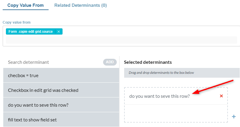
You can also use a determinant in the destination edit grid copy value from tab. This will enable you to copy just the rows for which the determinant was true. |
|
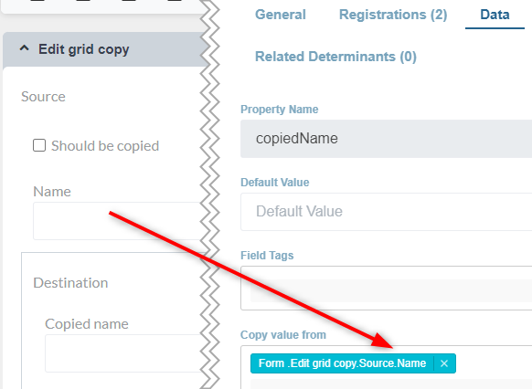
Then set the copy value from property on fields inside the destination edit grid to take the values from fields in source edit grid and publish the service . As soon as an entry is created in the source edit grid an entry will be created in the destination edit grid with the values copied in accordance with what was configured in BPA. The data can be copied this way between edit grids, data grids, from edit grid to data grid and opposite. |
|
As soon as an entry is created in the source edit grid an entry will be created in the destination edit grid with the values copied in accordance with what was configured in BPA. The data can be copied between edit grids, data grids, from edit grid to data grid and opposite. |
|

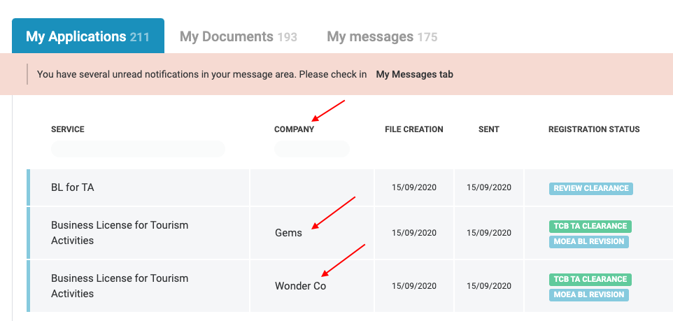
c. Field tags #Field tags are like bookmarks. We can put the same tag to various fields. It is used for concatenation of different fields. Listing-value (an element under field tags or as a toggle under basic settings): This feature will enable the name of the company under ‘My Applications’ on the user dashboard visible |
|
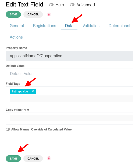
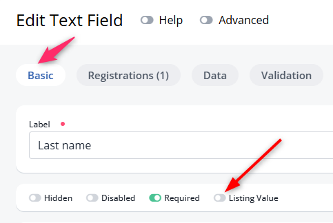
To add a listing value → Edit component A slider will open → Data → select ‘listing-value’ under ‘Field Tags’ → Save To add a listing value as a toggle → Edit component A slider will open → Basic→ click ‘Listing Value’ ‘Field toggle’ → Save |
|
d. Use formula with examples#1. Types of functions (non arithmetic operations) available in the formula builder# | |
To access those functions you need to create a formula on a given field. Click on the gear icon or the edit button |
|
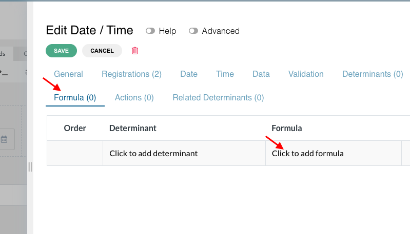
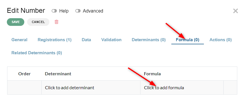
A slider will open. → Click on ‘Formulas’ → Click on the ‘click to add formula’ message |
|
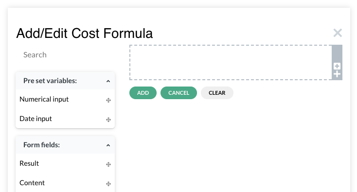
‘Add/Edit Cost Formula’ page will appear |
|
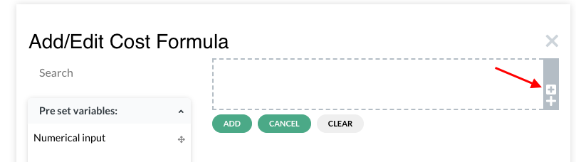
On the right side, click on the small ‘+’ sign on the box |
|
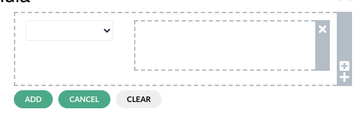
Another box will appear with a drop down field near it |
|
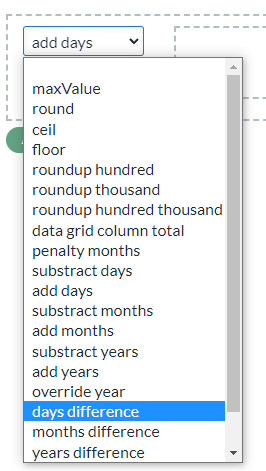
The dropdown field contains functions that the formula can perform on values of fields assigned to the formula. Below you will find a list of functions with explanation: | |
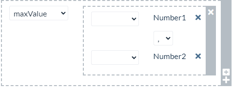
| maxValue - to be set on a number type field. It takes other number type fields and compares their values. The result is the highest number appearing in any of the examined fields. |
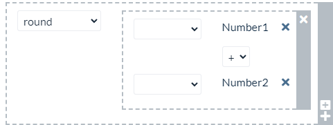
| round - to be set on a number type field. It takes other number type fields and rounds the result of any mathematical operation occurring between them. It will return the nearest whole number to the result. If result is 0.4 it will round down and will return 0 if it’s 0.5 it will round up and return 1 |
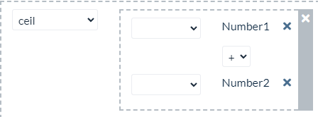
| Ceil - same as round only it always rounds the result up. |
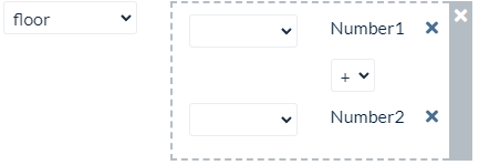
| Floor - same as round only it always rounds the result down. |
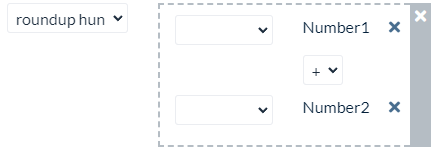
| Roundup hundred - to be set on a number type field. It takes other number type fields. It divides the result by 100 and rounds it up. If the result is 50 this action will return 1. If the result is 101 it will return 2 There are also two similar functions:: roundup thousands and roundup hundred thousands. They apply to a different order of magnitude of the numbers but the principal is the same. |
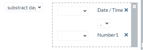
| Subtract days - to be set on a date/time type field. It takes another date/time type field and a number field and subtracts the number of days provided in the number field from the date field. If there is a need to operate on months or years there are two similar functions for that: Subtract months and subtract years |
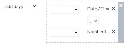
| Add days. It’s the same as subtract days, only the number of days is added to the date field. If there is a need to operate on months or years there are two similar functions for that: Add month and add years |
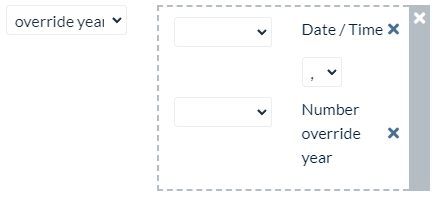
| Override year - to be set on a date/time type field. It takes other date/time type field and a number field and replaces year value from the date field with the one given in number field. |
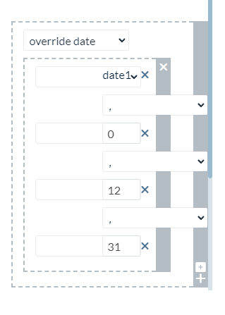
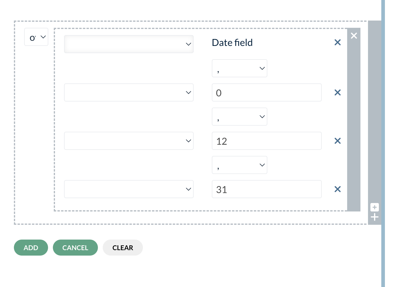
| Override date - to be set on a date/time type field. The overrideDate function allows you to modify specific components of a given date, such as year, month, day, hour, and minute. It takes six parameters: date, year, month, day, hour, and minute. Parameters:
Example: If we want to have a field that will always show the last day of the current year, we would have to take a date field in which we would have for example date that the file was submitted and we would apply this formula to the date field. The value from the date field is copied onto our field with formula. The year is not changed as the first parameter is 0. Month is set to 12 and day is set to 31. |
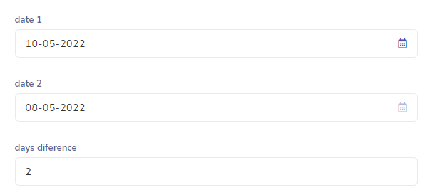
| Days difference - to be set on a number type field. It takes two date/time type fields and displays the difference in days between them. The second date field in the formula needs to have a value further in the past for the function to work correctly. Other similar functions are weeks difference, months difference and years difference. |
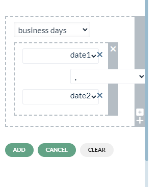
| Business days - to be set on a number type field. It takes two date/time type fields and displays the difference in business days between them. The second date field in the formula needs to have a value further in the past for the function to work correctly. Calculation is based on working hours that can be set in BPA instance settings in Time management tab. |
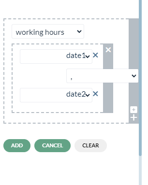
| Working hours - to be set on a number type field. It takes two date/time type fields and displays the difference in working hours between them. The second date field in the formula needs to have a value further in the past for the function to work correctly. Calculation is based on working hours that can be set in BPA instance settings in Time management tab. |
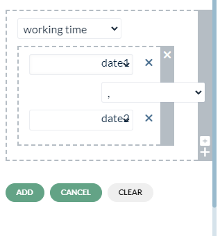
| Working time - to be set on a number type field. It takes two date/time type fields and displays the difference in working time between them. Time is given in milliseconds. The second date field in the formula needs to have a value further in the past for the function to work correctly. |
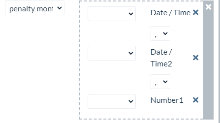
| Penalty months - to be set on a number type field. It takes two date/time type fields and a number input or field. First date field has to be in the past in relation to the second date field. This function will check the difference of dates in months and multiply it by the number provided. It also has a fourth argument to be set as 0 or 1. 0 is default.. If it’s set to 1 it will use ceil function on the result of date differences. Otherwise it will use floor function. Example: penaltyMonths("2020-01-01", "2021-01-01", 10, 0) Will equal: 12 * 10 = 120 |
| formatDateDD-MM-YYYY - to be set on a date/time type field. It will take date in any format as input and return it in "DD-MM-YYYY" format |
| Grid row counter- to be set on a number field. It takes just one argument which is a grid component for which the number of rows will be calculated. Function to select is “grid row counter” |
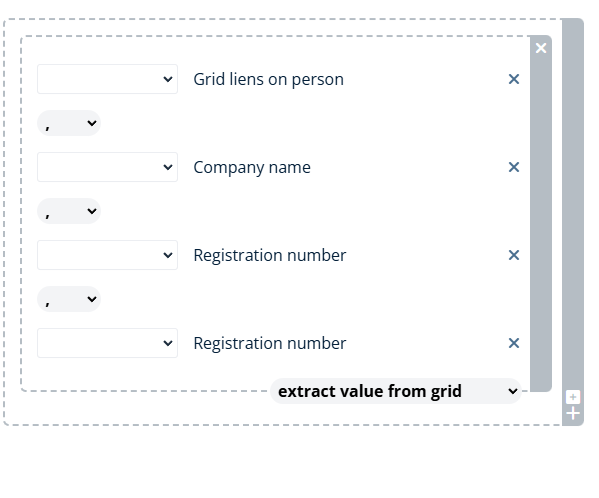
| Extract Value From Grid -extracts a specific value from a Grid component based on a matching criteria Function expects 4 components as its arguments separated by comma
Example
Extract the age of the person with name 'Bob'
We can use this formula to check if a value In one grid also exists in another grid. Example is shown in the image on the left. We have two grids one with companies which we want to put a lien on, and another with companies on which the lien is already placed. Field with this formula is placed in first grid and checks grid with comapnies which already have lien on them. Grid isnamed “Grid liens on person”. From this grid we want the name of the company “Company name” and we filter by Registration number in both grids. So As a result if the registration number is the same in both grids the company name will be copied to the first grid. This way we can have the indoermation that there is already a lien on the company we selected to put a lien on. |
2. Examples:# | |
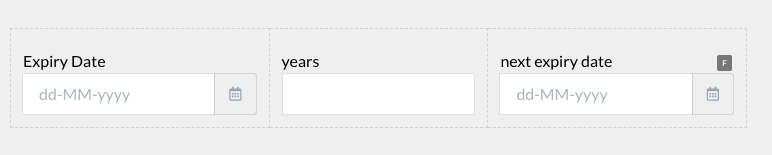
Formula will be in the date field and will be based on a number field and another date field |
|
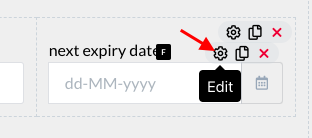
To create a formula to add the years to the expiry date, click on the gear icon or the edit button of the next expiry date field Note: the ‘years’ field has to be a number field (not a date field) |
|
A slider will open. → Click on ‘Formulas’ → Click on the ‘click to add formula’ message |
|
‘Add/Edit Cost Formula’ page will appear |
|
On the right side, click on the small ‘+’ sign on the box |
|
Another box will appear with a drop down field near it |
|
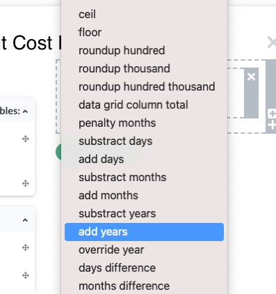
From the drop down list, select ‘add years’ Remark. This is where you select a type of operation (function) that is going to be performed on fields involved in the formula. Arithmetic operators “-,+, etc” can’t be used on date fields, so this is where you actually choose what the formula does. |
|
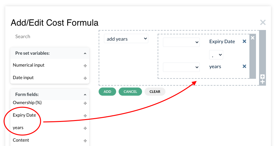
From the left panel, where the preset variables and form fields are available, drag and drop the ‘expiry date’ field and the ‘year’ field inside the box |
|
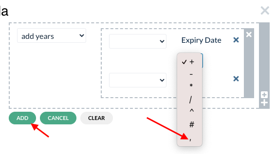
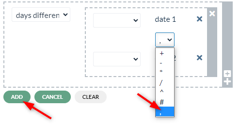
Select the comma (,) from the little drop down → Add Remark. Fields in this example are arguments of the “add years” function and have to be comma separated. So this is only a place to specify which fields are going to be used to execute the “add years” function. |
|
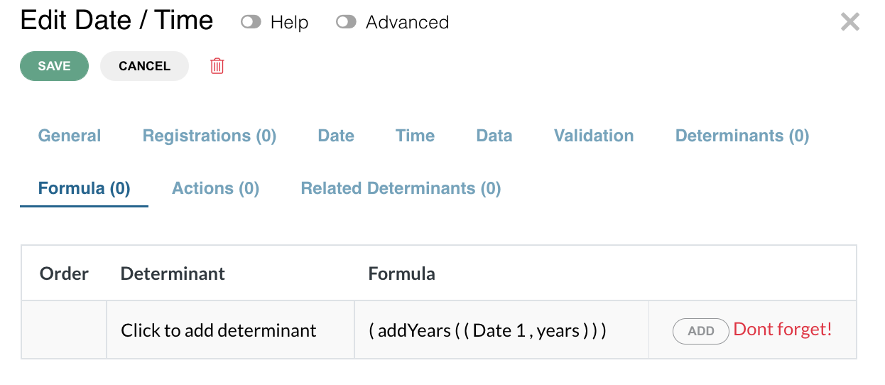
Do not forget to add the formula again on Formula page |
|
If the field configuration has a formula, it will be indicated by the letter ‘F’. When clicked on, it will open the slider directly on the Formula page. |
|



 F
F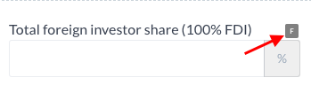
Formula will be in the number field based on two other date fields |
|
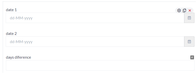
To create a formula to subtract two dates and present the number of days difference click on the gear icon or the edit button of a number filed |
|

A slider will open. → Click on ‘Formulas’ → Click on the ‘click to add formula’ message |
|
‘Add/Edit Cost Formula’ page will appear |
|
On the right side, click on the small ‘+’ sign on the box |
|
Another box will appear with a drop down field near it |
|
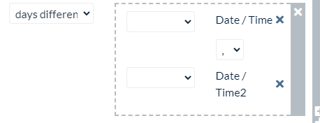
From the drop down list, select ‘days difference’ Remark. This is where you select a type of operation (function) that is going to be performed on fields involved in the formula. Arithmetic operators “-,+, etc” can’t be used on date fields, so this is where you actually choose what the formula does. |
|
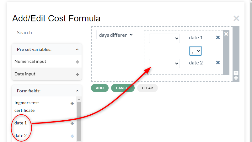
From the left panel, where the preset variables and form fields are available, drag and drop the ‘date1’ and ‘date2’ fields inside the box Remark. The order of fields is relevant. First added date field is the one that the function will be subtracting from. This means the second date field has to be further in the past for the formula to give a result. If this will not be respected, the result will show “0”. |
|
Select the comma (,) from the little drop down → Add Remark. Fields in this example are arguments of the “days difference” function and have to be comma separated. So this is only a place to specify which fields are going to be used to execute the “days difference” function. |
|
Do not forget to add the formula again on Formula page |
|
If the field configuration has a formula, it will be indicated by the letter ‘F’. When clicked on, it will open the slider directly on the Formula page. |
|
e. Input mask# | |
Used in the text field component to auto validate the characters in the field. | |
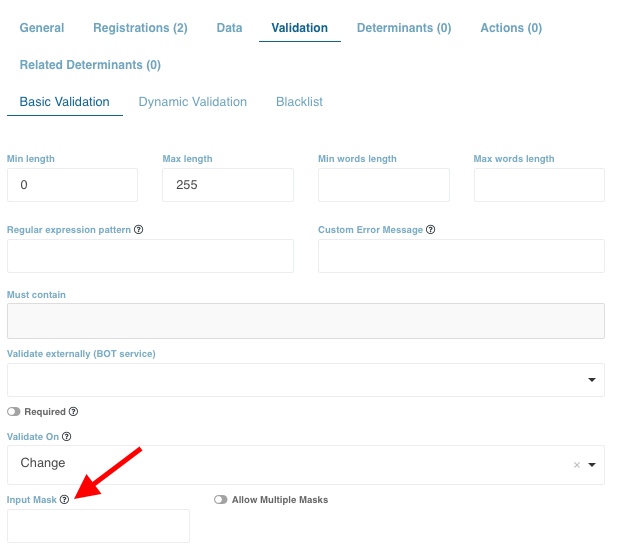
To create a mask (validation check), edit a text field. A slider will open. Input mask is available under the ‘Validation’ tab under ‘Basic validation’. To allow only numbers, enter ‘9’. Each 9 corresponds to a digit. For example, to allow only 8 digits, enter ‘9’ eight times. Likewise, to allow only letters, enter ‘A’ or ‘a’ corresponding to the number of letters you want to allow in the field. For alphanumeric values, enter asterix (*) corresponding to the number of values to be allowed. |
|
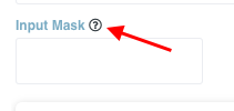
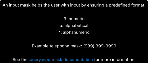
If the ‘Help’ toggle is active, the allowed characters will be shown in the input mask tooltip. |
|
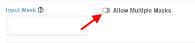
To create multiple masks, enable the ‘Allow Multiple Masks’ toggle |
|
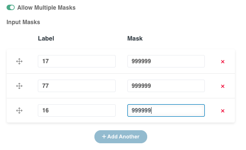
Enter labels and masks. For example, to allow phone numbers that start with a specific digit, enter those digits under Label, and the digits you want to limit under Mask. |
|
f. Blacklist# | |
This function is used for restricting certain words in a text field | |
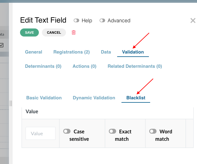
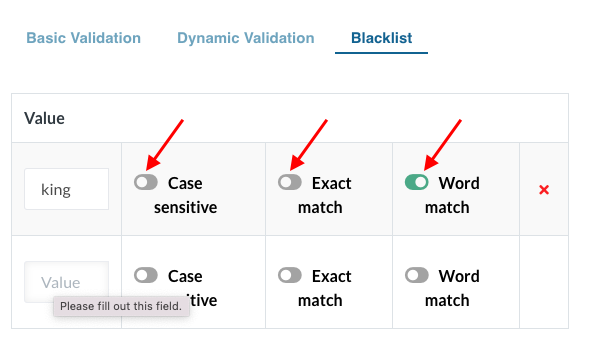
To blacklist/restrict a word on a text field, click on the edit button of the text field. A slider will open Click on the Validation tab → click on the Blacklist option |
|
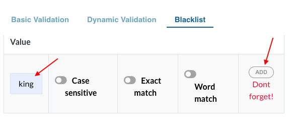
Enter the word(s) that are restricted for that field. For example, the word ‘king’ is a restricted word for business names. Enter the word under ‘value’ and click on the ‘Add’ button |
|
Depending on how the words should be restricted, enable any of the three options viz Case sensitive, Exact match and Word match More words can be added Click on the general Save button |
|
f.Extract data from documents# | |
Used to extract the data from documents and putting them automatically onto the form # | |
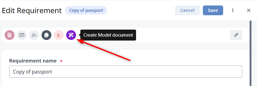
Under one of the registrations select the document which is your source of data and open edit modal. There you will see new document property “Create model document” |
|
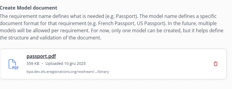
Upload an example document fo your document to the upload field that appeared. This is our document template. |
|
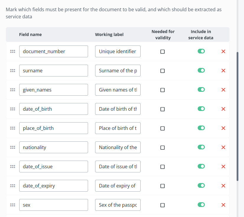
When the document is uploaded, the data extractor lists the data available for extraction: At this point the analyst can decide if a given field is needed for validation, meaning if the field is not found after uploading a file in DS the upload component should return validation error. He can also decide which data should be included in service data meaning, a value will be created in SFL so that it can be used in copy value from. |
|
Next the analyst needs to link this document somewhere on the form and prepare fields which will retain the extracted values. |
|
The last step is to copy the newly created variables onto the fields we want to populate with copy value from. This is a great way to populate most of the fields referring to someone's personal details without forcing this person to fill the form. |
|
8. Custom classes#
Custom class#
Video tutorial - Applying custom classes with two examples. (datagrid footer and field + button)
Custom class is a feature that can be applied to the fields in the forms. It is used for customizing fields (in terms of spacing, alignment, color, size, etc.) or to deploy a function to a particular field. Depending on the type of fields, different options to customize will be available for selection.
Description of each type of custom class is provided below:
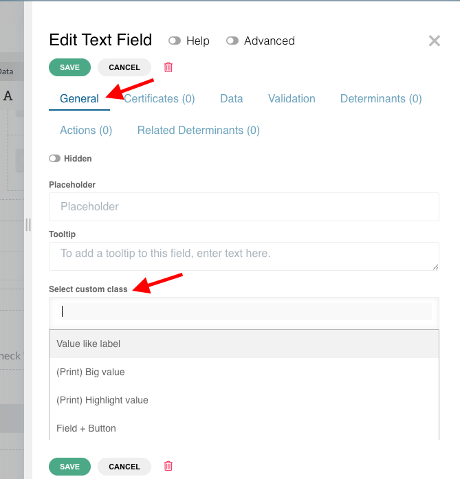
To add a custom class open edit modal of a particular field. For some fields the advanced toggle needs to be switched on for select custom class field to appear. |
| ||||||||||||||||||||||||||||||||||||||||||||||||||||||||||||||||||||||||||||||||||||||||||||||||||||||||||||||||||||||||||||||||||||||||||||||||||||||||||||||||||||||||||||||||||||
1 .Appearance changing classes.# | List of classes relevant to this chapter:
| ||||||||||||||||||||||||||||||||||||||||||||||||||||||||||||||||||||||||||||||||||||||||||||||||||||||||||||||||||||||||||||||||||||||||||||||||||||||||||||||||||||||||||||||||||||
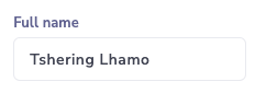
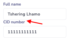
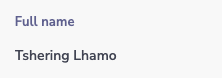
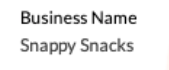
Value like label | To show a field value in the same way as a label.
| ||||||||||||||||||||||||||||||||||||||||||||||||||||||||||||||||||||||||||||||||||||||||||||||||||||||||||||||||||||||||||||||||||||||||||||||||||||||||||||||||||||||||||||||||||||
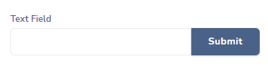
Field + Button | To show the button close to the field. To be used always with a field on the left and button on the right on a columns component and has to be applied on both, the field and the button. When applied it should look like this:
Sometimes the label on the field needs to be turned off for the components to align | ||||||||||||||||||||||||||||||||||||||||||||||||||||||||||||||||||||||||||||||||||||||||||||||||||||||||||||||||||||||||||||||||||||||||||||||||||||||||||||||||||||||||||||||||||||
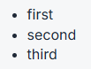
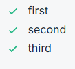
List bullet check | To replace bullets in an unordered list with a check icon. Normal unordered list: With this custom class . | ||||||||||||||||||||||||||||||||||||||||||||||||||||||||||||||||||||||||||||||||||||||||||||||||||||||||||||||||||||||||||||||||||||||||||||||||||||||||||||||||||||||||||||||||||||
Text right | Aligns both field value and field label to the right.
| ||||||||||||||||||||||||||||||||||||||||||||||||||||||||||||||||||||||||||||||||||||||||||||||||||||||||||||||||||||||||||||||||||||||||||||||||||||||||||||||||||||||||||||||||||||
Align value to right | Aligns only the field value to the right.
| ||||||||||||||||||||||||||||||||||||||||||||||||||||||||||||||||||||||||||||||||||||||||||||||||||||||||||||||||||||||||||||||||||||||||||||||||||||||||||||||||||||||||||||||||||||
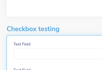
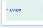
Highlight block | This class will add a blue border and glow to the block, in order to highlight it from a regular block. It should look like this when applied. Will be converted to a toggle at some point
| ||||||||||||||||||||||||||||||||||||||||||||||||||||||||||||||||||||||||||||||||||||||||||||||||||||||||||||||||||||||||||||||||||||||||||||||||||||||||||||||||||||||||||||||||||||
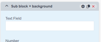
Background (Blue, Gray, Green, Orange, Red) IMPORTANT NOTE! Background color is inherited. If background color is set on a block which has a sub block, the sub block will have the same background color as its parent container unless other color was specified Also, use cases in which a container has a background color selected, and a child component has a Highlight block custom class applied is not supported. This will result in partial background color filling on the highlighted block | To be used on a container component. It sets the container background color to the color you have selected.
| ||||||||||||||||||||||||||||||||||||||||||||||||||||||||||||||||||||||||||||||||||||||||||||||||||||||||||||||||||||||||||||||||||||||||||||||||||||||||||||||||||||||||||||||||||||
Default notice | Will add a left border with the theme main color:
The border will be red if applied to block component. For other components it will be blue. | ||||||||||||||||||||||||||||||||||||||||||||||||||||||||||||||||||||||||||||||||||||||||||||||||||||||||||||||||||||||||||||||||||||||||||||||||||||||||||||||||||||||||||||||||||||
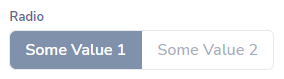
Radio Switch | Transform an inline radio group into a switchable button group:
| ||||||||||||||||||||||||||||||||||||||||||||||||||||||||||||||||||||||||||||||||||||||||||||||||||||||||||||||||||||||||||||||||||||||||||||||||||||||||||||||||||||||||||||||||||||
Search results list | Applies a hover effect on edit grid rows. | ||||||||||||||||||||||||||||||||||||||||||||||||||||||||||||||||||||||||||||||||||||||||||||||||||||||||||||||||||||||||||||||||||||||||||||||||||||||||||||||||||||||||||||||||||||
Change appearance classes matrix: for excel format click HERE
| |||||||||||||||||||||||||||||||||||||||||||||||||||||||||||||||||||||||||||||||||||||||||||||||||||||||||||||||||||||||||||||||||||||||||||||||||||||||||||||||||||||||||||||||||||||
2. Spacing and alignment classes# | List of classes relevant to this chapter:
| ||||||||||||||||||||||||||||||||||||||||||||||||||||||||||||||||||||||||||||||||||||||||||||||||||||||||||||||||||||||||||||||||||||||||||||||||||||||||||||||||||||||||||||||||||||
Remove top space | Removes the default top space for the component
| ||||||||||||||||||||||||||||||||||||||||||||||||||||||||||||||||||||||||||||||||||||||||||||||||||||||||||||||||||||||||||||||||||||||||||||||||||||||||||||||||||||||||||||||||||||
Space top (label space) | It creates space on the top (corresponding to the space occupied by a label). It is useful when a button must be aligned with a field.
| ||||||||||||||||||||||||||||||||||||||||||||||||||||||||||||||||||||||||||||||||||||||||||||||||||||||||||||||||||||||||||||||||||||||||||||||||||||||||||||||||||||||||||||||||||||
Top space | It adds a space on the top of the component (the default space that separates components) To be used in the cases where the component is the first inside a column or table cell and the space is removed by default to avoid double spacing (e.g. table space + field space). This will intentionally add the removed space.
| ||||||||||||||||||||||||||||||||||||||||||||||||||||||||||||||||||||||||||||||||||||||||||||||||||||||||||||||||||||||||||||||||||||||||||||||||||||||||||||||||||||||||||||||||||||
Top space (2X) | To add double of the default component separator space | ||||||||||||||||||||||||||||||||||||||||||||||||||||||||||||||||||||||||||||||||||||||||||||||||||||||||||||||||||||||||||||||||||||||||||||||||||||||||||||||||||||||||||||||||||||
Top space (3X) | To add triple of the default component separator space | ||||||||||||||||||||||||||||||||||||||||||||||||||||||||||||||||||||||||||||||||||||||||||||||||||||||||||||||||||||||||||||||||||||||||||||||||||||||||||||||||||||||||||||||||||||
Remove top inner space | Removes the space between the end of the component label and the beginning of the radio + label value. | ||||||||||||||||||||||||||||||||||||||||||||||||||||||||||||||||||||||||||||||||||||||||||||||||||||||||||||||||||||||||||||||||||||||||||||||||||||||||||||||||||||||||||||||||||||
Vertical align top/ center/ bottom | When added to columns, the content within each column will tend to align vertically dependent on the class used. When applied to a field within a datagrid, it will align vertically the field according to the current row | ||||||||||||||||||||||||||||||||||||||||||||||||||||||||||||||||||||||||||||||||||||||||||||||||||||||||||||||||||||||||||||||||||||||||||||||||||||||||||||||||||||||||||||||||||||
Full height | When added it gives the component the height of 100% which means the component will try to occupy 100% of the available height of its parent. Can be added to any component | ||||||||||||||||||||||||||||||||||||||||||||||||||||||||||||||||||||||||||||||||||||||||||||||||||||||||||||||||||||||||||||||||||||||||||||||||||||||||||||||||||||||||||||||||||||
Change alignment, classes matrix: for excel format click HERE
| |||||||||||||||||||||||||||||||||||||||||||||||||||||||||||||||||||||||||||||||||||||||||||||||||||||||||||||||||||||||||||||||||||||||||||||||||||||||||||||||||||||||||||||||||||||
3. Datagrid related classes# | List of classes relevant to this chapter:
| ||||||||||||||||||||||||||||||||||||||||||||||||||||||||||||||||||||||||||||||||||||||||||||||||||||||||||||||||||||||||||||||||||||||||||||||||||||||||||||||||||||||||||||||||||||
Datagrid footer | To be used on a columns component located just below a DataGrid component and intended to be used as a footer for the datagrid. These columns should have the same amount of columns as the datagrid and should contain in every column a field without a label that will show the column total.
| ||||||||||||||||||||||||||||||||||||||||||||||||||||||||||||||||||||||||||||||||||||||||||||||||||||||||||||||||||||||||||||||||||||||||||||||||||||||||||||||||||||||||||||||||||||
Add/Remove disabled | To be used to the datagrid footer (columns used for footer) when the Datagrid above does not allow to add or remove items
| ||||||||||||||||||||||||||||||||||||||||||||||||||||||||||||||||||||||||||||||||||||||||||||||||||||||||||||||||||||||||||||||||||||||||||||||||||||||||||||||||||||||||||||||||||||
Datagrid Condensed | To be used to the datagrid footer (columns used for footer), when the Datagrid above is using the condensed property:
The datagrid above the columns must have the custom class: Has footer | ||||||||||||||||||||||||||||||||||||||||||||||||||||||||||||||||||||||||||||||||||||||||||||||||||||||||||||||||||||||||||||||||||||||||||||||||||||||||||||||||||||||||||||||||||||
Width | To be used on any type of field inside a data grid. It sets the width of the field to a selected percentage of the whole row width. Can be set to value from 5% to 100% with the unit step of 5. Example values that this custom class can take are width5, width10, width15 ..... width95, width100 | ||||||||||||||||||||||||||||||||||||||||||||||||||||||||||||||||||||||||||||||||||||||||||||||||||||||||||||||||||||||||||||||||||||||||||||||||||||||||||||||||||||||||||||||||||||
Has footer | Applied to data grid components if the datagrid comes with a column component on the bottom that is suppose to be the data grid footer. | ||||||||||||||||||||||||||||||||||||||||||||||||||||||||||||||||||||||||||||||||||||||||||||||||||||||||||||||||||||||||||||||||||||||||||||||||||||||||||||||||||||||||||||||||||||
Datagrid Hide Column Label | When applied to a field contained in the datagrid, the label or column title will not be shown. In the case of a checkbox it will additionally center the checkbox and remove is label on the data cell also not only the heading cell | ||||||||||||||||||||||||||||||||||||||||||||||||||||||||||||||||||||||||||||||||||||||||||||||||||||||||||||||||||||||||||||||||||||||||||||||||||||||||||||||||||||||||||||||||||||
Datagrid related matrix: for excel format click HERE
| |||||||||||||||||||||||||||||||||||||||||||||||||||||||||||||||||||||||||||||||||||||||||||||||||||||||||||||||||||||||||||||||||||||||||||||||||||||||||||||||||||||||||||||||||||||
4. Custom classes for Button# | List of classes relevant to this chapter:
| ||||||||||||||||||||||||||||||||||||||||||||||||||||||||||||||||||||||||||||||||||||||||||||||||||||||||||||||||||||||||||||||||||||||||||||||||||||||||||||||||||||||||||||||||||||
Field + Button | To show the button close to the field. To be used always with a field on the left and button on the right on a columns component and has to be applied on both, the field and the button. When applied it should look like this:
If the label on the field is visible then button should have Space top (label space) custom class applied for both fields to align. | ||||||||||||||||||||||||||||||||||||||||||||||||||||||||||||||||||||||||||||||||||||||||||||||||||||||||||||||||||||||||||||||||||||||||||||||||||||||||||||||||||||||||||||||||||||
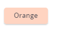
Orange/Blue/Green/Red | Will color the button according to the color on the class | ||||||||||||||||||||||||||||||||||||||||||||||||||||||||||||||||||||||||||||||||||||||||||||||||||||||||||||||||||||||||||||||||||||||||||||||||||||||||||||||||||||||||||||||||||||
Disable on success | Will prevent the button from being clickable after the button’s action is successful | ||||||||||||||||||||||||||||||||||||||||||||||||||||||||||||||||||||||||||||||||||||||||||||||||||||||||||||||||||||||||||||||||||||||||||||||||||||||||||||||||||||||||||||||||||||
Show cog during form submit | Will show the “cog” icon while the action triggered by the button is running. | ||||||||||||||||||||||||||||||||||||||||||||||||||||||||||||||||||||||||||||||||||||||||||||||||||||||||||||||||||||||||||||||||||||||||||||||||||||||||||||||||||||||||||||||||||||
Light color | Will apply lighter color shade to the button and will change the button font color to black
| ||||||||||||||||||||||||||||||||||||||||||||||||||||||||||||||||||||||||||||||||||||||||||||||||||||||||||||||||||||||||||||||||||||||||||||||||||||||||||||||||||||||||||||||||||||
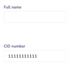
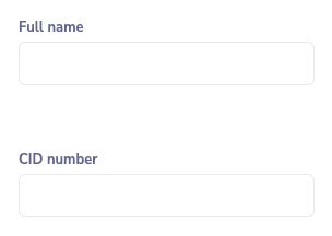
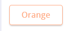
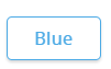
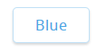
Outline button | Will render the button with border and font color In the color that was set on the button and with white background
Light color class can be used together with Outline color to give more subtle border line and slightly thinner font. Example: Button with just Outline button class Button with both classes applied | ||||||||||||||||||||||||||||||||||||||||||||||||||||||||||||||||||||||||||||||||||||||||||||||||||||||||||||||||||||||||||||||||||||||||||||||||||||||||||||||||||||||||||||||||||||




5. Custom classes used for certificate layout # | List of classes relevant to this chapter: Old certificate styles:
New certificate styles:
| ||||||||||||||||||||||||||||||||||||||||||||||||||||||||||||||||||||||||||||||||||||||||||||||||||||||||||||||||||||||||||||||||||||||||||||||||||||||||||||||||||||||||||||||||||||||||||||||||||||||||||||||||||||||||||||||||||||||||||||||||||||||||||||||||||||||||||||||||||||||||||||||||||||
New certificate styles: | |||||||||||||||||||||||||||||||||||||||||||||||||||||||||||||||||||||||||||||||||||||||||||||||||||||||||||||||||||||||||||||||||||||||||||||||||||||||||||||||||||||||||||||||||||||||||||||||||||||||||||||||||||||||||||||||||||||||||||||||||||||||||||||||||||||||||||||||||||||||||||||||||||||
Print Page A4 | Used to define a page in the style guide. Applied to Blocks only | ||||||||||||||||||||||||||||||||||||||||||||||||||||||||||||||||||||||||||||||||||||||||||||||||||||||||||||||||||||||||||||||||||||||||||||||||||||||||||||||||||||||||||||||||||||||||||||||||||||||||||||||||||||||||||||||||||||||||||||||||||||||||||||||||||||||||||||||||||||||||||||||||||||
Print text center | Utility class: Used to center align the value text of a field | ||||||||||||||||||||||||||||||||||||||||||||||||||||||||||||||||||||||||||||||||||||||||||||||||||||||||||||||||||||||||||||||||||||||||||||||||||||||||||||||||||||||||||||||||||||||||||||||||||||||||||||||||||||||||||||||||||||||||||||||||||||||||||||||||||||||||||||||||||||||||||||||||||||
Print text right | Utility class: Used to right align the value text of a field | ||||||||||||||||||||||||||||||||||||||||||||||||||||||||||||||||||||||||||||||||||||||||||||||||||||||||||||||||||||||||||||||||||||||||||||||||||||||||||||||||||||||||||||||||||||||||||||||||||||||||||||||||||||||||||||||||||||||||||||||||||||||||||||||||||||||||||||||||||||||||||||||||||||
Print text left | Utility class: Used to left align the value text of a field | ||||||||||||||||||||||||||||||||||||||||||||||||||||||||||||||||||||||||||||||||||||||||||||||||||||||||||||||||||||||||||||||||||||||||||||||||||||||||||||||||||||||||||||||||||||||||||||||||||||||||||||||||||||||||||||||||||||||||||||||||||||||||||||||||||||||||||||||||||||||||||||||||||||
Print center vertical | Utility class: Used to align center vertically the value text of a field | ||||||||||||||||||||||||||||||||||||||||||||||||||||||||||||||||||||||||||||||||||||||||||||||||||||||||||||||||||||||||||||||||||||||||||||||||||||||||||||||||||||||||||||||||||||||||||||||||||||||||||||||||||||||||||||||||||||||||||||||||||||||||||||||||||||||||||||||||||||||||||||||||||||
Print Page top margin small | Set the defined page top margin with 12mm | ||||||||||||||||||||||||||||||||||||||||||||||||||||||||||||||||||||||||||||||||||||||||||||||||||||||||||||||||||||||||||||||||||||||||||||||||||||||||||||||||||||||||||||||||||||||||||||||||||||||||||||||||||||||||||||||||||||||||||||||||||||||||||||||||||||||||||||||||||||||||||||||||||||
Print Page top margin medium | Set the defined page top margin with 24mm | ||||||||||||||||||||||||||||||||||||||||||||||||||||||||||||||||||||||||||||||||||||||||||||||||||||||||||||||||||||||||||||||||||||||||||||||||||||||||||||||||||||||||||||||||||||||||||||||||||||||||||||||||||||||||||||||||||||||||||||||||||||||||||||||||||||||||||||||||||||||||||||||||||||
Print Page top margin large | Set the defined page top margin with 36mm | ||||||||||||||||||||||||||||||||||||||||||||||||||||||||||||||||||||||||||||||||||||||||||||||||||||||||||||||||||||||||||||||||||||||||||||||||||||||||||||||||||||||||||||||||||||||||||||||||||||||||||||||||||||||||||||||||||||||||||||||||||||||||||||||||||||||||||||||||||||||||||||||||||||
Print Page bottom margin small | Set the defined page bottom margin with 12mm | ||||||||||||||||||||||||||||||||||||||||||||||||||||||||||||||||||||||||||||||||||||||||||||||||||||||||||||||||||||||||||||||||||||||||||||||||||||||||||||||||||||||||||||||||||||||||||||||||||||||||||||||||||||||||||||||||||||||||||||||||||||||||||||||||||||||||||||||||||||||||||||||||||||
Print Page bottom margin medium | Set the defined page bottom margin with 24mm | ||||||||||||||||||||||||||||||||||||||||||||||||||||||||||||||||||||||||||||||||||||||||||||||||||||||||||||||||||||||||||||||||||||||||||||||||||||||||||||||||||||||||||||||||||||||||||||||||||||||||||||||||||||||||||||||||||||||||||||||||||||||||||||||||||||||||||||||||||||||||||||||||||||
Print Page bottom margin large | Set the defined page bottom margin with 36mm | ||||||||||||||||||||||||||||||||||||||||||||||||||||||||||||||||||||||||||||||||||||||||||||||||||||||||||||||||||||||||||||||||||||||||||||||||||||||||||||||||||||||||||||||||||||||||||||||||||||||||||||||||||||||||||||||||||||||||||||||||||||||||||||||||||||||||||||||||||||||||||||||||||||
Print Page horizontal margin small | Set the defined page left and right margin with 12mm | ||||||||||||||||||||||||||||||||||||||||||||||||||||||||||||||||||||||||||||||||||||||||||||||||||||||||||||||||||||||||||||||||||||||||||||||||||||||||||||||||||||||||||||||||||||||||||||||||||||||||||||||||||||||||||||||||||||||||||||||||||||||||||||||||||||||||||||||||||||||||||||||||||||
Print Page horizontal margin medium | Set the defined page left and right margin with 24mm | ||||||||||||||||||||||||||||||||||||||||||||||||||||||||||||||||||||||||||||||||||||||||||||||||||||||||||||||||||||||||||||||||||||||||||||||||||||||||||||||||||||||||||||||||||||||||||||||||||||||||||||||||||||||||||||||||||||||||||||||||||||||||||||||||||||||||||||||||||||||||||||||||||||
Print Page horizontal margin large | Set the defined page left and right margin with 36mm | ||||||||||||||||||||||||||||||||||||||||||||||||||||||||||||||||||||||||||||||||||||||||||||||||||||||||||||||||||||||||||||||||||||||||||||||||||||||||||||||||||||||||||||||||||||||||||||||||||||||||||||||||||||||||||||||||||||||||||||||||||||||||||||||||||||||||||||||||||||||||||||||||||||
Print corner top left | Set the defined page top left corner image. Used with a Content component that will have the corner image | ||||||||||||||||||||||||||||||||||||||||||||||||||||||||||||||||||||||||||||||||||||||||||||||||||||||||||||||||||||||||||||||||||||||||||||||||||||||||||||||||||||||||||||||||||||||||||||||||||||||||||||||||||||||||||||||||||||||||||||||||||||||||||||||||||||||||||||||||||||||||||||||||||||
Print corner top right | Set the defined page top right corner image. Used with a Content component that will have the corner image | ||||||||||||||||||||||||||||||||||||||||||||||||||||||||||||||||||||||||||||||||||||||||||||||||||||||||||||||||||||||||||||||||||||||||||||||||||||||||||||||||||||||||||||||||||||||||||||||||||||||||||||||||||||||||||||||||||||||||||||||||||||||||||||||||||||||||||||||||||||||||||||||||||||
Print corner bottom left | Set the defined page bottom left corner image. Used with a Content component that will have the corner image | ||||||||||||||||||||||||||||||||||||||||||||||||||||||||||||||||||||||||||||||||||||||||||||||||||||||||||||||||||||||||||||||||||||||||||||||||||||||||||||||||||||||||||||||||||||||||||||||||||||||||||||||||||||||||||||||||||||||||||||||||||||||||||||||||||||||||||||||||||||||||||||||||||||
Print corner bottom right | Set the defined page bottom right corner image. Used with a Content component that will have the corner image | ||||||||||||||||||||||||||||||||||||||||||||||||||||||||||||||||||||||||||||||||||||||||||||||||||||||||||||||||||||||||||||||||||||||||||||||||||||||||||||||||||||||||||||||||||||||||||||||||||||||||||||||||||||||||||||||||||||||||||||||||||||||||||||||||||||||||||||||||||||||||||||||||||||
Print watermark | Set the defined page watermark image. Used with a Content component that will have the watermark image | ||||||||||||||||||||||||||||||||||||||||||||||||||||||||||||||||||||||||||||||||||||||||||||||||||||||||||||||||||||||||||||||||||||||||||||||||||||||||||||||||||||||||||||||||||||||||||||||||||||||||||||||||||||||||||||||||||||||||||||||||||||||||||||||||||||||||||||||||||||||||||||||||||||
Print footer distance small | Set to small the defined page footer element distance from the bottom edge of the page counting the page margins also. | ||||||||||||||||||||||||||||||||||||||||||||||||||||||||||||||||||||||||||||||||||||||||||||||||||||||||||||||||||||||||||||||||||||||||||||||||||||||||||||||||||||||||||||||||||||||||||||||||||||||||||||||||||||||||||||||||||||||||||||||||||||||||||||||||||||||||||||||||||||||||||||||||||||
Print footer distance medium | Set to medium the defined page footer element distance from the bottom edge of the page counting the page margins also. | ||||||||||||||||||||||||||||||||||||||||||||||||||||||||||||||||||||||||||||||||||||||||||||||||||||||||||||||||||||||||||||||||||||||||||||||||||||||||||||||||||||||||||||||||||||||||||||||||||||||||||||||||||||||||||||||||||||||||||||||||||||||||||||||||||||||||||||||||||||||||||||||||||||
Print footer distance large | Set to large the defined page footer element distance from the bottom edge of the page counting the page margins also. | ||||||||||||||||||||||||||||||||||||||||||||||||||||||||||||||||||||||||||||||||||||||||||||||||||||||||||||||||||||||||||||||||||||||||||||||||||||||||||||||||||||||||||||||||||||||||||||||||||||||||||||||||||||||||||||||||||||||||||||||||||||||||||||||||||||||||||||||||||||||||||||||||||||
Print non latin text | Used with Content component to define non latin text like arabic, with a custom proper font for the specified alphabet characters. The font is defined via code in the custom css of the country template | ||||||||||||||||||||||||||||||||||||||||||||||||||||||||||||||||||||||||||||||||||||||||||||||||||||||||||||||||||||||||||||||||||||||||||||||||||||||||||||||||||||||||||||||||||||||||||||||||||||||||||||||||||||||||||||||||||||||||||||||||||||||||||||||||||||||||||||||||||||||||||||||||||||
Print color light | Set a lighter gray color to the output text of a field value | ||||||||||||||||||||||||||||||||||||||||||||||||||||||||||||||||||||||||||||||||||||||||||||||||||||||||||||||||||||||||||||||||||||||||||||||||||||||||||||||||||||||||||||||||||||||||||||||||||||||||||||||||||||||||||||||||||||||||||||||||||||||||||||||||||||||||||||||||||||||||||||||||||||
Print color dark | Set a black color to the output text of a field value | ||||||||||||||||||||||||||||||||||||||||||||||||||||||||||||||||||||||||||||||||||||||||||||||||||||||||||||||||||||||||||||||||||||||||||||||||||||||||||||||||||||||||||||||||||||||||||||||||||||||||||||||||||||||||||||||||||||||||||||||||||||||||||||||||||||||||||||||||||||||||||||||||||||
Print color brand | Set a custom environment country color to the output text of a field value | ||||||||||||||||||||||||||||||||||||||||||||||||||||||||||||||||||||||||||||||||||||||||||||||||||||||||||||||||||||||||||||||||||||||||||||||||||||||||||||||||||||||||||||||||||||||||||||||||||||||||||||||||||||||||||||||||||||||||||||||||||||||||||||||||||||||||||||||||||||||||||||||||||||
Print space xsmall | Creates a 2mm top space to the applied component | ||||||||||||||||||||||||||||||||||||||||||||||||||||||||||||||||||||||||||||||||||||||||||||||||||||||||||||||||||||||||||||||||||||||||||||||||||||||||||||||||||||||||||||||||||||||||||||||||||||||||||||||||||||||||||||||||||||||||||||||||||||||||||||||||||||||||||||||||||||||||||||||||||||
Print space small | Creates a 4mm top space to the applied component | ||||||||||||||||||||||||||||||||||||||||||||||||||||||||||||||||||||||||||||||||||||||||||||||||||||||||||||||||||||||||||||||||||||||||||||||||||||||||||||||||||||||||||||||||||||||||||||||||||||||||||||||||||||||||||||||||||||||||||||||||||||||||||||||||||||||||||||||||||||||||||||||||||||
Print space medium | Creates a 8mm top space to the applied component | ||||||||||||||||||||||||||||||||||||||||||||||||||||||||||||||||||||||||||||||||||||||||||||||||||||||||||||||||||||||||||||||||||||||||||||||||||||||||||||||||||||||||||||||||||||||||||||||||||||||||||||||||||||||||||||||||||||||||||||||||||||||||||||||||||||||||||||||||||||||||||||||||||||
Print space large | Creates a 12mm top space to the applied component | ||||||||||||||||||||||||||||||||||||||||||||||||||||||||||||||||||||||||||||||||||||||||||||||||||||||||||||||||||||||||||||||||||||||||||||||||||||||||||||||||||||||||||||||||||||||||||||||||||||||||||||||||||||||||||||||||||||||||||||||||||||||||||||||||||||||||||||||||||||||||||||||||||||
Print space xlarge | Creates a 16mm top space to the applied component | ||||||||||||||||||||||||||||||||||||||||||||||||||||||||||||||||||||||||||||||||||||||||||||||||||||||||||||||||||||||||||||||||||||||||||||||||||||||||||||||||||||||||||||||||||||||||||||||||||||||||||||||||||||||||||||||||||||||||||||||||||||||||||||||||||||||||||||||||||||||||||||||||||||
Print value small | Sets the value of a field to a smaller text size of 10pt | ||||||||||||||||||||||||||||||||||||||||||||||||||||||||||||||||||||||||||||||||||||||||||||||||||||||||||||||||||||||||||||||||||||||||||||||||||||||||||||||||||||||||||||||||||||||||||||||||||||||||||||||||||||||||||||||||||||||||||||||||||||||||||||||||||||||||||||||||||||||||||||||||||||
Print value large | Sets the value of a field to a bigger text size of 14pt | ||||||||||||||||||||||||||||||||||||||||||||||||||||||||||||||||||||||||||||||||||||||||||||||||||||||||||||||||||||||||||||||||||||||||||||||||||||||||||||||||||||||||||||||||||||||||||||||||||||||||||||||||||||||||||||||||||||||||||||||||||||||||||||||||||||||||||||||||||||||||||||||||||||
Print label small | Sets the label of a field to a smaller text size of 8pt | ||||||||||||||||||||||||||||||||||||||||||||||||||||||||||||||||||||||||||||||||||||||||||||||||||||||||||||||||||||||||||||||||||||||||||||||||||||||||||||||||||||||||||||||||||||||||||||||||||||||||||||||||||||||||||||||||||||||||||||||||||||||||||||||||||||||||||||||||||||||||||||||||||||
Print label large | Sets the label of a field to a bigger text size of 10pt | ||||||||||||||||||||||||||||||||||||||||||||||||||||||||||||||||||||||||||||||||||||||||||||||||||||||||||||||||||||||||||||||||||||||||||||||||||||||||||||||||||||||||||||||||||||||||||||||||||||||||||||||||||||||||||||||||||||||||||||||||||||||||||||||||||||||||||||||||||||||||||||||||||||
Old certificate styles: | |||||||||||||||||||||||||||||||||||||||||||||||||||||||||||||||||||||||||||||||||||||||||||||||||||||||||||||||||||||||||||||||||||||||||||||||||||||||||||||||||||||||||||||||||||||||||||||||||||||||||||||||||||||||||||||||||||||||||||||||||||||||||||||||||||||||||||||||||||||||||||||||||||||
In text and number fields | |||||||||||||||||||||||||||||||||||||||||||||||||||||||||||||||||||||||||||||||||||||||||||||||||||||||||||||||||||||||||||||||||||||||||||||||||||||||||||||||||||||||||||||||||||||||||||||||||||||||||||||||||||||||||||||||||||||||||||||||||||||||||||||||||||||||||||||||||||||||||||||||||||||
print-big-field | Used in the print forms to increase the size of the value to the applied field.
| ||||||||||||||||||||||||||||||||||||||||||||||||||||||||||||||||||||||||||||||||||||||||||||||||||||||||||||||||||||||||||||||||||||||||||||||||||||||||||||||||||||||||||||||||||||||||||||||||||||||||||||||||||||||||||||||||||||||||||||||||||||||||||||||||||||||||||||||||||||||||||||||||||||
print-small-field | Used to reduce the font size of the field value | ||||||||||||||||||||||||||||||||||||||||||||||||||||||||||||||||||||||||||||||||||||||||||||||||||||||||||||||||||||||||||||||||||||||||||||||||||||||||||||||||||||||||||||||||||||||||||||||||||||||||||||||||||||||||||||||||||||||||||||||||||||||||||||||||||||||||||||||||||||||||||||||||||||
(Print) Highlight Value | Used only in Print Forms, to highlight a certificate number or the most relevant information in the certificate. The way this class looks, will depend on what the development team and the analysts agree beforehand.
| ||||||||||||||||||||||||||||||||||||||||||||||||||||||||||||||||||||||||||||||||||||||||||||||||||||||||||||||||||||||||||||||||||||||||||||||||||||||||||||||||||||||||||||||||||||||||||||||||||||||||||||||||||||||||||||||||||||||||||||||||||||||||||||||||||||||||||||||||||||||||||||||||||||
In blocks | |||||||||||||||||||||||||||||||||||||||||||||||||||||||||||||||||||||||||||||||||||||||||||||||||||||||||||||||||||||||||||||||||||||||||||||||||||||||||||||||||||||||||||||||||||||||||||||||||||||||||||||||||||||||||||||||||||||||||||||||||||||||||||||||||||||||||||||||||||||||||||||||||||||
(Print) Certificate | To be used only on the print forms. It has to be applied to the first block containing all the rest of components on the certificate. This block has to be without heading text. | ||||||||||||||||||||||||||||||||||||||||||||||||||||||||||||||||||||||||||||||||||||||||||||||||||||||||||||||||||||||||||||||||||||||||||||||||||||||||||||||||||||||||||||||||||||||||||||||||||||||||||||||||||||||||||||||||||||||||||||||||||||||||||||||||||||||||||||||||||||||||||||||||||||
In columns | |||||||||||||||||||||||||||||||||||||||||||||||||||||||||||||||||||||||||||||||||||||||||||||||||||||||||||||||||||||||||||||||||||||||||||||||||||||||||||||||||||||||||||||||||||||||||||||||||||||||||||||||||||||||||||||||||||||||||||||||||||||||||||||||||||||||||||||||||||||||||||||||||||||
(Print) Document Section | To be used in Print Forms only. It will create a separation of the columns component. Usually to be used to group related fields on a certificate | ||||||||||||||||||||||||||||||||||||||||||||||||||||||||||||||||||||||||||||||||||||||||||||||||||||||||||||||||||||||||||||||||||||||||||||||||||||||||||||||||||||||||||||||||||||||||||||||||||||||||||||||||||||||||||||||||||||||||||||||||||||||||||||||||||||||||||||||||||||||||||||||||||||
(Print) Documents last section | To be used in Print Forms only. It will add in certain cases a separation line or a bigger separation to the last section of the certificate. | ||||||||||||||||||||||||||||||||||||||||||||||||||||||||||||||||||||||||||||||||||||||||||||||||||||||||||||||||||||||||||||||||||||||||||||||||||||||||||||||||||||||||||||||||||||||||||||||||||||||||||||||||||||||||||||||||||||||||||||||||||||||||||||||||||||||||||||||||||||||||||||||||||||
In content | |||||||||||||||||||||||||||||||||||||||||||||||||||||||||||||||||||||||||||||||||||||||||||||||||||||||||||||||||||||||||||||||||||||||||||||||||||||||||||||||||||||||||||||||||||||||||||||||||||||||||||||||||||||||||||||||||||||||||||||||||||||||||||||||||||||||||||||||||||||||||||||||||||||
(Print) Terms and conditions | Used for certificates in the terms and conditions content component to give a smaller style and specific list items alignment. | ||||||||||||||||||||||||||||||||||||||||||||||||||||||||||||||||||||||||||||||||||||||||||||||||||||||||||||||||||||||||||||||||||||||||||||||||||||||||||||||||||||||||||||||||||||||||||||||||||||||||||||||||||||||||||||||||||||||||||||||||||||||||||||||||||||||||||||||||||||||||||||||||||||
(Print) Certificate header | Used for certificates in the document header content component to give specific styles to the heading items used there. Usually this content component would have the country name and the ministry involved | ||||||||||||||||||||||||||||||||||||||||||||||||||||||||||||||||||||||||||||||||||||||||||||||||||||||||||||||||||||||||||||||||||||||||||||||||||||||||||||||||||||||||||||||||||||||||||||||||||||||||||||||||||||||||||||||||||||||||||||||||||||||||||||||||||||||||||||||||||||||||||||||||||||
(Print) Certificate document title | Used for certificates in a content component before the data sections, to give specific styles to the document title. Usually is the word “Certificate” or can be “License” and the activity or some other relevant information | ||||||||||||||||||||||||||||||||||||||||||||||||||||||||||||||||||||||||||||||||||||||||||||||||||||||||||||||||||||||||||||||||||||||||||||||||||||||||||||||||||||||||||||||||||||||||||||||||||||||||||||||||||||||||||||||||||||||||||||||||||||||||||||||||||||||||||||||||||||||||||||||||||||
(Print) Certificate footer | Used for certificates in the document footer content component to keep the footer at the bottom of the page | ||||||||||||||||||||||||||||||||||||||||||||||||||||||||||||||||||||||||||||||||||||||||||||||||||||||||||||||||||||||||||||||||||||||||||||||||||||||||||||||||||||||||||||||||||||||||||||||||||||||||||||||||||||||||||||||||||||||||||||||||||||||||||||||||||||||||||||||||||||||||||||||||||||
| |||||||||||||||||||||||||||||||||||||||||||||||||||||||||||||||||||||||||||||||||||||||||||||||||||||||||||||||||||||||||||||||||||||||||||||||||||||||||||||||||||||||||||||||||||||||||||||||||||||||||||||||||||||||||||||||||||||||||||||||||||||||||||||||||||||||||||||||||||||||||||||||||||||
6. Other custom classes # | List of classes relevant to this chapter:
| ||||||||||||||||||||||||||||||||||||||||||||||||||||||||||||||||||||||||||||||||||||||||||||||||||||||||||||||||||||||||||||||||||||||||||||||||||||||||||||||||||||||||||||||||||||||||||||||||||||||||||||||||||||||||||||||||||||||||||||||||||||||||||||||||||||||||||||||||||||||||||||||||||||
Payment form component | This class should be added by default to Payment Page related blocks and is here only to be used in the case that it was not added by default by the system | ||||||||||||||||||||||||||||||||||||||||||||||||||||||||||||||||||||||||||||||||||||||||||||||||||||||||||||||||||||||||||||||||||||||||||||||||||||||||||||||||||||||||||||||||||||||||||||||||||||||||||||||||||||||||||||||||||||||||||||||||||||||||||||||||||||||||||||||||||||||||||||||||||||
I-swear component | To be added to I swear component in BPA for proper styling | ||||||||||||||||||||||||||||||||||||||||||||||||||||||||||||||||||||||||||||||||||||||||||||||||||||||||||||||||||||||||||||||||||||||||||||||||||||||||||||||||||||||||||||||||||||||||||||||||||||||||||||||||||||||||||||||||||||||||||||||||||||||||||||||||||||||||||||||||||||||||||||||||||||
E. BOT builder#
A BOT is an automated action performed by the system. There are two types of BOTs:
- data BOT, to exchange data between an eRegistration service and an external system (eg a GDB database)
- document BOT, to display a document on the screen (e.g. a license, or a certificate) or upload it to the user file.
There are two types of document BOTS:
- Display: it displays a document on the screen
- Upload: it uploads the document to the user file
1. Create a BOT#
a) Document BOT #
Click on BOT Builder tab on the side menu |
|
Click on “add” button in the search bar |
|
A slider will open. Enter BOT name |
|
Select “Document BOT” under Type of BOT |
|
Categories field will appear. Select “generate and display” under Categories (to display the certificate), choose “generate and upload” if the certificate has to be uploaded to the user file or “generate upload display to perform both actions on the generated document → select document from the drop down → Create. Please note that only one document can be generated under one button. If there is a need to generate multiple documents in the form, each document generating BOT should be assigned to separate button |
|

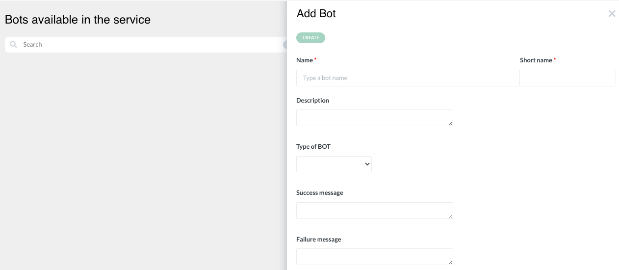
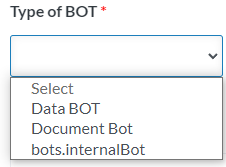
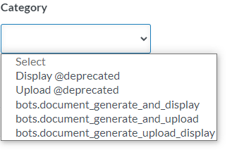
b) Data BOT #
Click on BOT Builder tab on the side menu |
|
Click on “add” button in the search bar |
|
A slider will open. Enter BOT name |
|
Select “Data BOT” under Type of BOT |
|
Categories field will appear. Select “Create” under Categories → Create. Explanation for different types of BOTs available in the system can be found here: List of APIs |
|
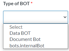
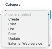
c) Internal BOT#
Internal BOT is a new type of BOT that enables the analyst to copy data from one component to another. It can be performed on components within the same form, between two different forms, between grid components or even between forms in different services. | |
Click on BOT Builder tab on the side menu |
|
Click on “add” button in the search bar |
|
A slider will open. Enter BOT name |
|
Select “Internal BOT” under Type of BOT → Create. |
|
Select the BOT that was just created from the list of bots |
|
Apply the required mapping on the mapping page |
|
1. Linking services with internal BOT# | Linking services is a powerful feature which can be used whenever one service is related or dependent on another service. |
What it does | When it is required, the analyst can configure an internal BOT which will paste the data from the current service form to another form in a different service. Whenever this internal BOT is called, the new browser tab will be opened with the target service displayed, and the data mapped in the BOT will be transferred between the services. |
How to set it up: Create an internal BOT as described above. In the mapping page you will see that the service you are currently working on is selected by default. |
|
Change the receiving service to a different one that is available in the same instance. You will see the other service form structure was loaded. You can now apply the required mappins |
|
Apply the bot in your service in the place where it is necessary to redirect the user to the other service. If the first service should await for any type of result from the second service, combine this functionality with the Polling BOT role | |

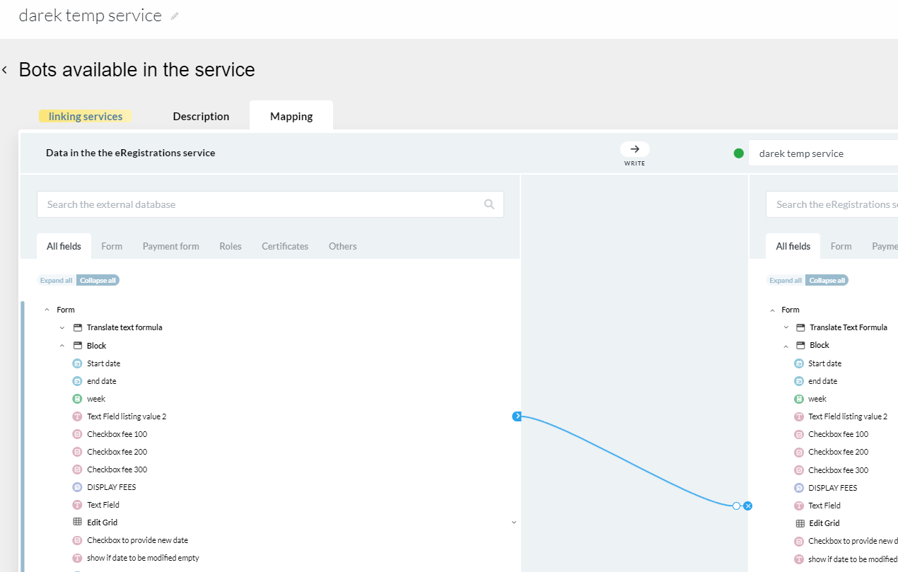
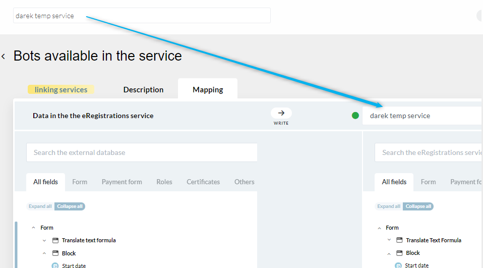
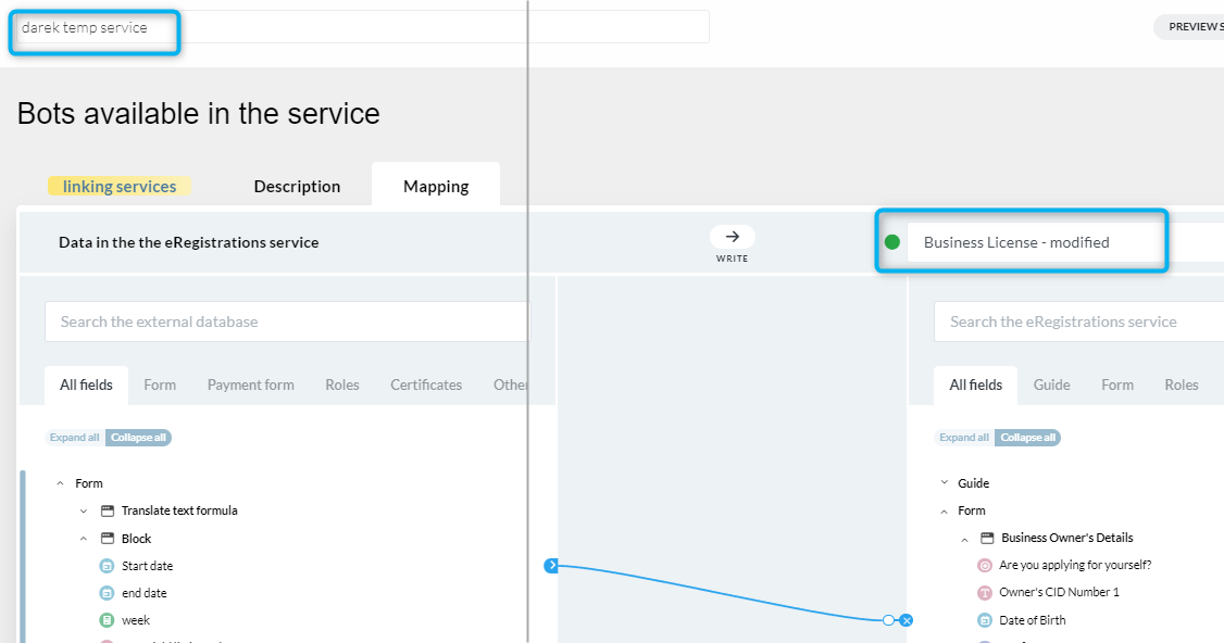
d) Adding actions (BOT roles) to the form # | |
There are three ways to add action (BOT role) to the form:
| |
1. BOT applied to a button.#To add action buttons (BOT roles) on the form, drag and drop a ‘Block’ from ‘Containers’ |
|
A slider will open. Enter name of the action in the Block Title → Save |
|
Drag and drop ‘table’ from Containers into the block |
|
A slider will open. Choose number of rows and columns depending on the number of actions that will be created → save |
|
Drag and drop “button” from the Other Components tab into the table |
|
A slider will open. Enter the name of the action under ‘Label’ → select custom color and size for the action button |
|
Click on “Actions” |
|
Click on “click to add BOT” |
|
If the BOT (action) is available in the list, simply drag and drop it on the right side → save If the action is not available in the list, click on “add” |
|
Data and/or Document bots can be executed either in sequence or concurrently - a designated toggle can be activated to define the concurrent flow. Important! System actions cannot be executed concurrently with any Data or Document bots (the toggle does not appear or if, in some cases, visible it is then disabled). It is possible to add actions after System actions. Exceptions which always need to be last are: “Validate Send page” and any of the Part B System actions |
|
Alternatively, bots can be created from the BOT Builder tab on the side menu. See Create a BOT |
|
To position the button on the top, click on the gear icon |
|
A slider will open Click on the field under ‘select custom class’ |
|
Select ‘space top zero’ → Save |
|
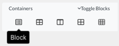
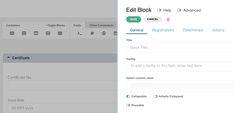
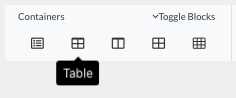
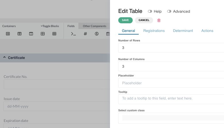
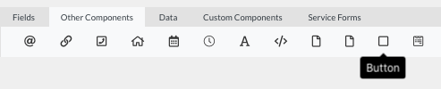
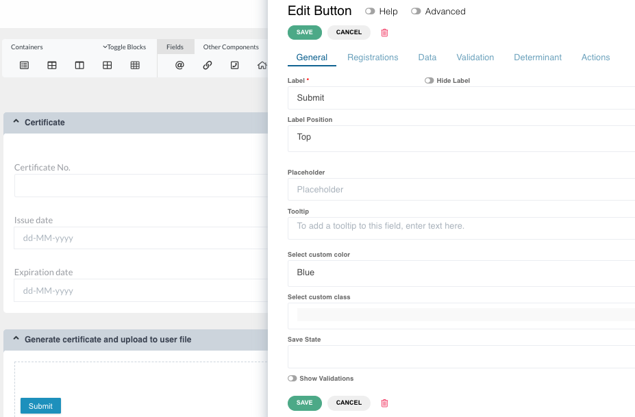
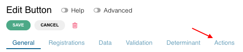
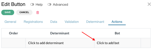
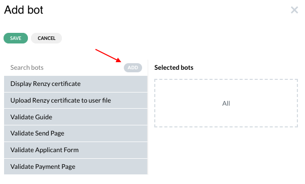
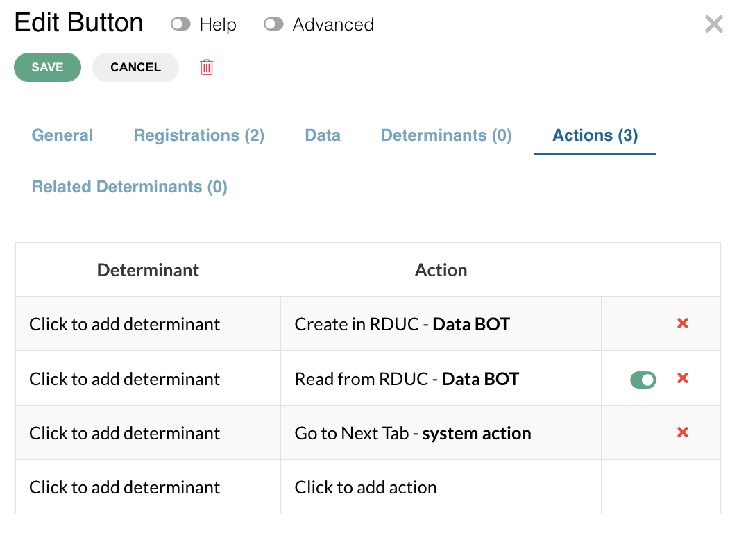
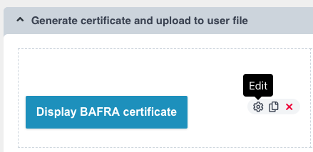
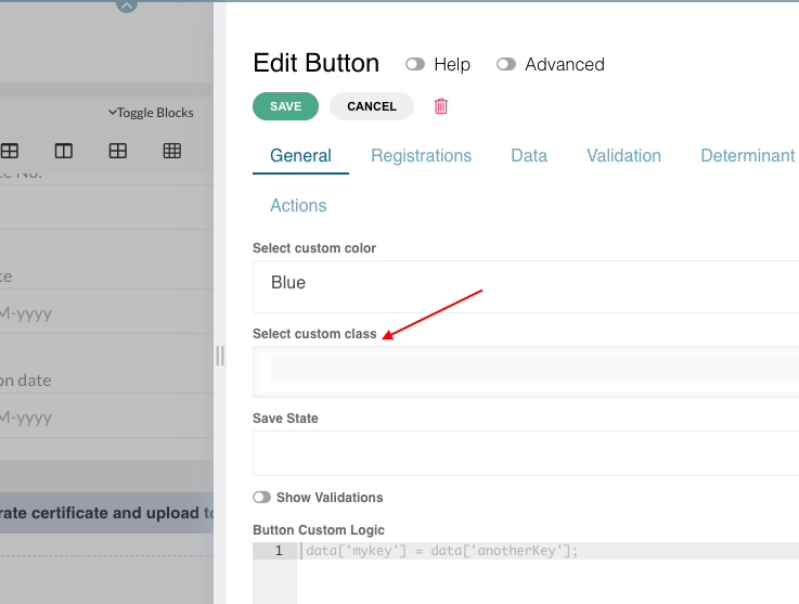
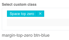
2. BOT applied to a field.#To add action (BOT roles) on the field, drag and drop any type of input field from “Fields” |
|
A slider will open. Enter name in the Label field → Save |
|
Click on the edit (gear) button, go to actions tab and click on “click to add action” |
|
If the action is available in the list, simply drag and drop it on the right side → save If the action is not available in the list, click on “add” |
|
Important to know: Action applied to a field will be executed after 1,5 seconds from occurrence of last change in this field. |
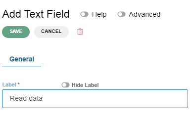
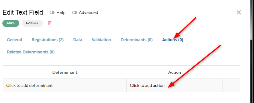
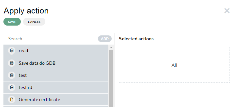
2. BOT applied to a block.#To add action (BOT roles) on the block, drag and drop a block element from “Containers” |
|
A slider will open. Block name can be provided in the title field, but it is not mandatory → Save |
|
Click on the edit (gear) button, go to actions tab and click on “Click to add action” |
|
If the action is available in the list, simply drag and drop it on the right side → save If the action is not available in the list, click on “add” |
|
Important to know: Action applied to a block will be executed after the block is rendered on the form. If there is no determinant on this block, the action will be executed when this form loads. If there is a determinant on the block, the action will be executed when the determinant becomes true. |

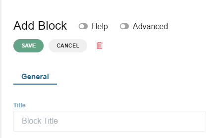
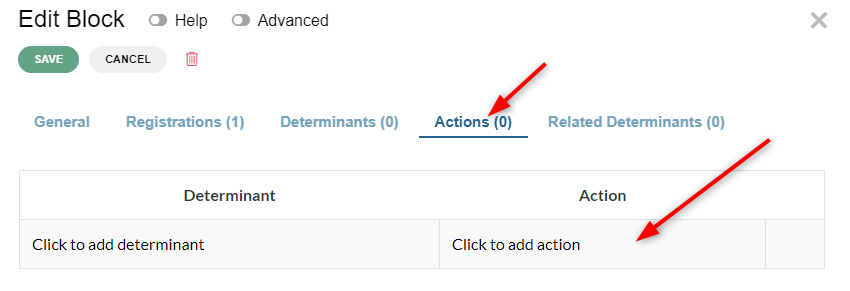
2. Mapping#
Mapping or data mapping is the process of matching fields from one database to another. This feature enables the transfer of data between the eRegistrations system and the GDB system. And this task is performed by data BOTs.
Mapping data in internal BOTs allows the user to transfer the data between different forms within the same service. It does not require sending the data to external database
a) Mapping between eRegistrations and GDB#To map the data between eRegistrations database and GDB → select the service → click on BOT builder on the side menu → click on the data BOT |
|
Click on Mapping |
|
This page displays two functionalities of the data BOTs viz “write” and “receive” “Write”: data from eRegistrations database is copied to GDB “Receive”: data received by eRegistrations database from GDB |
|
Click on the dropdown bar and select the database from GDB with the correct version. This action needs to be performed every time the database in GDB has been updated (the latest version needs to be selected) Once the GDB database is selected, the link between the databases of the two systems is created |
|
To enable data BOTs to transfer data from eRegistrations database to GDB, click on the drop down arrow on the bar with the “write” function |
|
Click on “expand all” under both databases |
|
To create map links between the two databases, the same data should be connected with the blue arrow To create a link, click on a data on eRegistrations database → then click on the same data in the GDB |
|
The field type should be the same in both the databases. If not, the link will not work. It will be indicated by a combination of blue and red line |
|
Click on the eye to hide the fields that you do not want to show This helps to reduce the number of information on the screen and improve your work space |
|
Every time a change is made in the DB structure of GDB, the version gets updated. it should be saved and published to apply the change for mapping |
|
Accordingly, select the updated version in data BOT mapping in BPA |
|
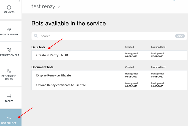
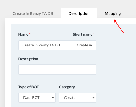
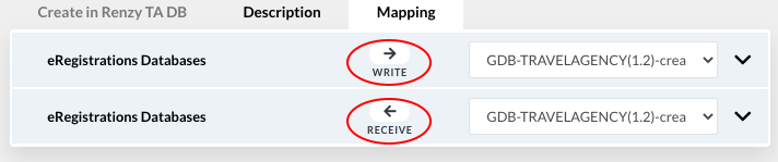
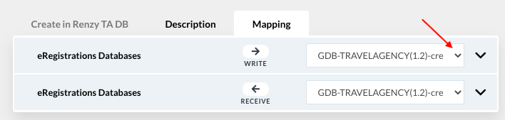
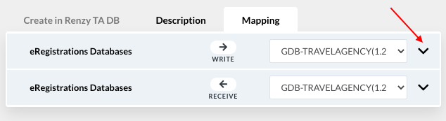
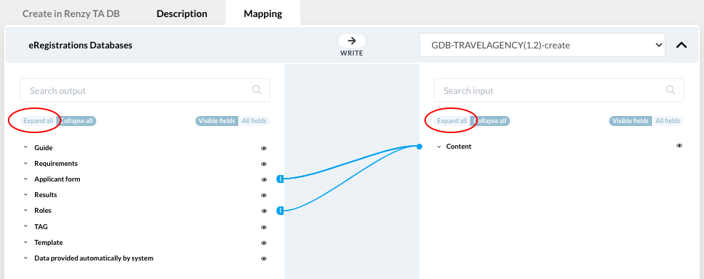

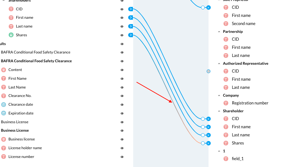
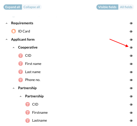
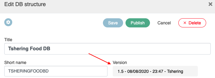
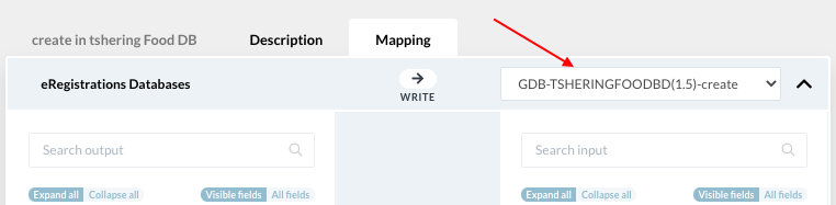
b) Mapping in internal BOTs#To map the data between forms in the same service → select the service → click on BOT builder on the side menu → click on the internal BOTs |
|
Click on Mapping |
|
This page displays two trees with all the forms available in your service |
|
Click on “expand all” under both databases |
|
To create map links between the two forms, the same data should be connected with the blue arrow To create a link, click on a data in the left tree → then click on the same data in right tree |
|
The field type should be the same on both sides of mapping. If not, the link will not work. It will be indicated by a combination of blue and red line |
|
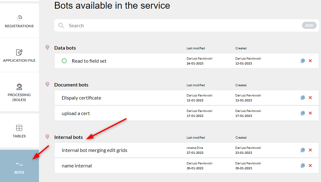
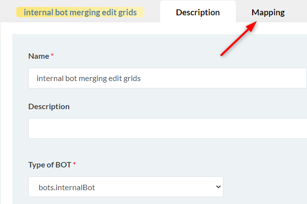
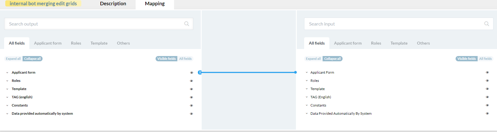

c) Mapping transformations#
There are several logic conditions that can be applied to the mapping in order to get a different query result from the database than the simple comparison of data on both sides of the mapping.
They are called transformations.
To add a transformation to the mapping, click on the white circle on existing mapping connection |
|
A window will pop up in which one of the predefined transformations can be selected |
|
Select a transformation you need to apply and click the save button |
|
In mapping with transformation applied the circle will have violet color. If there is no transformation applied, the circle will remain white. |
|

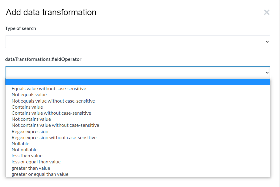
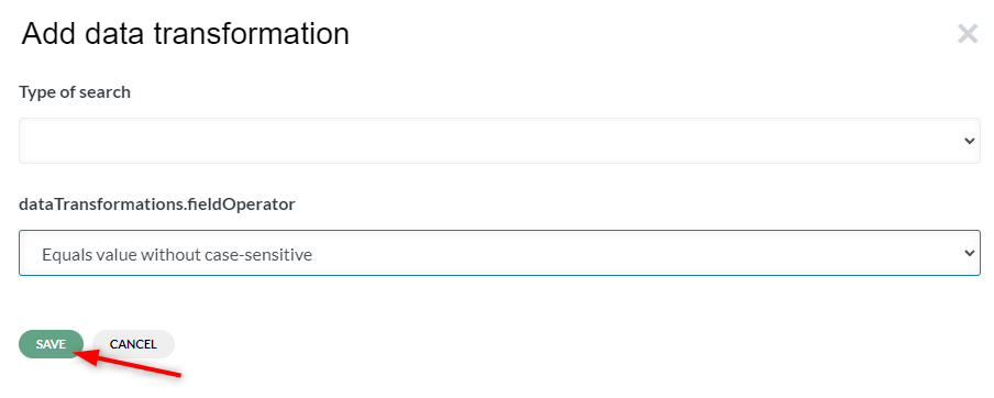

1.Mapping transformations list#
Following table explains all mapping transformations behavior.
Equals value without case-sensitive | Transformation will check for a text string value in the database, but will accept both capital and lower-case letters in regard to every letter of the queried string. Example: User is querying the database for “kings french fries” while in the database the corresponding value is “KINGS French fries”. With “Equals value without case-sensitive transformation” applied the BOT will give a positive result although both values are not exactly the same. |
Not equals value | Transformation will return all values that are different from the value queried.It is case-sensitive |
Not equals value without case-sensitive | This transformation is to be used on text fields due to case sensitivity check. It will return all values that are different from the value queried regardless of how the value was saved in the database (with capital letters, lower-case letter, or mix of both) |
Contains value | Transformation will return all values that contain the queried data. Example: if the query value would be “kin” the database of english dictionary would return values like - Skin, king, baking, striking, electrokinetics |
Contains value without case-sensitive | It is the same as Contains value, only it does not distinguish the letters size. Example: if the query value would be “kin” in this case it would additionally return words like King, Kinetic etc. |
Not contains value | Transformation will return all values that do not contain the queried value. It is case-sensitive |
Not contains value without case-sensitive | Transformation will return all values that do not contain the queried value. It is not case-sensitive |
Less than value | Transformation will return all values that are less than the queried value. It applies for example to number and date type fields |
Less or equal than value | Transformation will return all values that are less or equal to the queried value. It applies for example to number and date type fields |
IN | IN transformation is used to query for a value within a list of values in a database. |
Greater than value | Transformation will return all values that are greater than the queried value. It applies for example to number and date type fields |
Greater or equal than value | Transformation will return all values that are greater or equal to the queried value. It applies for example to number and date type fields |
Starts with | Transformation will return all values that start with the queried value.Example: If the query value would be “Kin” in english dictionary database then the query would return words like King, Kinetic etc, but words like Skin,, baking, striking, electrokinetics would not be returned for the query. |
Similarity | With this transformation we are able to search the DB for all words in the query in any order they will occur. We can also sort the results of this action to put the most matching ones in the top of the response. To do that additional parameter has to be provided with the query which needs to be linked to the ordering field in the BOT.
The ordering value that needs to be pasted depends on the structure in DB for which we are querying the value. In this case we are querying for Name column which is inside Name block
So the ordering parameter value in this case will be “Name.Name__similarity” |
Fuzzy and fuzzy with precision class1…8 | With the “Fuzzy” transformation we are able to search the DB for a value that is not exactly the same as the query value. The list of available fuzzy transformations in as follows: Fuzzy - it will return values that match more than 20% of the query value Fuzzy with precision class from 1 Fuzzy with precision class from 2 … Fuzzy with precision class from 8 - it will return values that match the query with the selected number (class) of characters difference (missing, extra, replaced). Example: Fuzzy with precision class 2 means two characters can differ from the query value We can also sort the results of this action to put the most matching ones in the top of the response. To do that additional parameter has to be provided with the query which needs to be linked to the ordering field in the BOT. The ordering value that needs to be pasted depends on the structure in DB for which we are querying the value. In this case we are querying for primer_nombre column which is inside identidad block.
The ordering parameter value is Identidad.primer_nombre__fuzzy |
Regex expression | |
Regex expression without case-sensitive | |
Nullable | |
Not nullable |
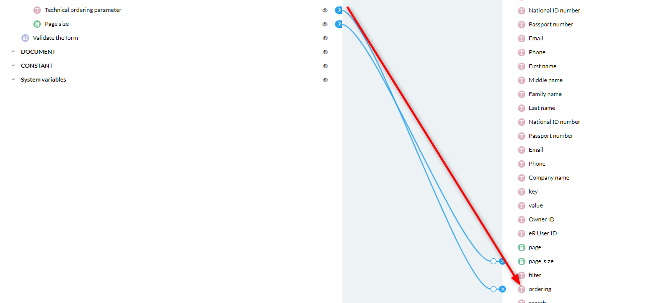
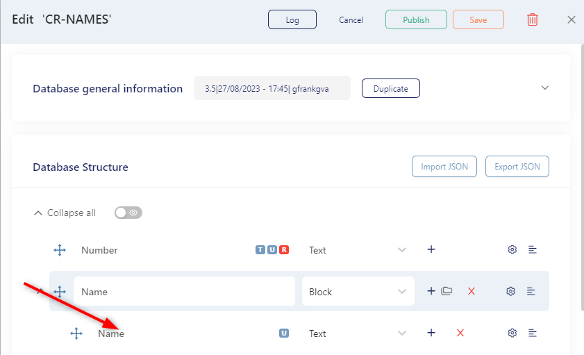
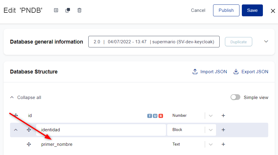
F. Roles#
A role is a necessary action by a public institution for a registration to be processed.
There are 2 types of roles
- Human role: a person will review the file, add some information (example: approval date, etc.), and approve, reject or send back the file. There are various types of human roles: example, review role and processing role.
- BOT role: an automatic processing role performed by a BOT in the system. A bot can be applied to a field or used in a role to exchange data between eRegistrations and an external database.
1. Create human roles #
Click on the Processing (Roles) tab on the side menu → click on “add” button in the search bar |
|
A slider will open |
|
‘Human role’ is selected by default. Activate “Is start role in process flow” if it is the first role in the registration |
|
Select Role Type → Activate “Visible for applicant” → enter name of the role → enter short name → create |
|
A role can be removed from a service by clicking on the cross button. The numerical 1 on the role indicates that this is the first role for the registration/service |
|
To edit a role, click on the name of the role or anywhere in the row |
|
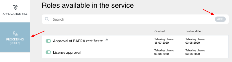
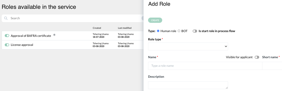

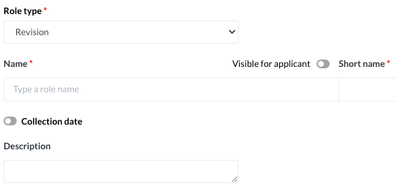
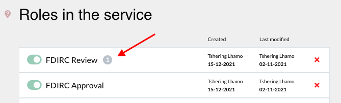
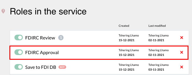
A human role is defined by 3 elements;
Description: name of the role, institution in charge of the role, and registrations linked to the role
Form: it describes the action that will take place in the context of the role, either human or BOT
Status: the status of the applicant file in relation to the role (0=pending, 1=passed successfully, 2=send back for correction, 3=rejected)
a. Description #
The Description tab opens when you click on a role available in the service. Name and short name of the role appears as created. However, you can also make changes to the names on this page. |
|
To add registrations linked to the role, click on “select registration(s)” → select from the list that drops down OR click on “select all” if all registrations are linked to the role |
|
To add the institution in charge, click on “+select or add new”. A list appears from which you can select from the registered institutions. |
|
If the institution is not found in the list, click on the “add” button |
|
A slider opens. Enter name of institutions → enter short name → enter URL → save |
|
A slider opens. Enter the name of the institution → enter the short name for the institution → enter URL → save |
|
The unit involved under the institution can be added. Click on “add new” under Involved Unit. |
|
There can be multiple units assigned to one institution. This feature is especially useful when, depending on the content of the form, different operators should be processing the file further. Rights to see files with a given institution/unit assigned can be granted to a user in CAS or Keycloak. |
|
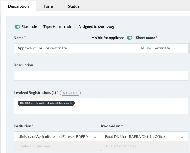
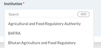
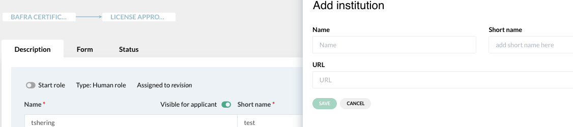
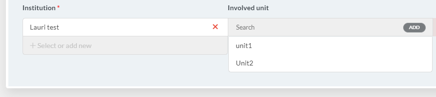
b. Form #
The form describes the action of the role.
In the Form tab, you can incorporate the action you want the operator to perform Example; to provide certificate number (This can be done by dragging Blocks and fields) Data from the fields in this section can be copied to the certificate by using the “copy value from” function under Data on the Edit slider |
|
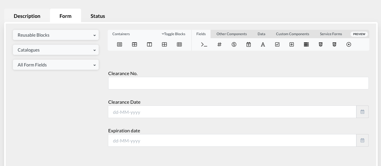
c. Status#
The “status” indicates the position of the user file in relation to a specific role
This functionality allows the analyst to:
- Define the flow of the applicant file in the processing part
- Send messages and alerts at various stages of processing
- Use for statistics
There are 4 basic statuses:
0 = Pending
1 = approved by the role / successfully passed the role
2 = sent back for correction
3 = rejected
The last 2 (send back and reject) are not authorized by default, they must be specifically authorized by the Analyst to allow the Operator to send back or reject an application.
Under statuses 1 and 2, the analyst must indicate under ‘destination role’ who will receive the file: the applicant or an operator in another role

To add a messages at various stages:
Click on the “add” button under Messages |
|
A slider opens. Click on the “add” button in the search bar to create a new message |
|
Enter name of the message → enter subject → write the content of the message |
|
The moustache template syntax can be used to write the content of the message. What it simply does is copy the values from the application file to the message |
|
To use the moustache template, activate the moustache button. List of fields in the application file will appear. Choose by clicking on whichever field is required in the message content → Save |
|
“Rejection-reasons” mustache can be used in email messages sent to the applicant, or to the alerts showing in my messages in the user dashboard, or both. File-rejected can be applied the same way, it will provide documents rejection reasons only. |
|
It is possible to put a clickable link in the message content window. This is useful when the user has to be redirected to some other webpage or service to perform an action. This feature is applicable to both messages and alerts sent by the system. |
|
Once the message is created, click on the “add button” again |
|
Then select the message that was created from the list |
|
→ Set Receiver (applicant or operator in another role) Under Delays, indicate how many times you want to send the message to the receiver → Add |
|
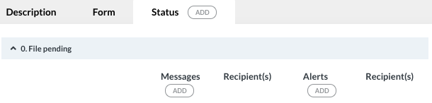
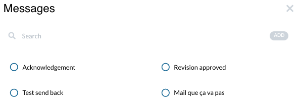
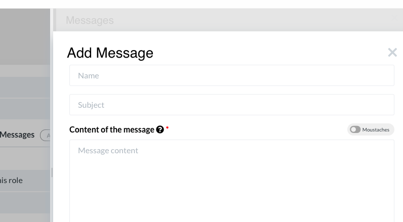
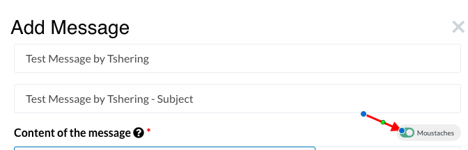
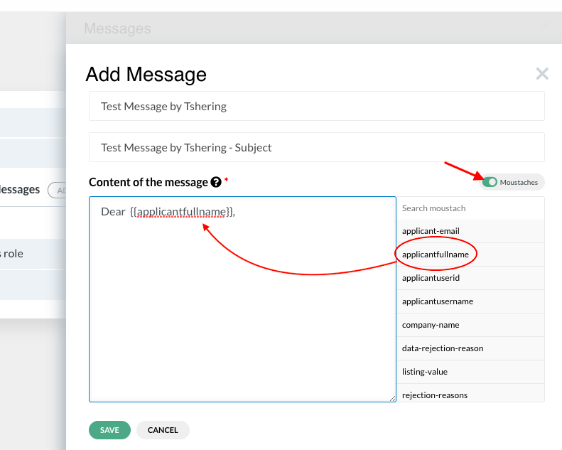
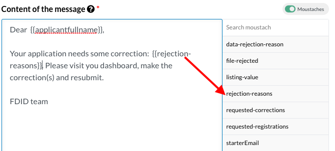
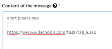
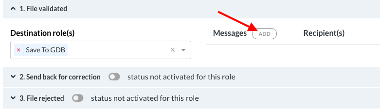
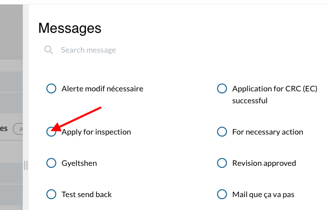
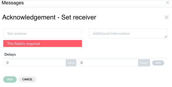
2. Create BOT roles #
Click on the Processing (Roles) tab on the side menu → click on “add” button in the search bar |
|
A slider will open |
|
‘Human role’ is selected by default. Click on ‘BOT role’. Activate “Is start role in process flow” if it is the first role in the registration. Enter Role name → enter short name → Create |
|
To activate the role, select the preceding role |
|
click on Status → click on ‘1. File validated’ → assign the Destination Role. This action will activate the next role. |
|
On the roles page, click on the BOT role that was created. |
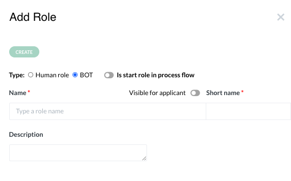
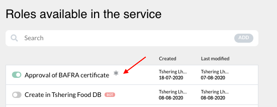
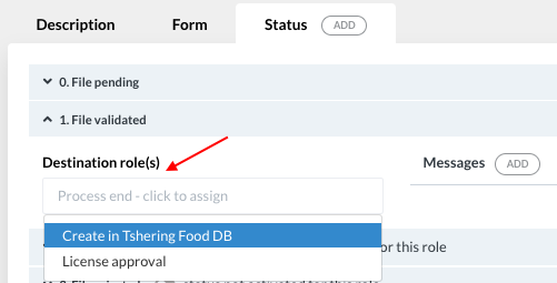
A BOT role is defined by 3 elements;
Description: name of the role, type of BOT, institution in charge of the role, and registrations linked to the role
BOT: it describes the BOT action that will take place in the context of the role
Status: Status of the applicant file in relation to the role (0=pending, 1=passed successfully, 2=send back for correction, 3=rejected)
a. Description #
The Description tab opens when you click on the BOT role available in the service. Activate “start Role” if it is the first role in the service. Select “Data BOT” under Type of BOT. Category tab will appear. Select the action you want the BOT to perform in the system under Category. |
|
To add registrations linked to the role, click on “select registration(s)” → select from the list that drops down OR click on “select all” to link all registrations involved in the role |
|
To add the institution in charge, click on “+select or add new”. A list appears from which you can select from the registered institutions. |
|
If the institution is not found in the list, click on the “add” button |
|
A slider opens. Enter name of institutions → enter short name → enter URL → save |
|
A slider opens. Enter the name of the institution → enter the short name for the institution → enter URL → save |
|
The unit involved under the institution can be added. Click on “add new” under Involved Unit. |
|
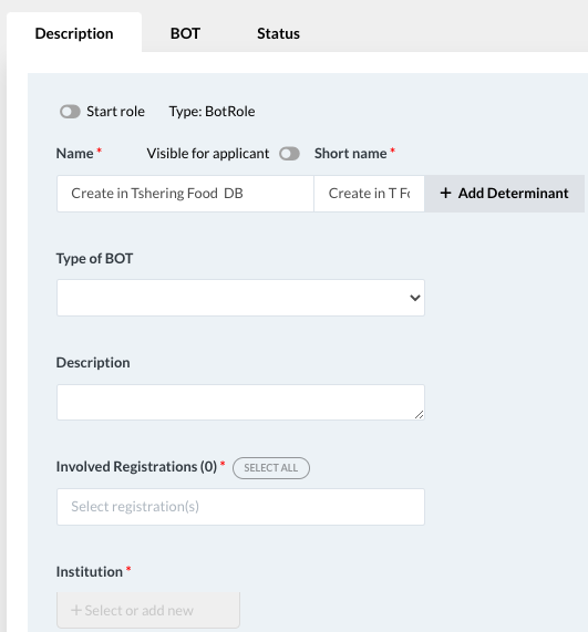
b. BOT#
Under the BOT tab, type of BOT and category will be prefilled from the Description tab. Under ‘Bots’, select the BOT created for the role |
|
Description and Mapping tabs will appear below Mapping enables the data flow to and from the eRegistrations database and the GDB |
|
To map the data between eRegistrations database and GDB, click on the dropdown bar and select the latest version of the API that should be used in this BOT. This action needs to be performed every time the database in GDB is updated. |
|
Once the API from GDB is selected, the link between the databases of the two systems is created |
|
The APIs used for BOTs are generated automatically in GDB, for each new version of the database. We recommend to delete the APIs corresponding to old versions of the database, which have no chance to be used. |
|
Go to Mapping to see how mapping is done |
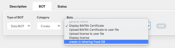
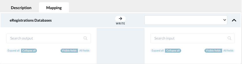


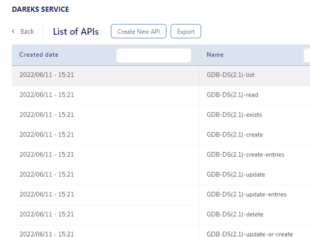
c. Status#
The functionality of the status under BOT role is the same as the status under the Human role However, the BOT will not have the right to reject an application |
|
The destination role has to be assigned under statuses 1 and 2 |
|
By activating status 2 by the Analyst, it allows the Operator to send an application back for correction. |
|
2.1 Polling BOT# | We are able to configure a BOT role so that the BOT is querying the database periodically for a set amount of time.If the data we are searching for will not appear within the set amount of time, the bot will fail. If it will appear before the time expires, the bot rolle will be successful and the file will be sent to the next role in the flow. The whole feature is explained in detail in this Tutorial. |
To set up the polling BOT add a role in the processing tab. Select type of role to be BOT. Selecting BOT type will reveal few fields including a toggle named by default“roles repeat until successful”. Please note the name is subjected to translation and may differ if translation was applied |
|
Switching the toggle on will reveal two sections in which time values can be specified |
|
In first section we can set how often the bot role is going to send a query to the database In the second section we can set how long the BOT should stay active before it fails. In this example the interval was set to one hour which means the bot will send a query to the database every hour for 24 hours (duration - one day) The duration was set to one day which means that if within one day the value we are querying for will not be saved in the database then the Bot role will fail. If the value will be saved in the database before the time expires, the Bot role will be successful and the application will continue the flow. |
|
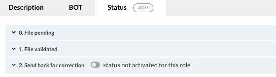
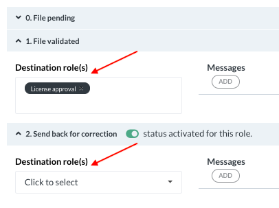
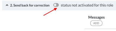
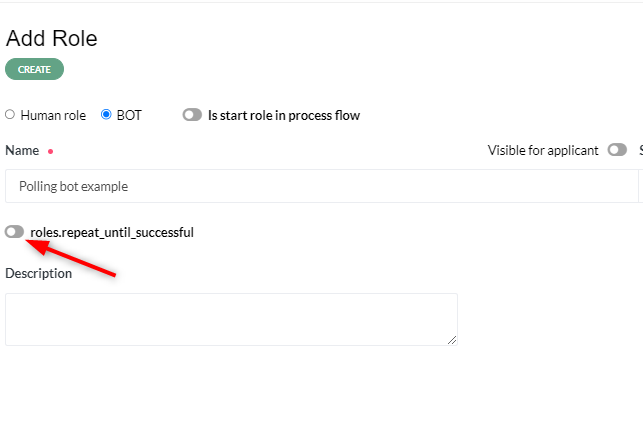
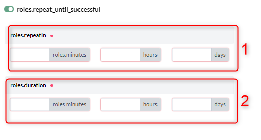
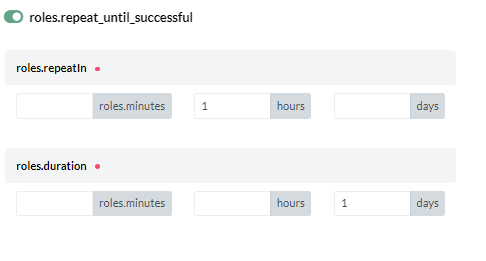
3. Description of various categories of human roles #
a. Revision role #
Revision role obliges the operator (in the processing page under DS) to verify and validate the documents and data before sending to the next role A revision role is usually the start role of a process |
|
At the bottom of the documents revision tab, the documents uploaded by the applicant will appear on the left side and data and requirements will appear on the right side This will allow the reviewer/ operator to verify the information from one page |
|
If the operator chooses “NO” under documents revision tab, a field appears where the operator has to choose the reason for rejection |
|
To add reasons for rejection, click on Tables on the side menu in the BPA → click on Instance Catalog → click on Document Rejection reasons → add the reason → click on the Add button → save |
|
The data revision tab displays all components of the applicant file viz Guide, Applicant Form, Payment and Send page |
|
To enable field-by-field verification, click on the service settings in BPA |
|
Under ‘Pages, buttons and fields’ tab, enable the ‘Revision by field’ toggle |
|
This enables validation of each field in Part B |
|
For instance, if the business name provided by the applicant is a restricted word, disable the ‘valid’ button and provide the reason in the text box that will appear |
|
The approval button under Processing tab will be activated only if the operator validates the documents and data |
|
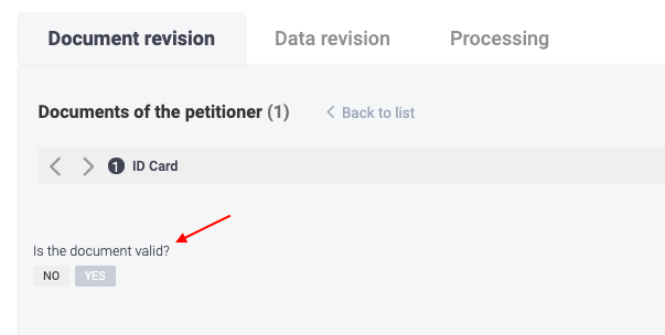
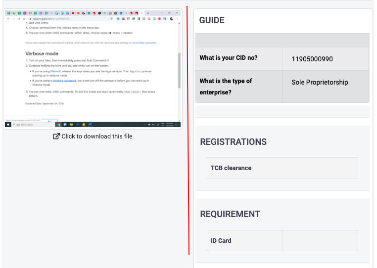
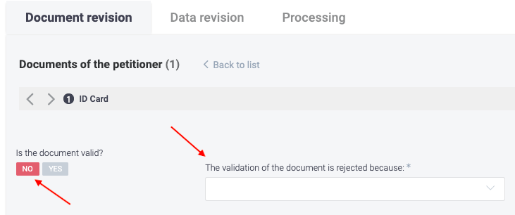
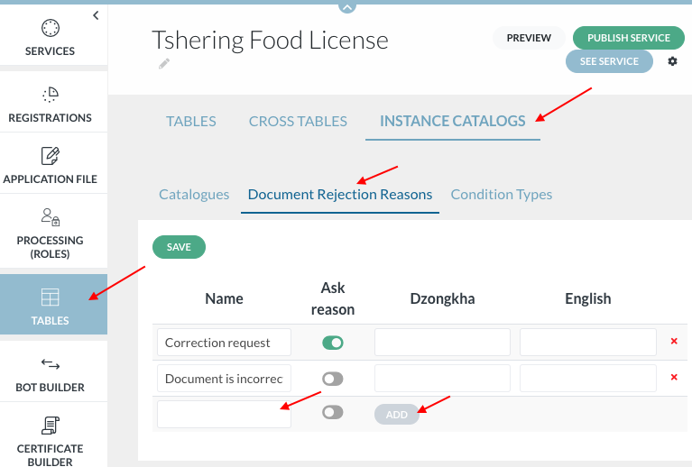
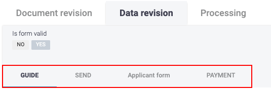
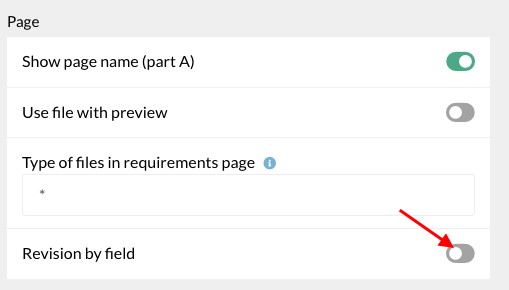
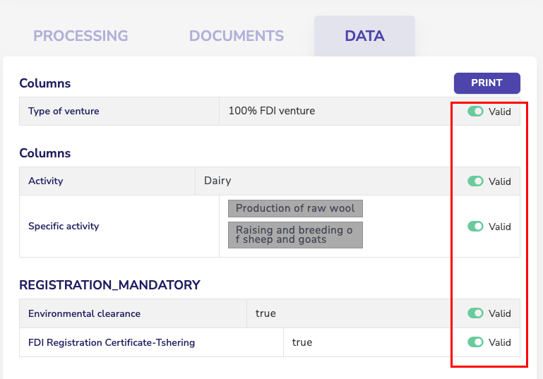
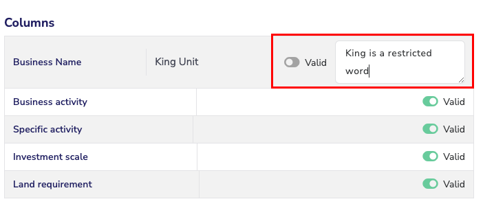
G. Certificates #
1. Build certificates#
- Templates/ certificates for electronic results can be built on the system in two ways
- through certificate builder that appears on the left hand side bar of user level 2
- through the registration.
- Creating certificate through certificate builder
Click on ‘Certificate’ on the side menu under user level 2 |
|
Click on ‘Add’ to add a new certificate template |
|
A slider will open. Add name of the certificate → Create |
|
The certificate will be added in the list of templates in the service |
|
To configure the certificate, click on the certificate name |
|
The form builder page will appear. Other certificates/ templates built for the service will appear on the top menu. The one highlighted with an underline is the certificate form builder that is currently open Click on the ‘cert.form’ tab to build the certificate |
|
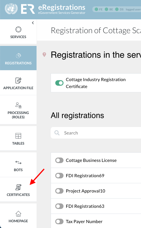
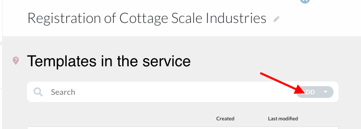
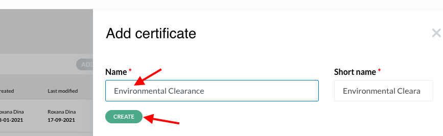
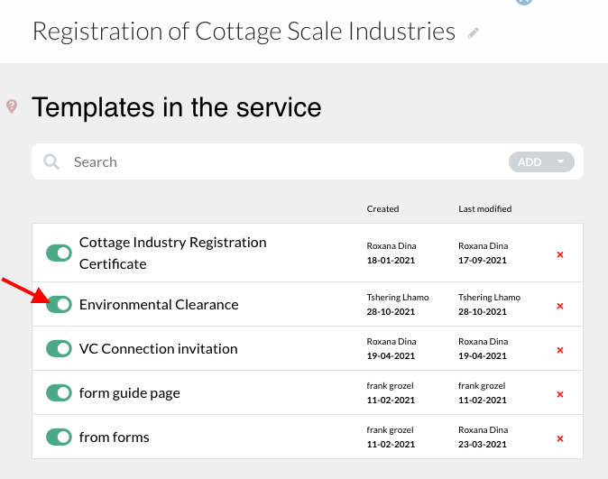
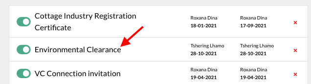
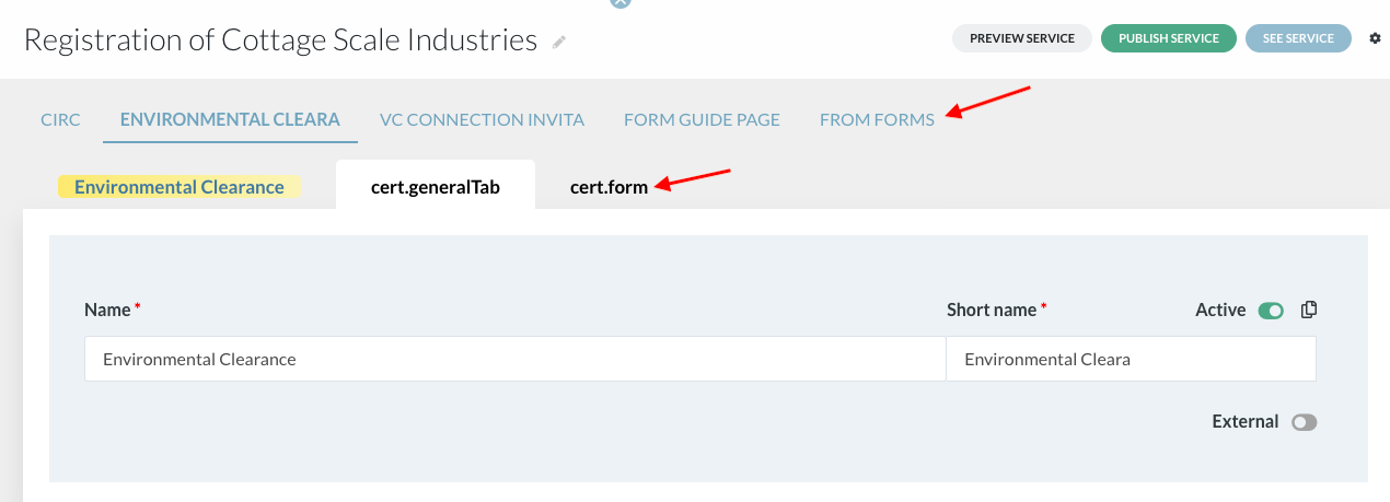
- Creating certificate through registration
Choose the registration |
|
Click on ‘Digital result’ represented by the green button |
|
A slider will open. Activate the digital result button. Scroll down and click on “create template” |
|
Add new template in the service |
|
Enter name of the result and click outside the field |
|
The certificate form can be built just like the application form. |
|
Value for text fields on the certificate template can be copied from the application file or processing role through → edit text field → data → copy value from |
|
Value of expiration date can be fixed from the ‘data’ tab |
|
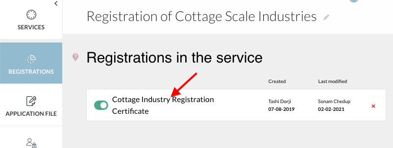
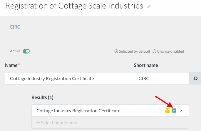
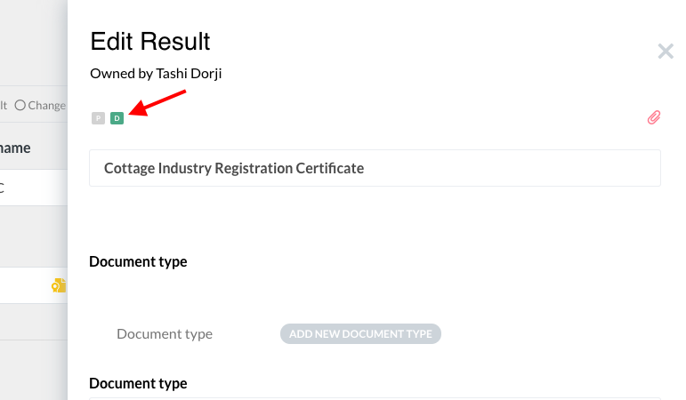
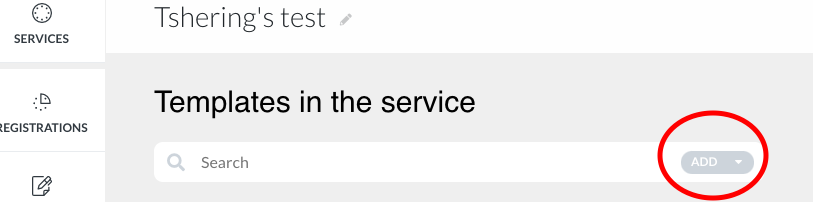

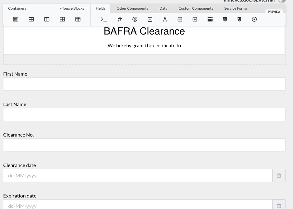
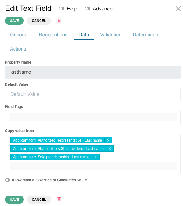
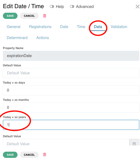
2. Add QR Code#
- The QR technology merges the physical world with the digital world
- Signatures and other authentications are replaced by QR codes. They manifest the legitimacy of a document. They contain all the information of the document.
To add QR code on a template, drag and drop the ‘QR code’ from the Customs Component tab on the template |
|
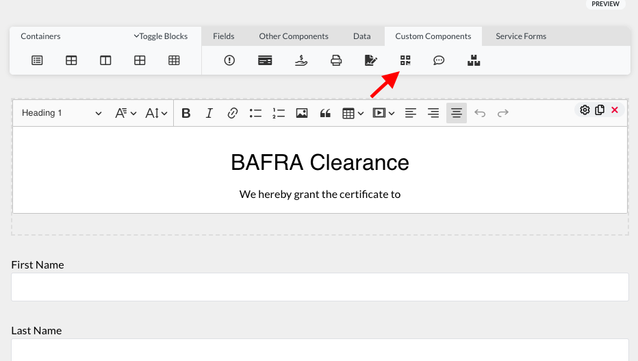
H. Tables #
Tables is a list of catalogs in the system |
|
There are three types of tables/catalogs:
Service catalogs (tables) and cross-tables show the data of elements related to only one service. Instance catalogs show the catalogs of elements that can be applied to all services in one instance. |
|
1. Tables/ Service catalogs#
Tables/ service catalogs: they group by nature all the elements created in the services (data fields, fees, documents, institutions, units, determinants, questions, etc.). |
|
The number within the brackets indicate the number of elements available to a service. For example, click on ‘Questions’ |
|
The questions registered in the service will be listed |
|
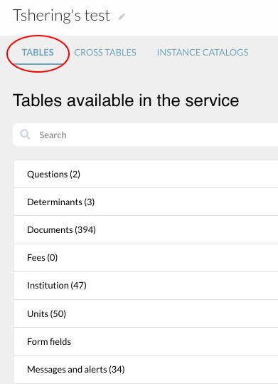
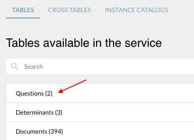
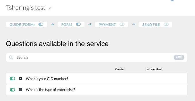
2. Cross-tables#
Cross-tables: it is a way to see the elements linked to each registration (data/registrations, documents/registrations, fees/registrations, roles/registration, etc.) |
|
For example, click on ‘fees’ |
|
It shows the fees applied to the registrations in that particular service |
|
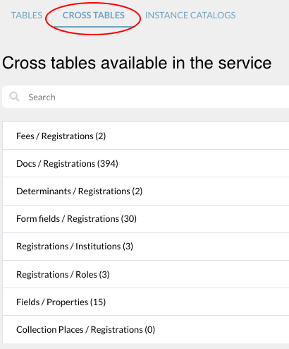
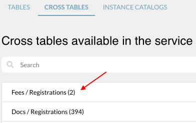

3. Instance catalogs. #
Catalogs that can be used by all services in one instance (Bhutan test = one instance), such as list of countries, list of cities in the country, type of companies in the country, list of economic activities according to the country official classification, etc.
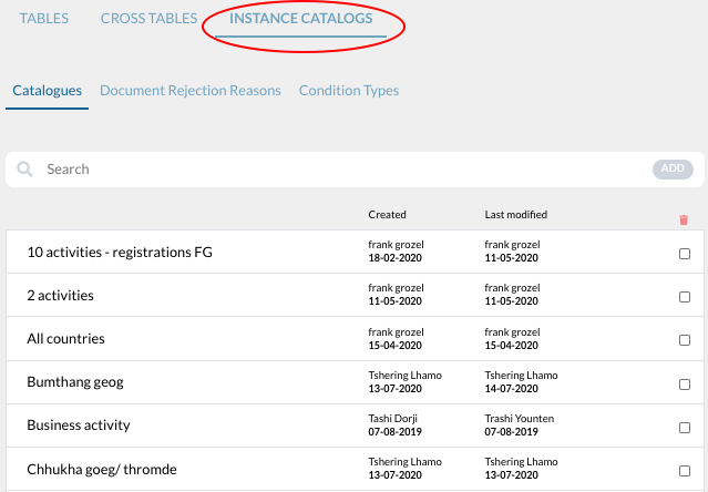
a)How to create a catalog#
To create an instance catalog, click on the “add” button on the search bar |
|
Type in the name of the catalog and click on “create” | |
List the items in the catalog by adding new values. To add a new value, type in the name of the item and click on ‘Add’ Up to 500 characters are supported by the value field/item |
|
To create a catalog with Sub catalogs click on the select button next to the catalog item and select a catalog that will be a sub catalog of this item. |
|
To create GDb based catalg drag and drop a catalog field onto the form, open this field edit modal and go to the data tab. | |
In system source select GDB Next select the database based on which you want to create the catalog values. Next select two GDB columns . Frist which will be the value of your catalog item and second, which will be the key. |
|
You can also select a catalog field in GDB (instead of two separate columns). In this case you will refer to the same field in both cases. You will just have to select the field property value when assigning catalog value and key when assigning the key. |
|
In case we are creating GDB based catalog, the values are not being read to BPA, so you can't select a default value for example if the catalog is created this way. But they will be visible in DS after the service is published. | |
b) How to import a catalog with subcatalogs and/or multiple translations# | |
To create an instance catalog, click on the “add” button on the search bar |
|
Type in the name of the catalog and click on “create” | |
Click upload catalog button and |
|
Upload items modal will appear. In here you can download a template for every type of import available (1), modify the template, save it as xls file and import the modified file (2) |
|
How to prepare a file to import | |
This is the structure of exemplary file to be imported |
|
Structure explanation: | First column is the value that is going to be imported to the catalog. Second column is the level to which the value belongs to. On the screen shot we see only level 1 which will be the main catalog values and level 2 which will be subcatalog values for main value “Damascus” and “Damascus Countryside” Third column is the name of the parent catalog. It is important to provide it for every value that is not level one value. It has to be the same as one of the 1 level values. Fourth column is the English translation. Fifth and sixth columns are empty in this example, because in the instance that I am importing to, there are two more languages active between English and Arabic, for which I don't have translations ready. Last column is the arabic translation |
Groups #Groups are created in catalogs when there are many items in the catalog. Groups are created to segregate items in the catalog under different categories |
|
To create a group, type the name of the group and click on the “add” button |
|
The items in the list can be selected under which group they fall using the toggle button. The example in the picture is the list of business activities that require clearances from different agencies grouped together Groups formed can be used as determinants |
|
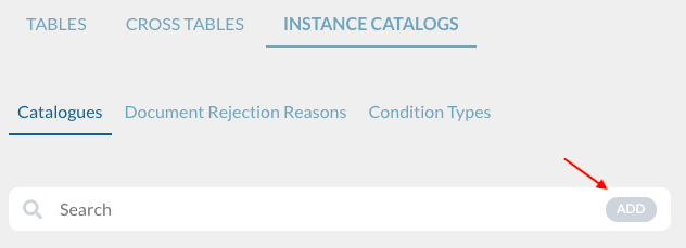
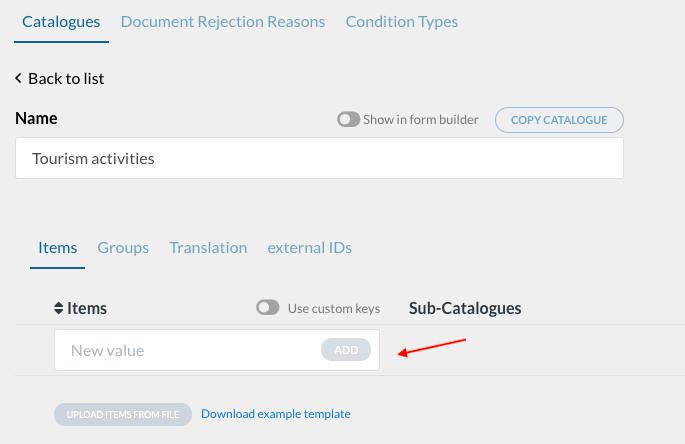

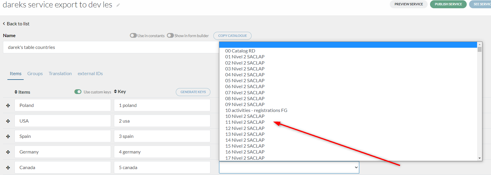
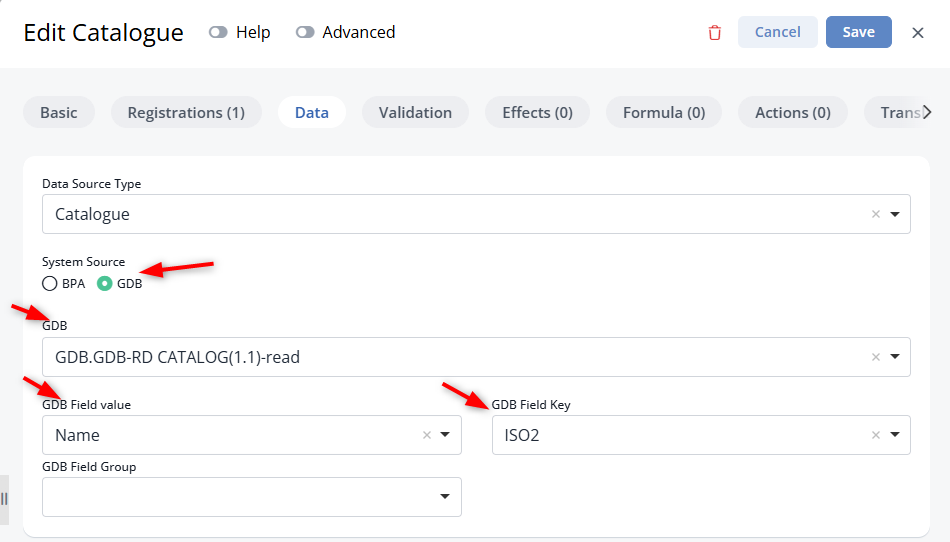
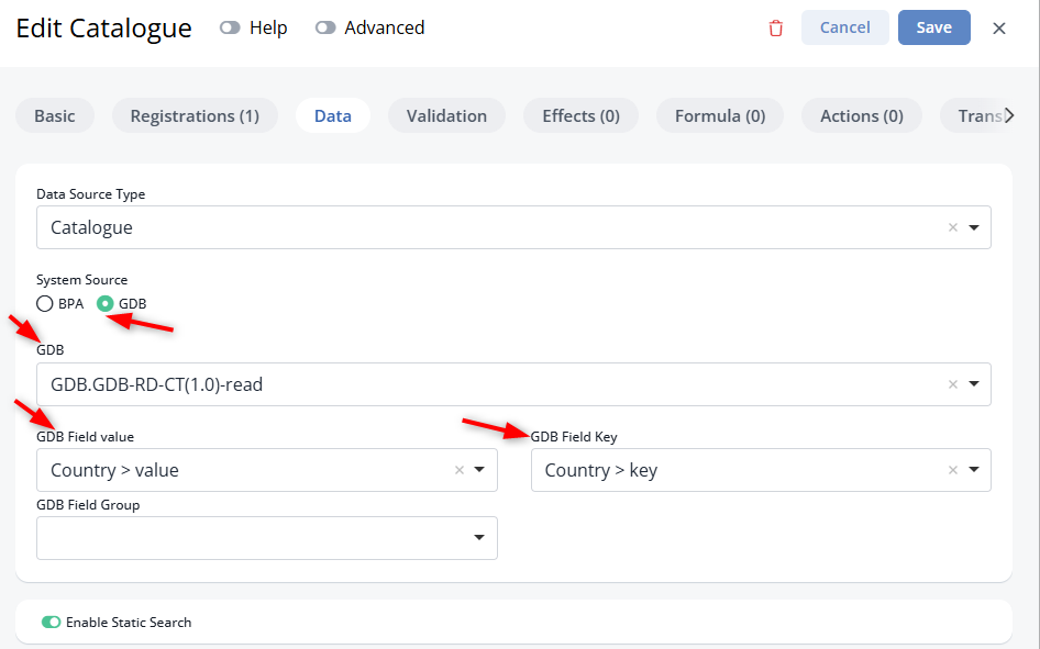
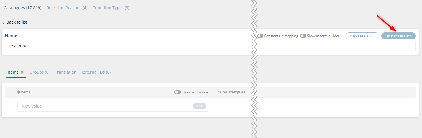
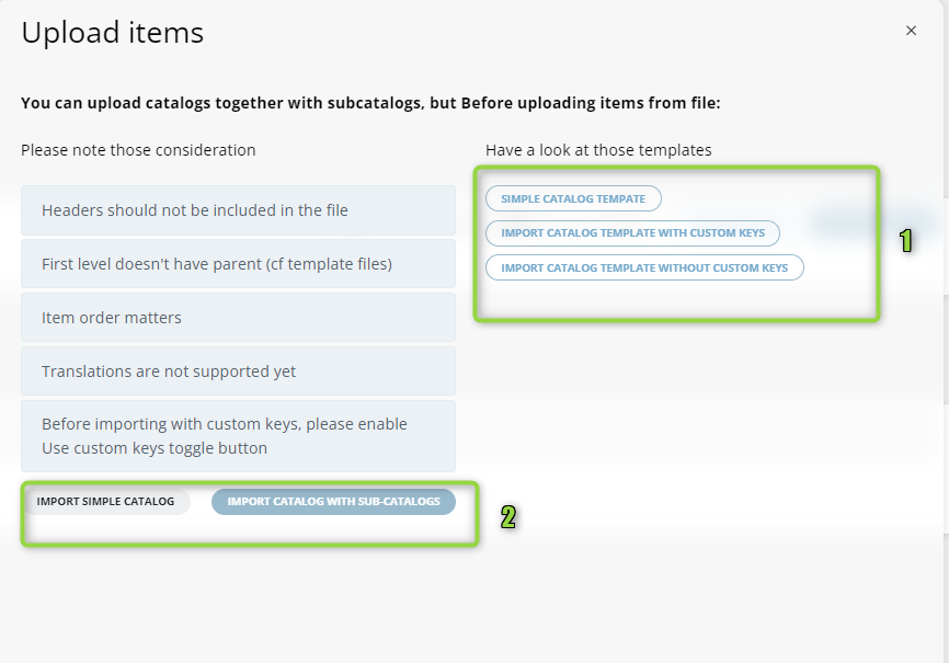
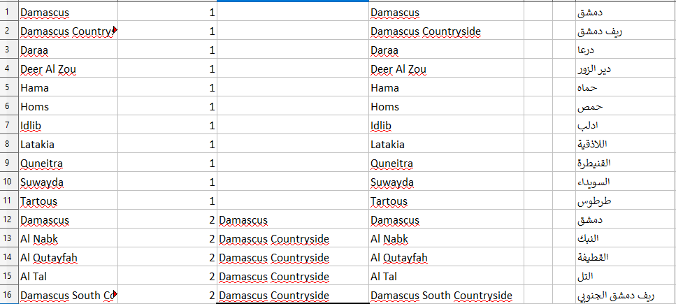
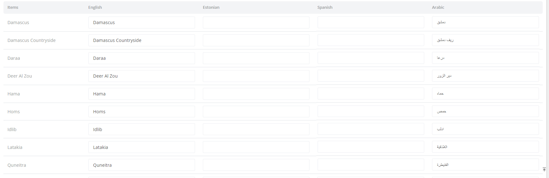
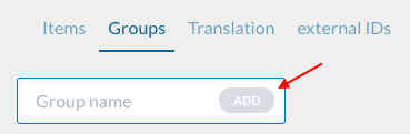
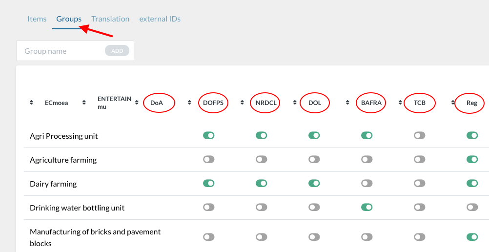
c)Document rejection reasons#
This functionality allows the analyst to create/ add all the reasons for rejection of documents in the operators' processing page, in the revision role. The reasons can be applied to all services in that particular instance.
To add reasons for rejection of documents, click on ‘Document Rejection reasons’ tab → add the reason → click on the ‘Add’ button → Save |
|
I. Settings#
1. Instance settings#
Settings made in the instance settings will be applied to all the services in that instance.
The instance settings icon is placed at the end of the instance menu bar |
|
The instance settings consist of three elements viz Settings, Translations and the Log out tab |
|
This page also provides information such as external instances where services can be published, |
|
Options in display system: From the list under options in display system, you can choose which component to show in the user dashboard in DS. The following are the display properties;
|
|
| |
|

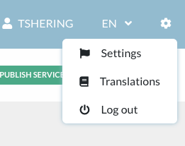
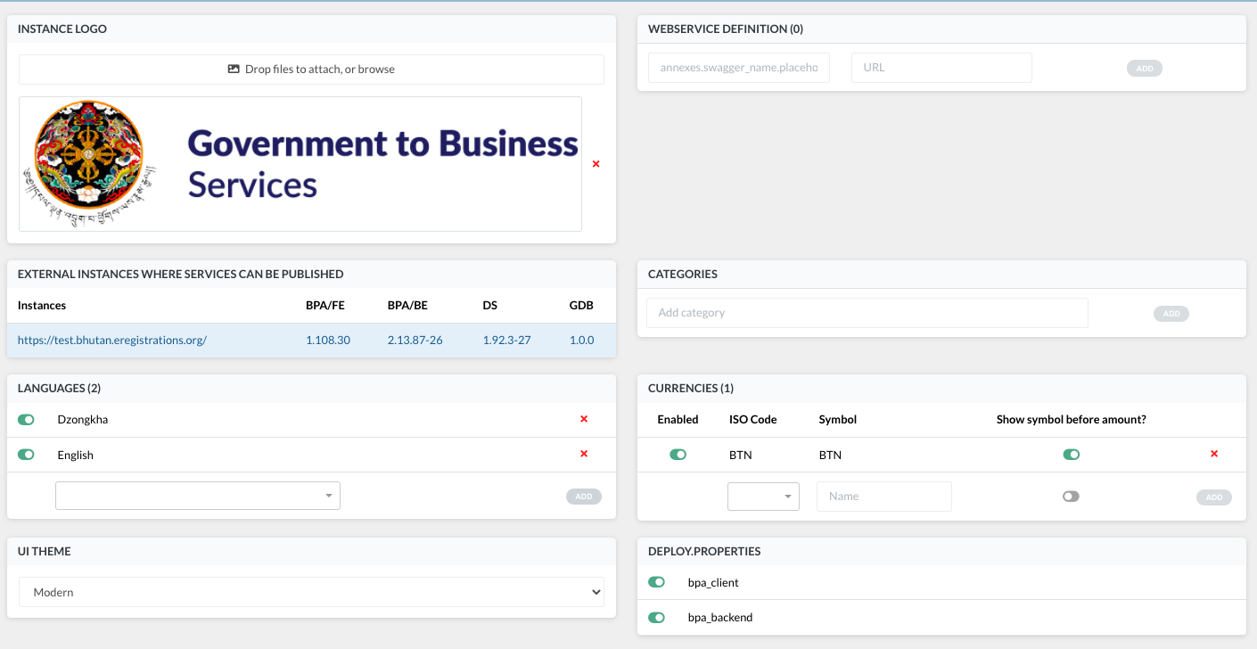
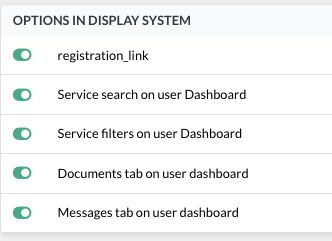
2. Service settings #
The setting made in the service settings will be applied only to that particular service.
The service settings icon is placed at the end of the service menu bar |
|
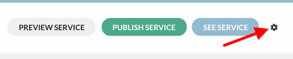
a) Pages , buttons and fields: # |
|
Blocks and fields: Option to make blocks/fields visible in Part A and Part B based on their linkage to a registration |
|
Buttons: Options to show print buttons on Guide and Part B, and enabling use of BPA system buttons in Part B |
|
Page: Options to show page name, use file in preview, setting the file type for required documents, to enable revision by field in Part B, To show data next to document revision and to show decimals for costs. Under ‘Type of files in requirements page’, you can restrict the user to upload only PDF documents. The format for entering multiple allowed file type is ".pdf .jpg .docx" |
|
Application history: |
|
Old guide: |
|
Shopping cart: |
|
Formio version: To switch the service to the new formio version, make sure that the same version is selected for both Part A and Part B Note: Formio version transformation may break the service. Make sure the service is well tested before publishing it to live. |
|
UI theme: |
|
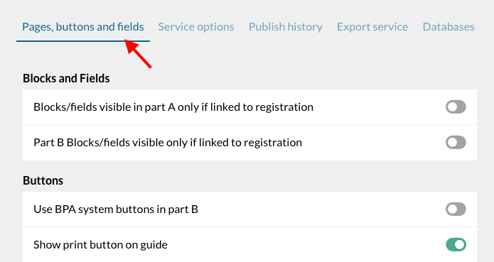
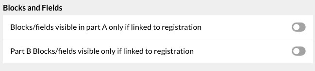
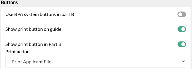
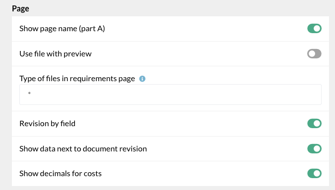

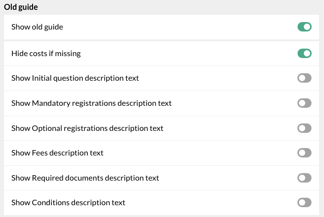

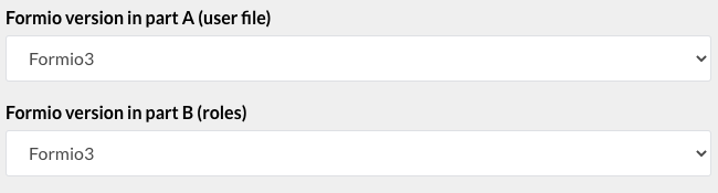

b) Service Options # |
|

c) Publish history# |
|

d) Export service# |
|

e) Databases# |
|

II. The user site#
The user site or the Display System is the user dashboard.
A. The user dashboard #
1. For new users#
This is the header and menu bar of the display system

It consists of





The home page displays all the available online services
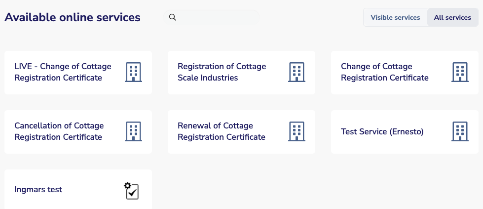
2. For logged in users #
This is the menu bar

It consists of
| The home button and My Account page |
| Name of the user |
| Choice of language |

The Home button or My Account page displays the list of applications saved/submitted by the user under the My Applications tab.
My Documents tab shows the list of documents submitted.
My Messages tab shows all the messages received by the user from the administrations/ processing roles.
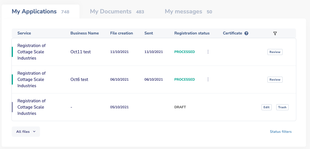
Under My Applications, the columns show, in order, the following details;
The name of the service |
|
Business name |
|
The date the application was started |
|
The date that the application/file was submitted |
|
The status of the file in the registration |
|
Certificate Certificates can be printed directly from the user dashboard by clicking on the certificate icon. Issued certificates can be seen in this column. The column can also facilitate multiple certificates. |
|
Filter This allows you to search for a specific application from the list by the name of the service of business name |
|







To see the application history of a file, click on any one of the services in the table |
|
The various stages of the application history will be displayed Below that, the documents that were submitted will be available along with all the data that were provided and certificates generated |
|
The application status is shown by different colors. |
|
Click on ‘Status filters’ at the bottom of the table to filter files by status under ‘My applications’ |
|
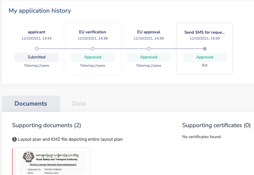
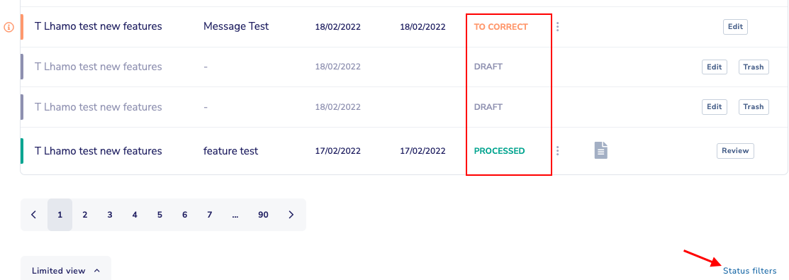

Below the list of files, the home page displays all the available online services
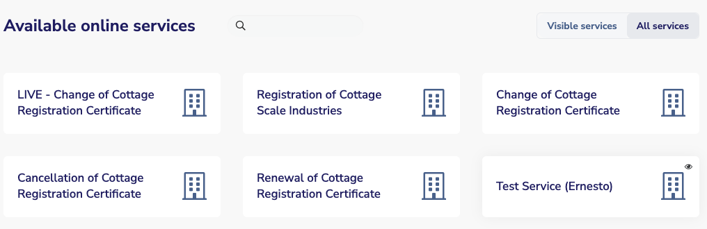
B. Application file (guide, applicant form, pay, send page)#
1. Guide#Answers provided in the Guide will help determine, for each specific user, which documents, fees and data are required. |
|
Shopping cart Alternative to the Guide, Shopping cart, an improved version is used. The shopping cart shows the summary of your registrations,, how much to pay and what documents to upload. It is accessible on all pages. |
|
2 .Applicant form#This is where the applicant provides all the relevant data that pertains to his objective. |
|
3. Documents#This is the documents upload page. This tab will appear only if documents need to be uploaded. |
|
4. Payment #Payment tab will appear only if there is a payment in the process. |
|
5. Send page#The confirmation page usually consists of a set of terms and conditions that the applicant needs to abide by. |
|
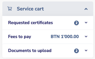


C. Operators processing pages (processing roles)#
Processing pages are what operators of the institutions which offer registrations in a service see.
- As a super administrator, you can access the operators’ processing pages for all services from the display system (through Part B) and you can see all roles.
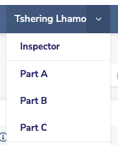
1. The file list page#
The list of files filtered by status (pending, approved, rejected, sent back for corrections) is displayed |
|
The drop down list in the menu bar at the top displays all the services in the system. |
|
To process a file, select the service from the drop down list |
|
Once the service is selected, the list of roles pertaining to the service can be selected from the first drop down list in the menu bar. The number indicates the number of roles in that service including the BOT roles |
|
The calendar icon below the services drop down allows the operator to view the applications submitted at a certain day/ time range |
|
The first screen of the operator’s role displays (by default) all pending files. |
|
The sub menu consists of Status of the file, Business name, Date of receipt, the status of registrations and the operator in charge. |
|
There is a status filter on the bottom corner of the window. The different colors indicate the different status of the file in each registration. |
|
All files under various status in the processing role can be viewed by selecting the status by clicking on the drop down. Other statuses/filters include all files, validated files, files that are sent back for correction and rejected files. |
|
When an application is received, the file will be listed under “pending” status. Click on the file to process the application. This will take you to the 2nd screen of the operator’s role. This will also add your name and surname to operator in charge column |
|
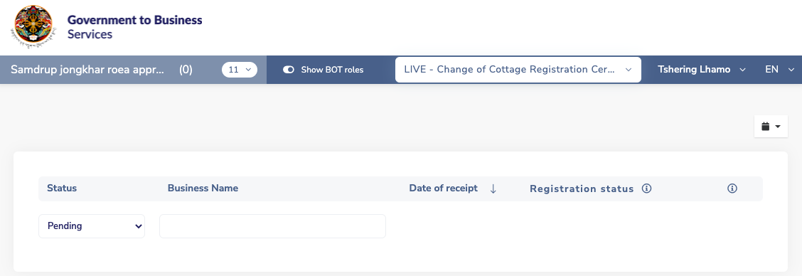
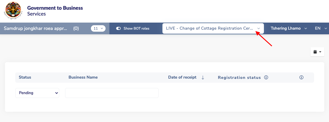
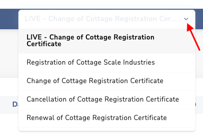

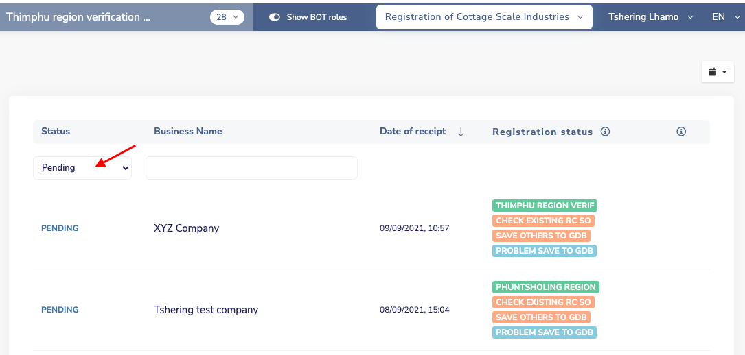
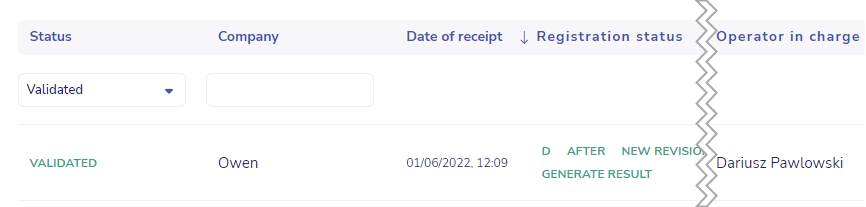

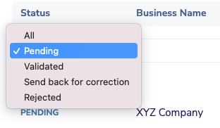

2. The processing page#
A processing page is the 2nd screen of the operator’s role. This is where the operator is able to see the file (data and documents) and to review and process it (i.e input some data and approve, reject or send back for corrections).
The top part of the processing page displays the application details and the application history
The application details has a zip folder that contains all the documents submitted with the application |
|
Application history displays the dates and details of all the roles applied to that file |
|

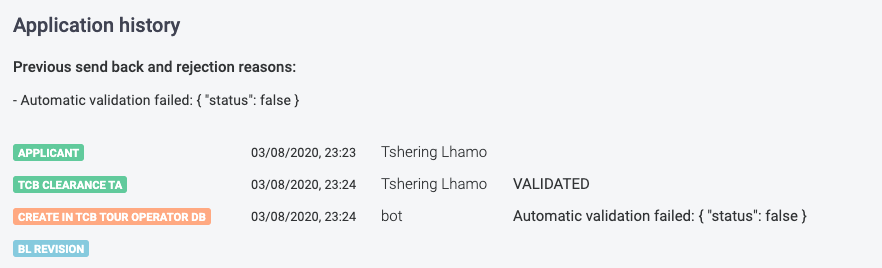
There are two types of operators’ role;
- Revision role
- Processing role
a) Revision role #
A revision role is usually the start role of a process This role requires the operator to verify the documents and data before validating and sending to the next role |
|
If the operator chooses “NO” under documents revision, a field appears where the operator has to choose the reason for rejection |
|
To add reasons for rejection in the list, click on Tables on the side menu in the BPA → click on Instance catalog → click on Document Rejection reasons → add the reason → click on the Add button → Save |
|
Under the documents revision tab, the documents uploaded by the applicant will appear on the left side and data and requirements will appear on the right side This will allow the reviewer/ operator to verify the information from one page |
|
The data revision tab displays all components of the applicant file viz guide, form, payment and send |
|
The approval button under Processing tab will be activated only if the operator validates the documents and data. If the operator has not validated the documents or data, the approval button will be inactive but the ‘send back for correction’ and ‘reject’ button will be activated. |
|
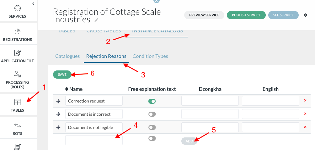
b) Processing role#
Processing tab is the form (action) developed by the analyst under Processing Roles of the BPA. |
|
Depending on the input decided by the analyst in BPA (data, documents), the operator can generate the action (i.e display and/or upload certificate to the user file) |
|
This is also where the operator validates, rejects or sends back the application for correction. To enable the operator to reject or send back for correction, the analyst in the BPA has to authorize those actions (in “status” under roles) |
|
Documents tab shows the list of documents uploaded by the applicant and certificates obtained |
|
Data tab shows all the components of the BPA application file (guide, applicant form, payment and send tabs) and results of preceding roles |
|
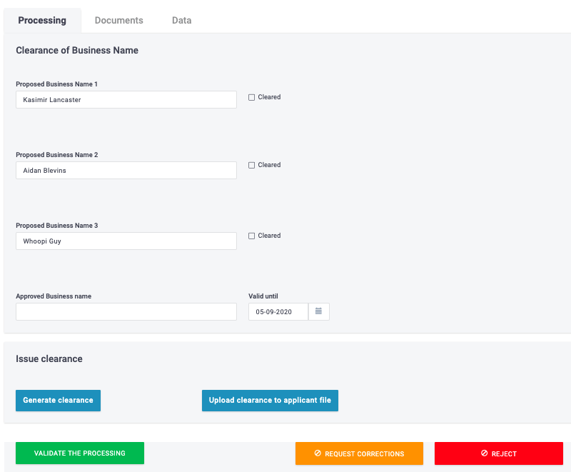

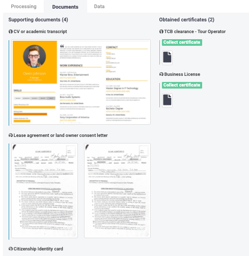
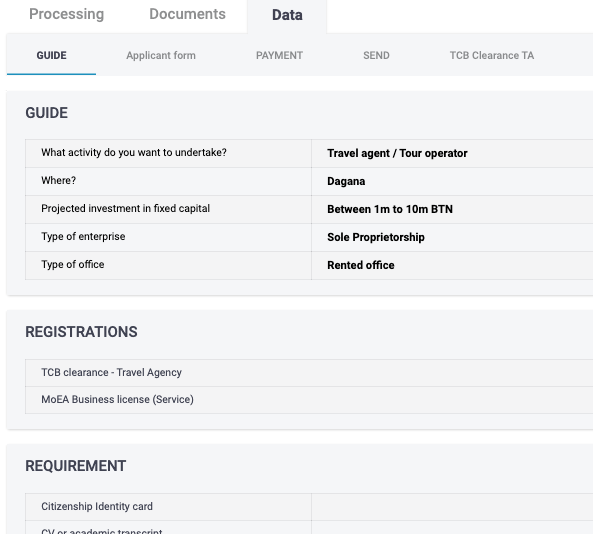
Clearing old file from the service#
- To clear
III. Generic Database System #
( GDB, https://gdbs.test.bhutan.eregistrations.org/)
GDB is a system to create and administer a professional database easily, without programming.
In addition, databases created with GDB can exchange data electronically with eRegistrations (without programming) and any other external system/database, through Web services.
GDB is composed of a public part (where we see the databases created and their content) and an admin part to create or modify the structure of the databases
A. Public part #
This is the public page of the GDB site. By default, the first database in the list is displayed on the screen. It also displays certain features of the admin part which are visible only to authorized users.
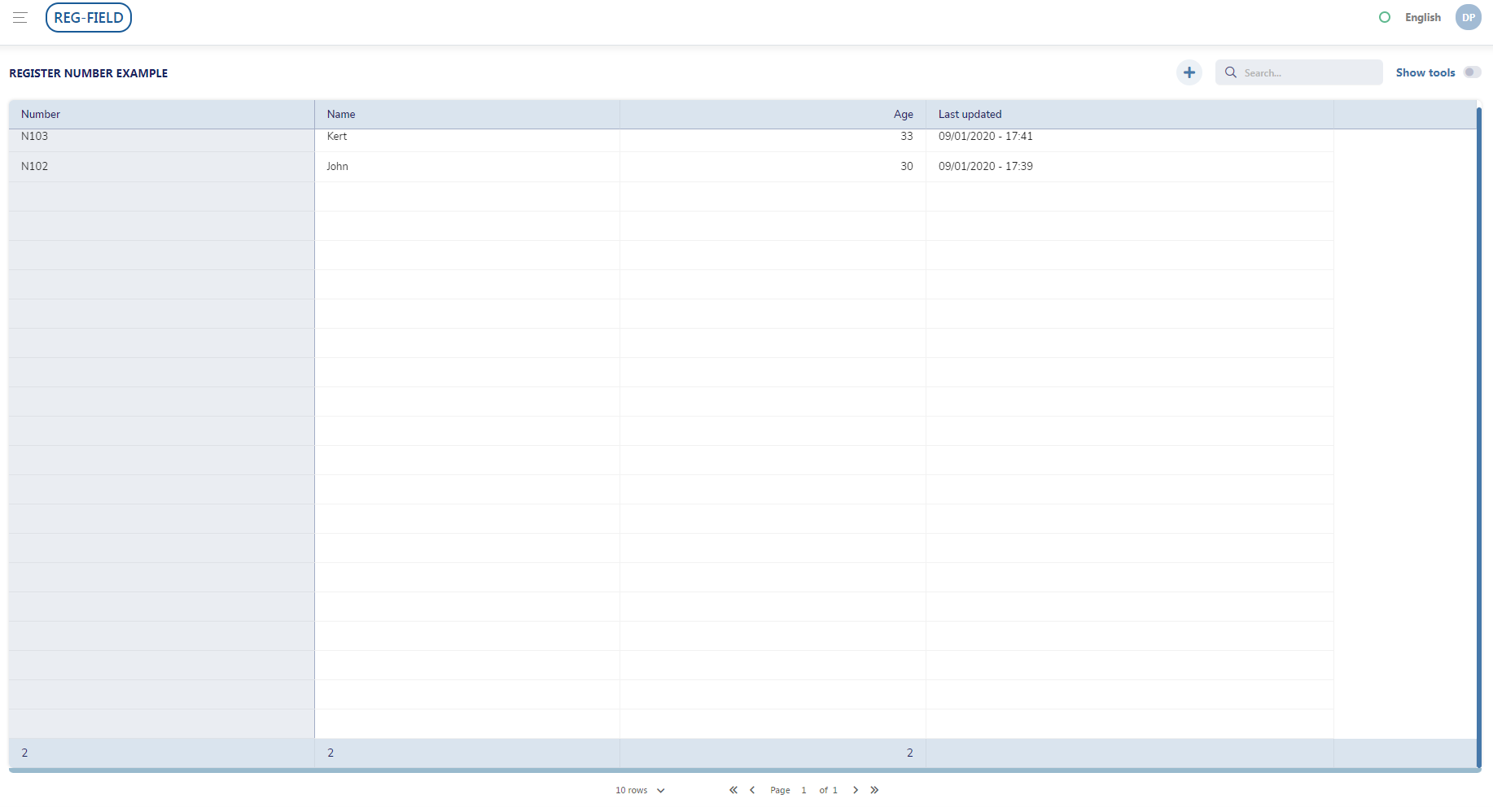
This is the header bar

It consists of:
| A hamburger button. It displays the list of database created in the system and the “create new database”, “create new group” buttons |
| Name of database which is currently displayed |
| Status button. When you hover the mouse over it, the version of the system and the date last updated will be shown |
| Language |
| Logged in user |



The sub menu displays the name of the database. The ‘add record’ button will not be visible if you are not an authorized user.

The edit and delete icons will also not be visible to unauthorized users
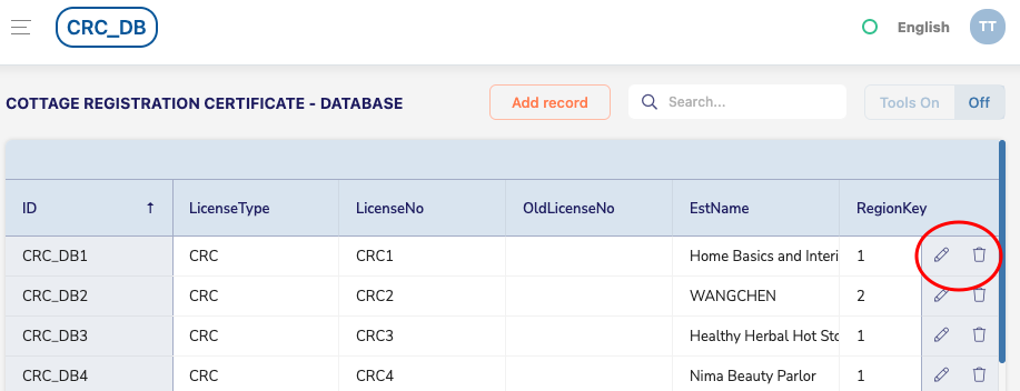
B. Admin part #
The admin part is the part of the database system that an authorized person has access to. He can create, change the structure of the database or delete a database depending on the rights administered to him.
1. Create a database#
To create a database, click on the hamburger button on the top left |
|
Then click on the “create new database” button |
|
Enter institution name under Title → enter short name Short name should be entered without spaces Since this is a new database, the version will start at 1.0 |
|
Create the database (DB) structure adding fields and blocks by clicking on the “+” symbol (“ID” appears by default as the first field. You can change it by typing over it) |
|
Click on the drop down to select the type of field input (text, number, block, date, catalog, etc.) Note: the type of field should be same as the one used in BPA for that data |
|
Use blocks to group the records/ fields together under the same component |
|
This is where blocks appear in the public part |
|
Click on the “simple view” button to view only the basic components of the DB structure |
|
The symbol in the front is used to change the order of data in the database. Simply click and drag fields to desired order |
|
Publish to save the database and see the changes in the public part |
|
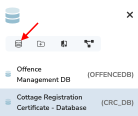
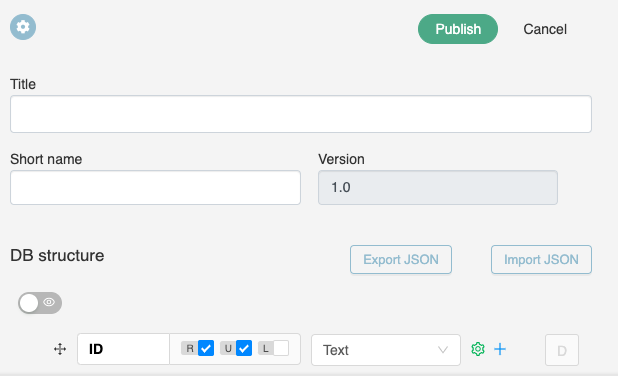
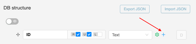
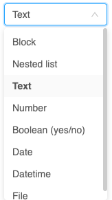
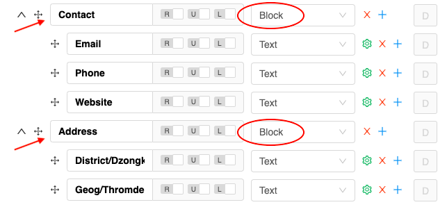
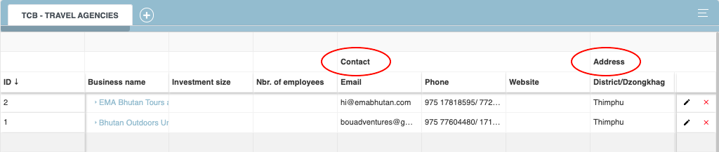
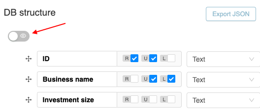

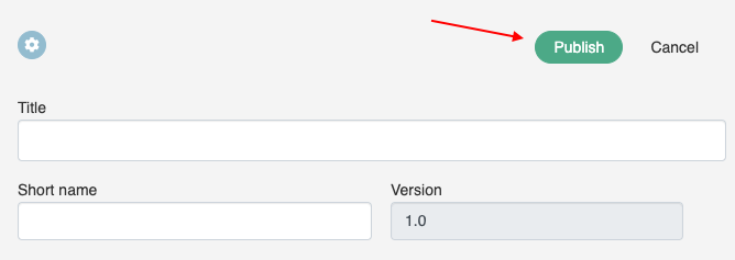
2. Create new database group#
To create a database group, click on the hamburger button on the top left |
|
Then click on the “create new group” button |
|
Enter a new group name under Name. You can also upload a logo for the new group. To do that, click the upload button and select an image of your choosing. Click the “save” button to finish creating a new group. |
|
To populate new group with databases you can:
| Video tutorials |
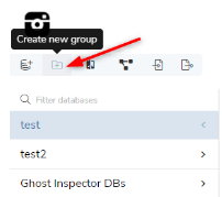
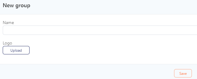
a) Edit Group#
b) Database diagram#
Database diagram is a visualization of how different databases within the same group relate to each other.
Video tutorial - How to access database diagram
To open Database diagram click on a group name and then on a diagram icon in left side menu |
|
All databases in the group are visualized as blocks and the relationship between them is shown by lines connecting certain values common to them |
|
You can zoom in and out of the current view by using Mouse scroll. You can also rearrange the database blocks with simple drag and drop. There are two icons in the right bottom corner of the screen. They help navigate through the view. The top one rearranges the database block layout to rows and columns for clearer view. The bottom one aligns the block layout to the left top corner of the screen. |
|
You can also modify the view of any particular database by expanding or collapsing its content. When collapsed it will only show Block titles When expanded it will show all fields in the database |
|
For easier visual distinction of type of containers used in the database, bloc titles are black and list titles are blue |
|
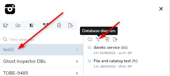
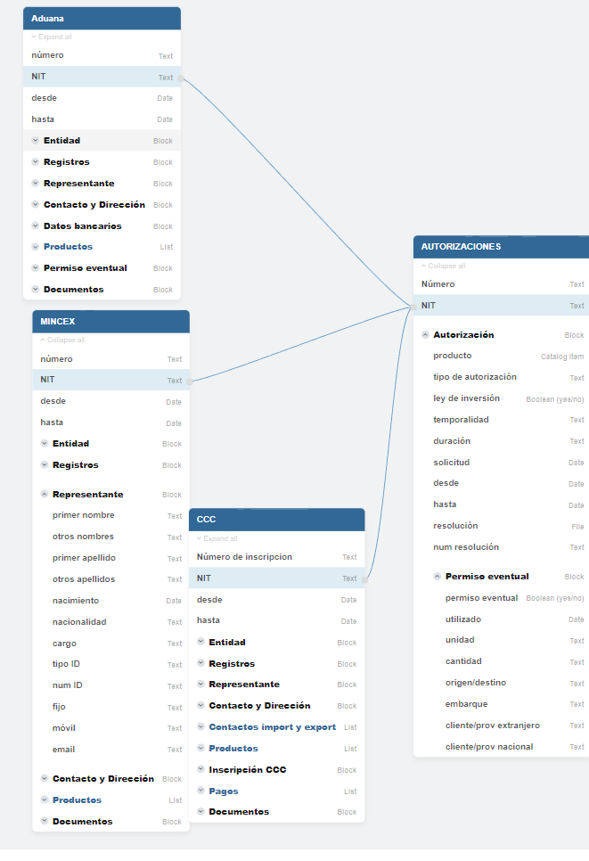
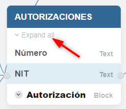
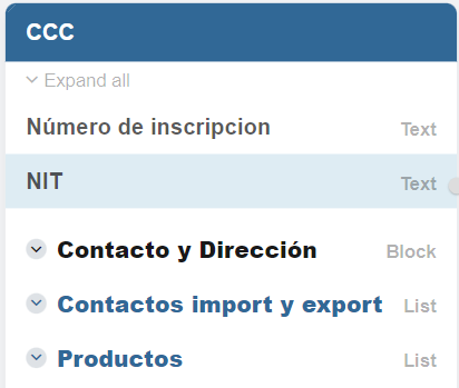
c) Creating a link between databases.#
There might be a need for some data to be saved in different databases. For example few institutions are required to store a citizen ID number within their own database. For this purpose we can link the values between databases to indicate that a value is common, and we can use it later for getting different information from all databases linked to that common value.
Video tutorial - How to establish a link between two database (query for common values
To link a field between databases, click DB structure button in the database you want to link from |
|
Click on the “Settings” button for a field you want to link |
|
In Field settings/Basic settings 1.switch the toggle “Link to other DBs” on. 2. Select the database that you want to establish link with 3. Select the field in the database that will be linked and click OK |
|
“L” icon will appear in the field row indicating that this field is linked with another database. You can also see the link was established If you open the database diagram. All databases on the picture to the right were linked by the NIT field. |
|
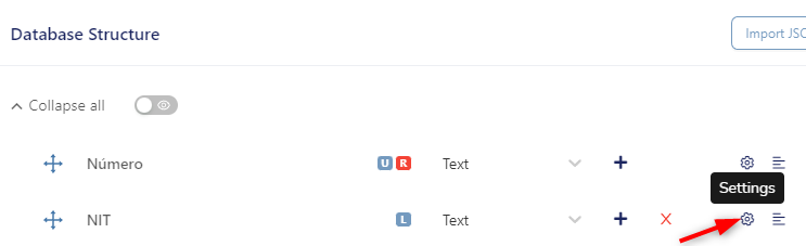


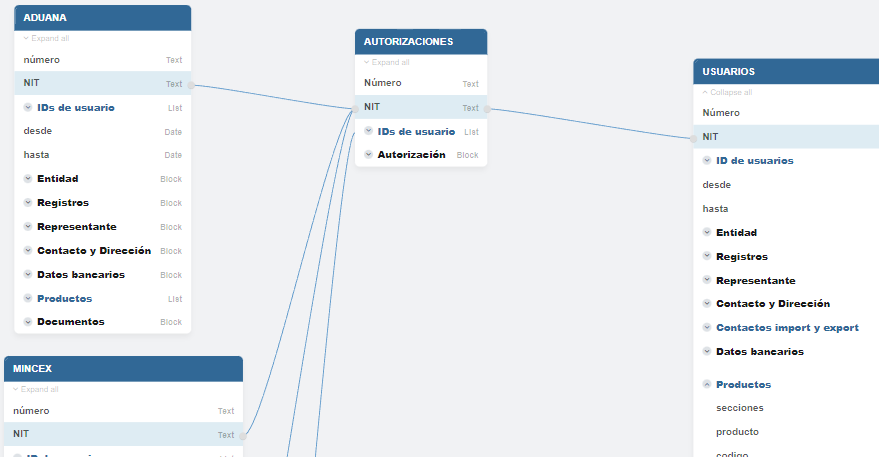
3. Add record (data) in the database#
Video tutorial: Some useful keyboard shortcuts used in GDB
To add a record in the database, click on the ‘Add record’ button on the sub menu |
|
A slider will open. Enter all data → Save |
|
The slider page can be expanded or minimized by clicking on the border and dragging it |
|
A record can be edited or deleted |
|

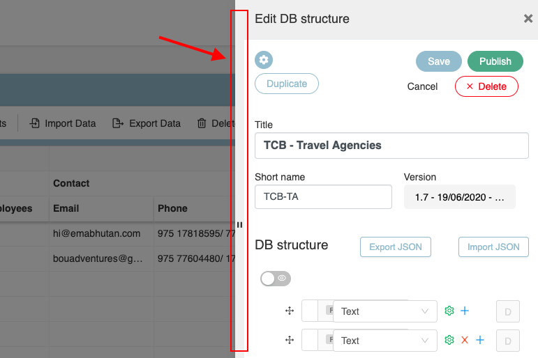
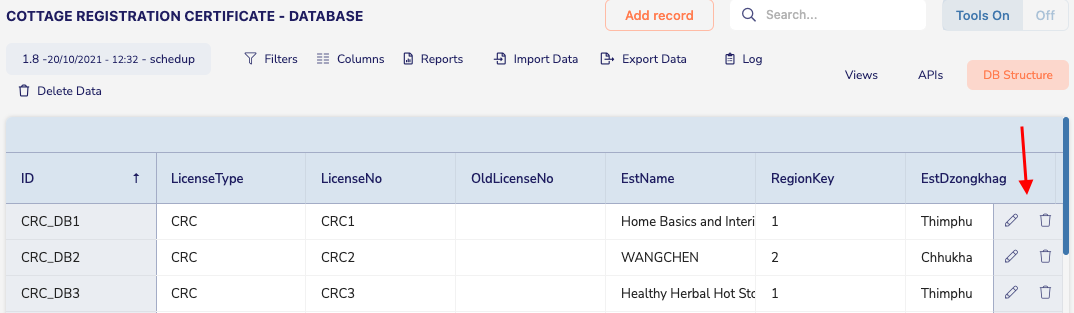
a) Field history #
If you need to check what was happening to a particular value stored in GDB it is now possible. After you click on a record to see the details you will see a history icon next to every field in the database |
|
Clicking the field history icon will open a new window with field history In respective columns we can see information about :
|
|
You can also see the same history icon next to block container if the container has a nested field or fields with modification |
|
When opening the container drawer you will be presented with a times table in which you can trace the value change for every field in this container by date of the change occurrence. If a change occurred on a given date the field will have a clock icon which the user can click to see the change made. The details of the change the user clicked on will be shown underneath the times table. The details table has the same |
|
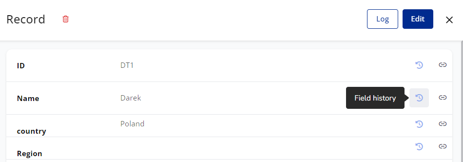
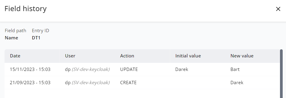
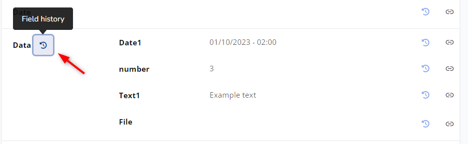
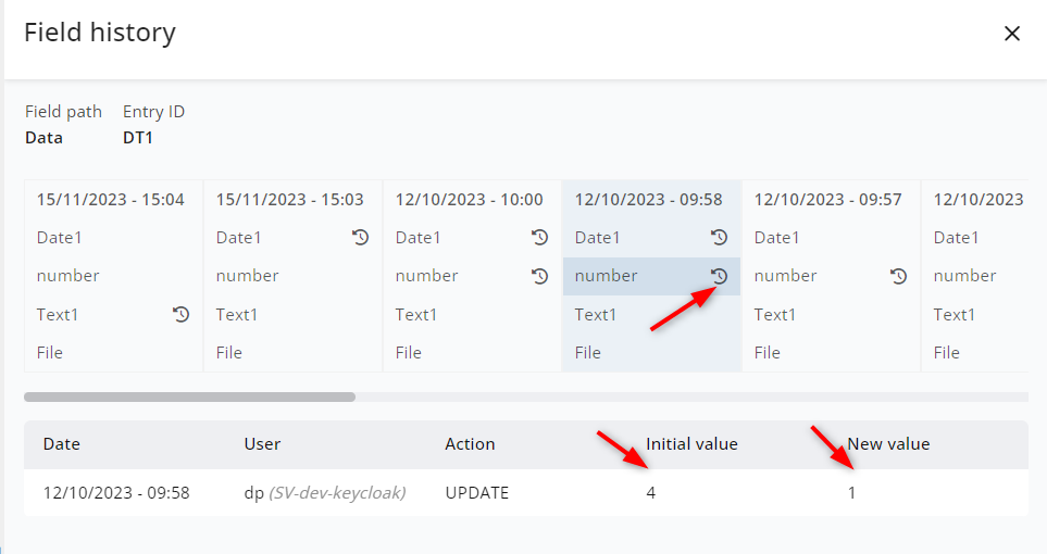
4. Database management section #
The ‘tools on’ button on the sub menu displays the database management menu;

The version of the database, date and time the database was created, and login ID of the administrator |
|
Filters allow any authorized user to filter and view any data in the database selectively |
|
To use ‘filters’ click on the ‘filters’ tab. On the drop down field, choose the variable in the database → choose the relevant operation → type the value You can add as many data by clicking on the ‘+’ sign → click on ‘Apply Filters’ |
|
We can also filter data contained in database edit grid to check if value is or is not a part of the list. To use this search open filters and select the edit grid component |
|
The logic is as follows: Values in the same condition act as they are OR separated so this condition will return rows that have any of the values specified. If there is a need to retrieve only rows that have certain set of values, they need to be separate conditions with AND between them. This will return only rows for which all conditions are true “Not in” excludes values specified from query. |
|
Complex filters are also available if there is a need for nested conditions while filtering the data | Video tutorial with Complex filter - click here |
The ‘Columns’ tab allows the user to display only the selected data in the database by unchecking the data you do not want to be displayed. |
|
Under the ‘Reports’ tab, we can create new reports based on the data available in the database, or see reports that were already created. |
|
‘Import data’ allows the user to import data from an external file, another database or system into the database in GDB. |
|
‘Export data’ allows the user to export the data from the database in various formats (JSON, XLs, CSV, etc.). |
|
‘Log’ displays the history of changes made in the database. For every change in the system, the name of the user, the change made and date of change is mentioned besides other details. |
|
‘Delete data’ button will remove all data in the database. Deleted data once removed cannot be recovered. Therefore, you should be cautious when managing the database. |
|

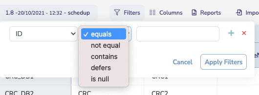
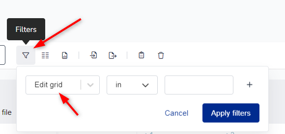
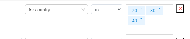
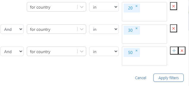
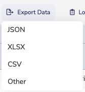


Other important elements of the database management are;
- Views
- APIs
- DB structure
- Advanced management system
a) Views #
Video tutorial - How to set a foreign key for data view (linking views)
‘Views’ is a subset of GDB that displays a selected set of data defined by a query (filters). Views allows users to see only certain data and denies access to every data in the database. This is a user-friendly function to read data because it hides the complexity and displays the simplified version of the data as per the requirement of the user. It can be used to generate reports. |
|
To create/add a View, click on the Views tab |
|
The Views page will open. Click on the ‘+’ button |
|
Enter the name of the view (data for reference) for the user |
|
Check on ‘filters for limited data’ to choose specific data for display or to create a query |
|
Create filters by choosing the desired fields and their required value |
|
More filters can be added by clicking on the ‘+’ button |
|
Choose the relevant conjunction between the filters to fit the query |
|
Add the fields to display in Views, by dragging the required fields from the ‘available fields’ and drop them individually under ‘view fields’ |
|
Column names in views can be customized according to your needs. Also fields in views can be customized. If some fields are not necessary in the view they can be deleted. If the order of fields is wrong it can be corrected. Please see the tutorials for details. | |
Go back to the top and click on ‘save’ or ‘publish’. Only the published Views can be seen by the intended audience |
|
This is how the views appear |
|
For each view, you can copy the url to share with others, embed the view on other sites, or open an external url to see the view. You can delete the view by clicking on the (red) cross |
|
1) Complex views involving multiple databases# | |
If you need to view data from multiple databases on one view it is now possible. First you need to link the databases you need to view at the same time with foreign key | Please see the tutorial on how to link databases. |
Next you need to create a new view for the database for which the foreign keys were created. |
|
In the View fields table you will see available databases from which you can drag and drop the columns from left to right view fields section. On the right side you will see an indicator informing you from which database the field was taken from to be displayed in the view |
|
After the view is configured click Publish button in the top panel |
|
Now you can open configured view by clicking open external URL button All columns from all databases that were dropped onto the View fields section in view configuration will be visible in your view. |
|

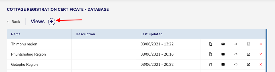
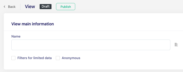


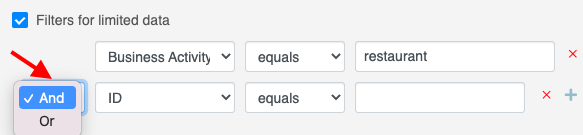
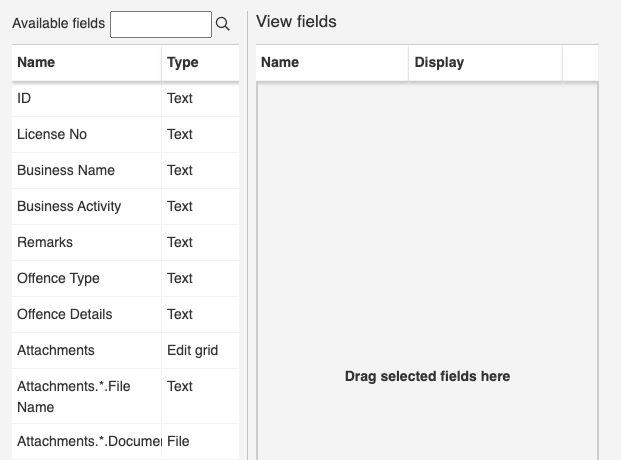
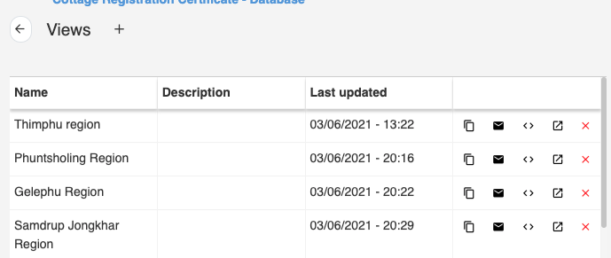
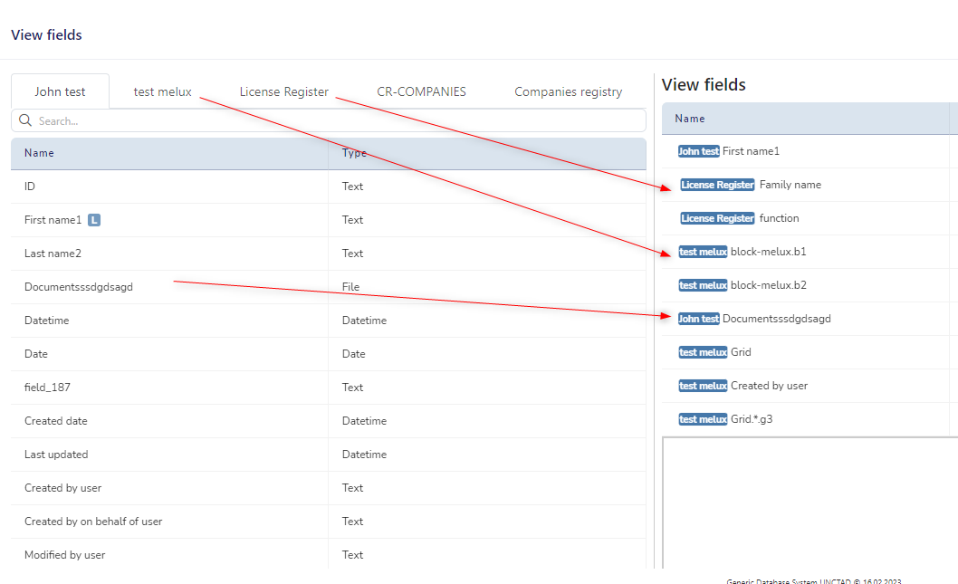


b) APIs#
API is a tool to make web services. It enables the user to communicate and exchange data between the Display System and the GDB.
To enter the list of available APIs click on the Services button on the top right corner of the screen.
Dashboard will appear that presents some useful information about the APIs
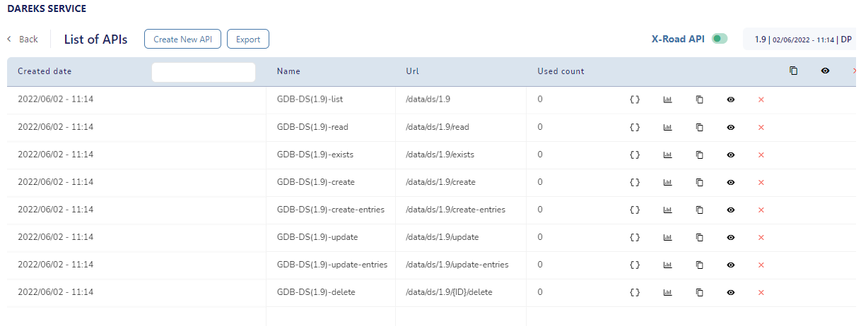
Dashboard top panel:#

Create New APi - to be explained |
|
Export is used to export a list of APIs in the current database version to a JSON file |
|
X-Road API -To be explained. |
|
Every version of the database has its own set of API’s. Database version can be changed by clicking on the gray rectangle in the top right corner of the screen. |
|


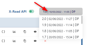
Dashboard header:#
There are filters available in the dashboard header to easily find a specific service, and three action icons that will be explained on the following page.

Table content:#
In this table you can see APIs Creation date, Name, Url, Used counts, and some actions that can be performed or information that can be obtained for a given web service.

Actions and information.
JSON- To be explained. |
|
Statistics is a visual representation of how often an API was called on a given day within the last 30 days period. |
|
Copy url is used to copy the address of the API to the clipboard memory. You can copy all APis url by clicking the icon on the top of the table or a single url by using the icon in the APIs row. |
|
Visibility is used to show or hide an API in BPA If visibility for a particular API is switched off it will not be available in the list of APIs in BPA. You can also hide all APIs in a given database version by using an eye icon in the dashboard header. |
|
If there is a need to delete all APIs from the database version, it can be done by clicking the red cross icon in the top panel. Video tutorial - How to delete all APIs on selected DB version |
|
A single API can be deleted by clicking the cross icon placed in that particular API row. Delete API action is only limited to selected database versions. APIs in other database versions will remain intact. |
|


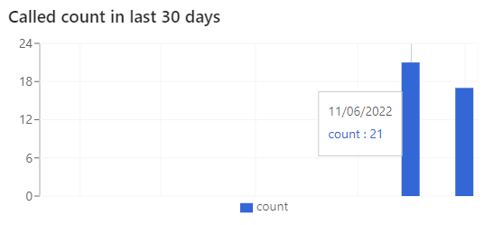


List of APIs usage:#
Create | Used to create a new entry in a database. Returns the create object |
Create-entries | Used to create a multiple entries in a database when the data is coming from an edit grid or data grid |
Read | Used to retrieve a single set of data from a database to DS |
List | Used to retrieve multiple sets of data from a database to DS and put them in an edit grid or data grid. It will retrieve all entries that meet the query conditions |
Update | Used to update a single entry in a database. If applied to an edit grid, it will push a new entry to EditGrid without removing previous entries. Returns the updated object |
Listen | Used to control the flow in the service if some information from an external source is required for the flow to continue. A “listener” BOT waits for data until it is sent from an external database or system. When the data is sent, the listener BOT gets activated and it changes the file status in a given role. Example:
Contrary to a “read” BOTs, which will time out and fail if the data can’t be read immediately, a listener BOT can wait until the data is available in the external system. Before creating a listener BOT, the analyst must ask the development team to create in Mule a web service which will bring the data from the external system.
A listener BOT must be used in a role. Once a file reaches this role it will wait until the external agency will send the required data to the listener BOT, and only then the file will change its status. |
Update-entries | Used to update multiple sets of data in a database. It will retrieve all entries that meet the query conditions and update them |
Exists | Used to check if an entry exists in a database. It returns boolean value |
Delete | Used to delete an entry from the database. |
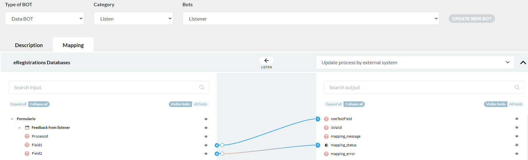
c) DB Structure#
Click on DB Structure → a slider will open. This is where the structure of the database that was created can be modified |
|
The database can be duplicated by clicking on the ‘Duplicate’ button. Video tutorial - Duplicating a database The name/title of the database can be changed on this page The “delete” button deletes the database from the system |
|
Click on the “+” symbol to add new fields The fields can be deleted by clicking on the red cross symbol The order of the fields can be changed by dragging the fields using the cross with arrow heads in the front |
|
Save the changes. Everytime a change is made and saved, the version of the database will be updated. The updated database should be published and remapping done in BPA |
|
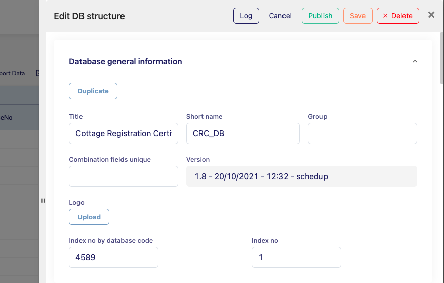
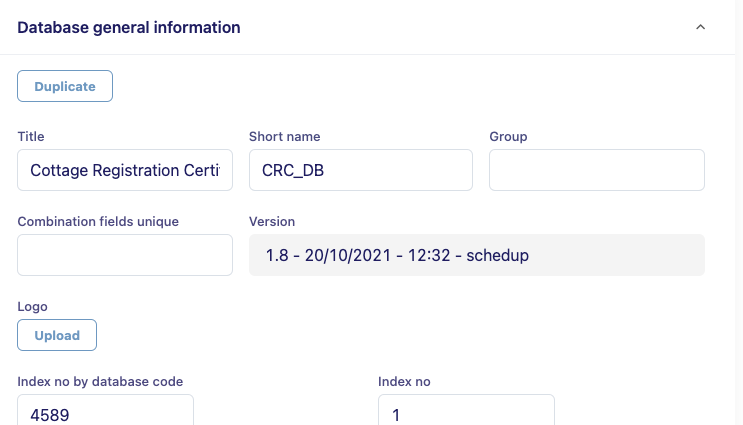
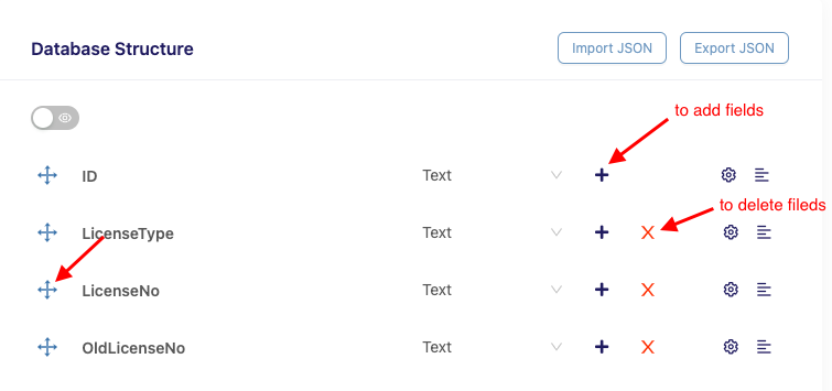

5. Special features#
a) To change format of ID #
Click on the DB Structure |
|

To change the default way new ID’s will be created when new entry is saved to the database go to DB Structure menu and click the setting cog icon on the ID column |
|
The Advanced Settings window will appear. Go to the Triggers tab. Here you can set the way new ID values will be created. To configure desired value use tags available in the field to the right of Action-> set value Important! After changing the tags you need to publish the new version of database and apply it to the BOT in BPA to see your changes |
|
1)Tags available for ID value creation# |
|
Short name - will copy value from Database general information -> Short name |
Example:
|
Index no - will add to the ID value index number from database general information. If more entities are created it will increment the index number with every new entry |
Example: two entries were created
|
Index no by database code- it will take current count of entries in the database and create a value equal to entries in the database+1 |
Example: two entries were created
|
Current year - will add a current year value to the ID value. Right now it will be 2022 | Example: this entry was created using tah id which had no value and current year The result is: |
End of number current year- works the same as Current year but it only adds the last two digits of the current year to the ID value. | |
Here are few video tutorials that show how to set a custom ID or field value using triggers: |
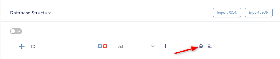
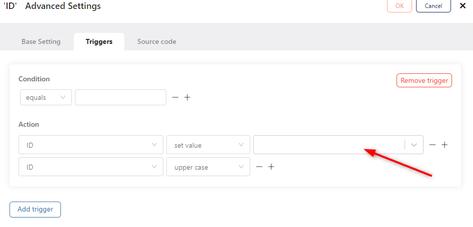
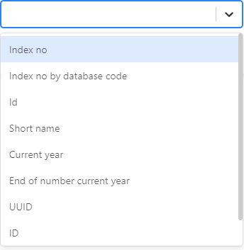
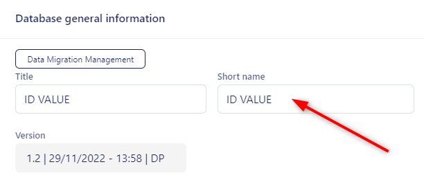
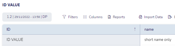
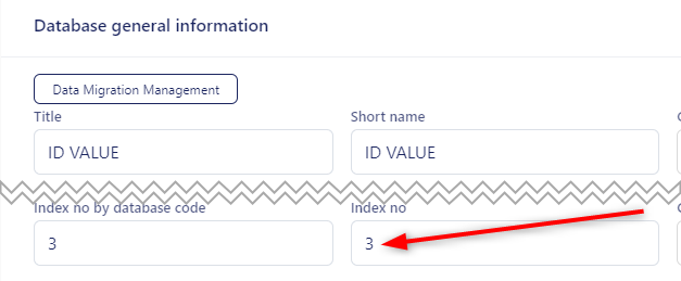
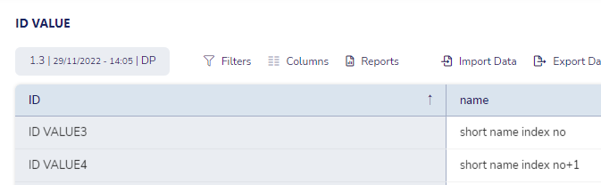
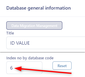
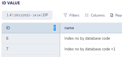


b) Show catalog Key in the database structure#
To show catalog key data in the table click DB Structure on a given database that has a catalog type field in the structure |
|
Click the “Settings” icon corresponding to the catalog for which you want the keys to be visible. Activate the “Show key and value”toggle |
|
Click “OK” in the top right corner of the settings window and publish the new version of the database. |
|
As of now when you click on a row in the database, you will see a new key field for every catalog type field in addition to the previously displayed value field |
|
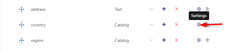
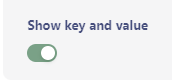



c) Migrate data between databases #
We can now copy all or some data between tables. Steps to be configured:
|
|
|
|
|
|
|
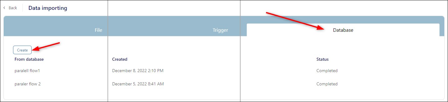
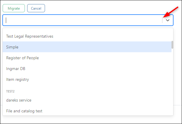
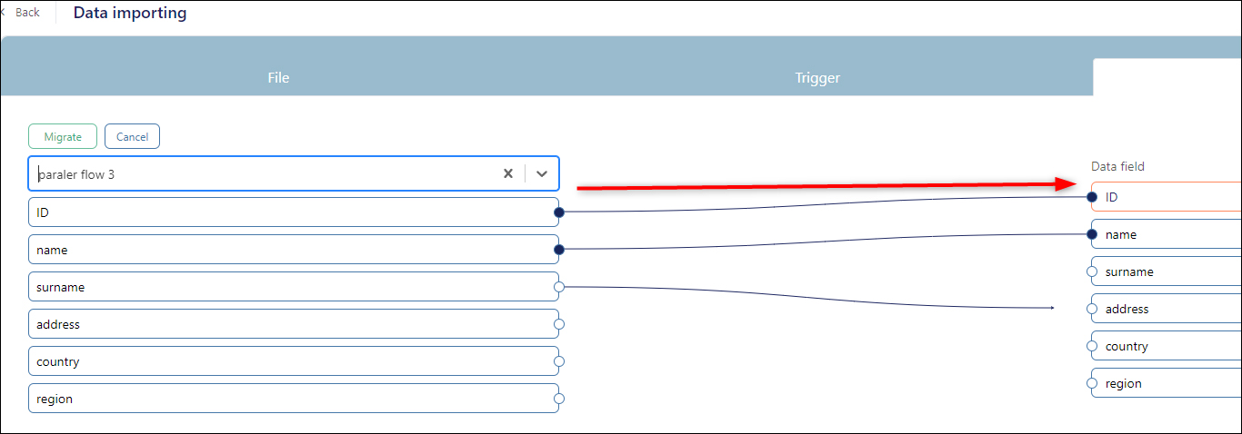
d) Import data to other database on trigger #
Another way to copy all or some data between tables is to import the data on trigger Here you can find a tutorial showcasing how this kind of import should be configured |
e) Setting readonly field property on GDB#
A field can be set to readonly with the appropriate toggle in field settings. Please see the tutorial for details. |
f) How to apply pattern label (regex using) on GDB#
We are able to set a specific pattern for the field in GDB so it will accept only the values that match the pattern. Basic knowledge of regular expressions is required. |
g) How to add listing value in GDB edit grids#
We can automatically add additional columns to the GDB edit grids that will present a value provided in a field outside of that edit grid. Please see the tutorial |
h) How to compare two databases#
The content of two tables can be compared in terms of the columns in both tables. Please see the tutorial to see how it is done |
i) How to make a textfield into a select predefined values field#
Text fields can be changed to be represented as dropdown select fields in GDB. Please see the tutorial | How to make a textfield into a select predefined values field |
j) Where to limit the document type accepted by the file field#
Where can we specify which type of documents will be accepted by the file field in GDB? Please see the tutorial |
k) How to configure database file field to accept multiple files#
GDB supports saving multiple files in a file type field.
In Base settings tab activate Multiple toggle, click OK and publish the database. |
|
Requirements in BPA are set to multiple by default so nothing more needs to be done if a requirement may consist of many files. For additional upload component which is not a requirement, you need to open the edit modal, go to Data tab, activate advanced options and activate Multiple Values toggle Please note: The structures have to be equal so file component with Multiple Values toggle switch on has to be mapped to Multiple file field in GDB |
|
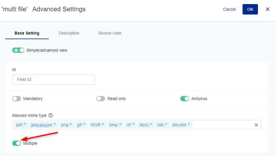
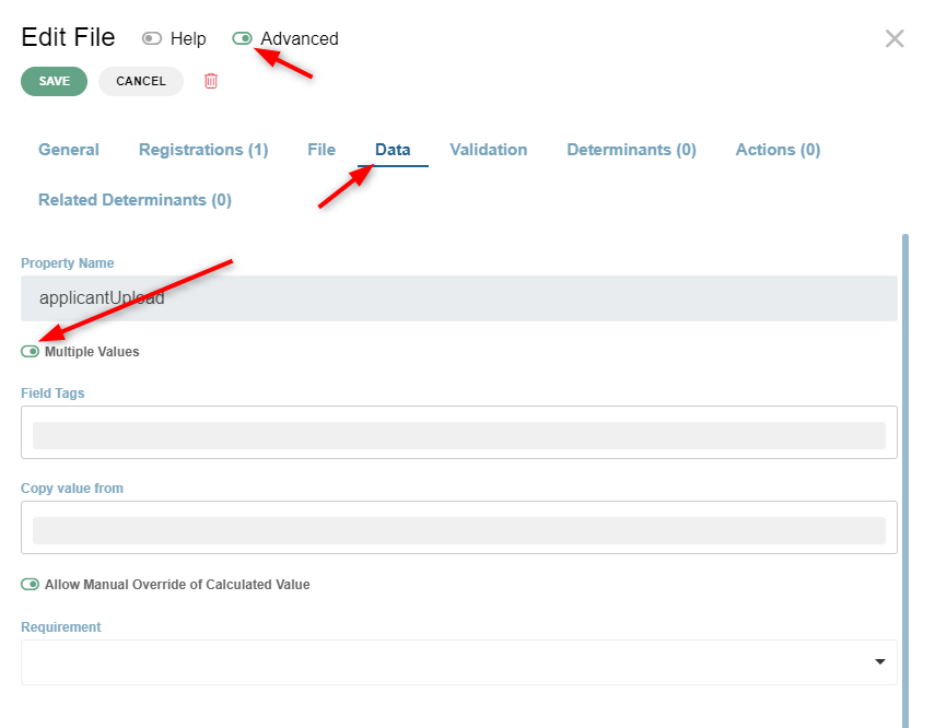
6. User rights in GDB#
User rights management is an interface that enables admin users to grant or take away rights and privileges to other users to perform certain actions on the database.
a) Introduction to the user rights page #
To access User rights management, click on the user button and select User management |
|
The page is composed of 2 parts:
|
|
Left side: users# | |
Search an existing user#This field enables to search for a specific user (already authorized in GDB), or to import new user from CAS or Keycloak |
|
Create a new user#Any new user must be previously registered in CAS (or Keycloak - KC) - User registration Then, to create a new user in GDB, you just import it from CAS/KC, by clicking on the icon next to the search field. Enter the user ID and select the user. The user is now authorized in GDB. The next step is to define rights for this user. |
|
Right side: rights# | |
If a user is selected he can be granted certain rights to (1) perform actions (2) on specific resources in GDB The resources are the databases available in the GDB instance. They are listed in the first column (this column is titled “resources”) The possible actions are defined in the other columns:
The toggles allow the administrator to define, for each database, the actions a user has the right to perform. Examples will be provided below. |
|
Groups of databases#When databases have been grouped in the database control panel (Grouping databases), they are listed under their group in the user right page. Example: DBs “file and catalog test” and “darek services” are listed under the “test2” group. You can grant a right to a group as a whole or to a specific database in a group. |
|
Video tutorial showcasing how user rights change when a database is moved between groups with different rights granted.# | GDB - user rights behavior when the DB is moved to a group with different rights granted. |
Two categories of rights Every database has two categories of rights that can be granted, on:
|
|
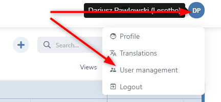
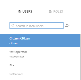
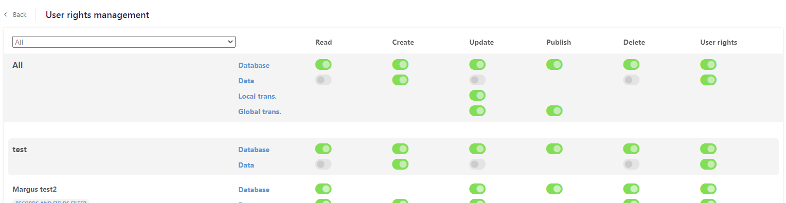
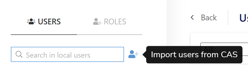

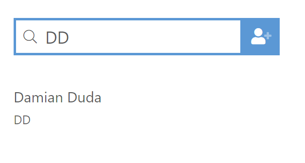
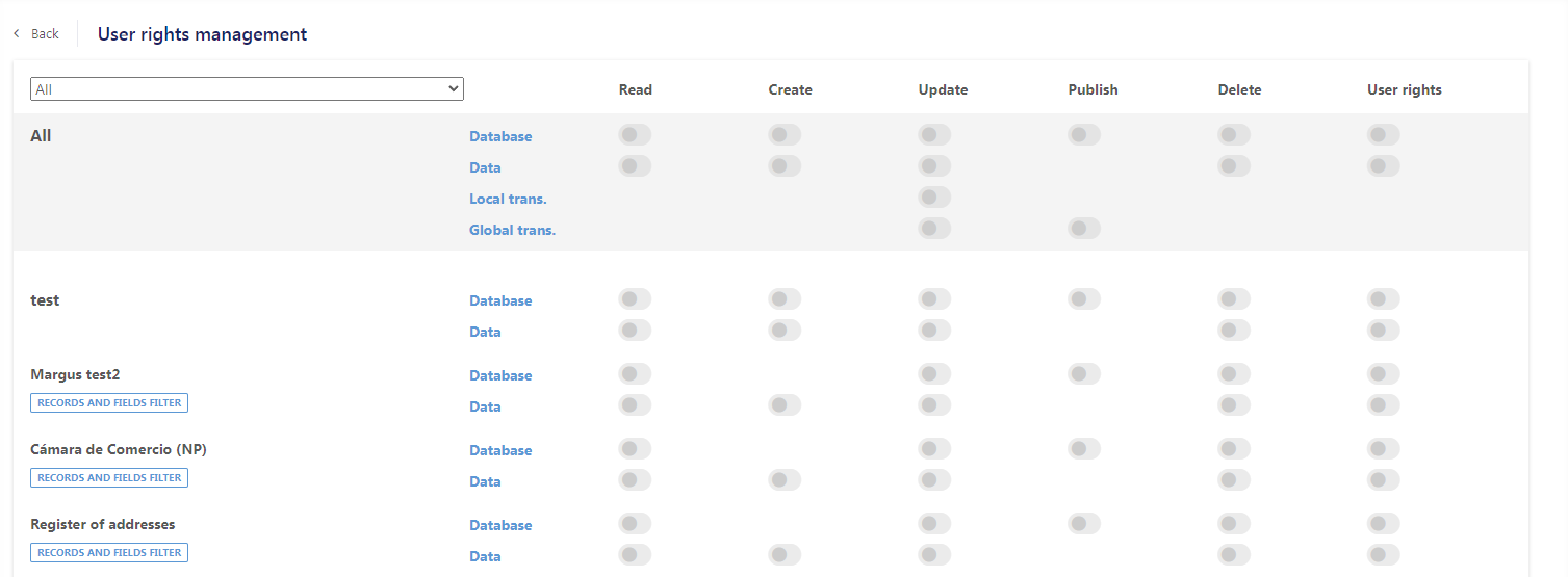
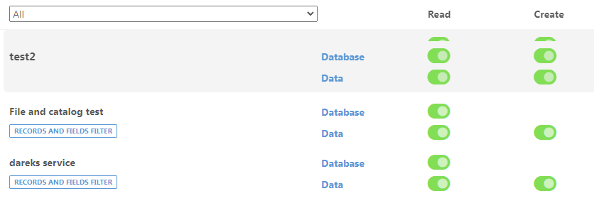
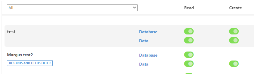
b) Granting right to the Database structure#
Read toggle switched on gives user right to read database structure (Data toggle needs to be on as well) To see DB Structure button in users dashboard, “Show tools” toggle needs to be switched on |
|
Update toggle gives users the right to update selected database data structure. When it is active, the “Save” button appears in the DB structure tab, so after making changes to the database structure, user is able to save them | |
Publish toggle gives users the right to publish changes made to the database structure. When it is active the “Publish” button appears in the DB structure tab. It is required to publish changes before they can be used in external services | |
Delete toggle gives users the right to delete the current version, (or all versions) of the database. When it is active the “Delete” button appears in the DB structure tab |
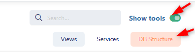
c) Data User rights (Generic)#
Read toggle “on” gives the user right to read data in the database |
|
Update toggle gives user right to update data on a single entry of the database To edit the data, click on a row and select the Edit button | |
Delete toggle gives the user right to delete a single entry on the database To delete the data, click on a row and select the Delete button |
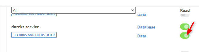
d) Data User rights (field level restrictions)#
Users can be granted more specific set of rights to operate on data in a database To access this functionality, click on “restrictions” button just below the database name |
|
Window will appear in which the admin can grant users right to read or update:
|
|
Setting up Records filter | |
To set up a filter on the database for the user, click the “plus” icon |
|
Filter tab will appear in which you need to specify the following:
|
|
Example: From column named “Tipo de servicio” analyst wants to show to the user only entries that equal to “LSOF8”. Analyst fills the fields and clicks save button . From now on, the user will only see entries in the database that match this condition. |
|
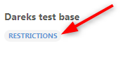
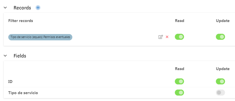
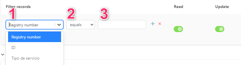
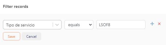
e) General rules for actions toggle behavior#
We have 3 colours:
The analyst can switch toggles from GREY (default) to GREEN and conversely YELLOW can’t be selected by the analyst, it is displayed automatically by the system
1.Putting a parent in GREEN puts in GREEN all children
2. Putting a parent in GREY puts in GREY all children
Summary Parent GREEN = all children are GREEN Parent YELLOW = at least one child is YELLOW or GREY Parent GREY = all children are GREY |
|

IV. Statistics#
A.Overview#
Statistics module is a tool for registered users to see statistical information about files and processes in eRegistrations system. It can also present KPI (Key Performence Indicators) for managers
When entering the statistics website the following view will appear:

Panel in the top enables to switch between several types of statistics, change the site language or log out:

Every type of statistics has its own set of filters and tools that will be described in detail on the following pages.
B.Types of statistics.#
1.Roles#
Roles tab purpose is to provide information about the number of files that obtained a specific status in a given service role for a defined period of time.
a) Roles filters#
| Filter empty rows will show/hide rows that have no values for all other filters set in a given period of time. |
| Show inactive services will show/ hide services that were turned off in BPA |
| The Date field lets you specify the period of time you want to obtain data about. |
| After clicking it, a calendar will appear in which you can specify the period of your interest. All the other filters always refer to the period selected here. |
| Service filter enables you to see data limited only to the selected service |
| Registration filter enables you to further limit the response to the roles in this selected registration. For this filter to work, the Service filter has to be already selected. |
| Status filter lest you to check how many files had a selected status in a given role |
| Thanks to this filter, we can present data broken down into days, weeks, months or years. This can significantly improve the readability of the presented data |




There is an option to export the current result to an excel or PDF file. To do that just click on the corresponding icon
2. Certificates issue#
Certificates issued tab purpose is to provide information about the number of certificates that were generated for a given service within some period of time.
a) Certificates issued filter#
Some of the filters are the same for multiple tabs like Service filter or Date field filter and they were already described above. Therefore only new filters, specific to the tab in question will be described.
| Certificates filter enables you to see data limited only to the selected certificate. If the certificate was used in more than one service, this filter will list them all. |
| To be explained when it will be possible to actually test it. |

3. Operators#
The purpose of the Operators tab is to provide information on specific operator activity. It provides information about the number of files that have been processed by the operator through a given role, broken down into the statuses in which the files were terminated in that role
The statuses are:
- Processed
- Approved
- Sent back
- Rejected
The sum of approved, sent back and rejected files will always be equal to files processed.
| An Operator filter is used to limit the search to a selected operator. This is an input field which means the user needs to type the required operator name into it. As soon as the typing starts the field will provide suggestions. |
| Roles filter allows you to limit the view to operators who processed the file in the selected role |


4. Times per Role#
The purpose of the Times per role tab is to provide information about how much time the file spent in a given role while it was processed. It shows calculated average time, minimum time and maximium time for all files that were processed through a role within a selected period of time.
Selecting a service will display all roles used in the service, the number of processed files in each role and calculated times that the file had spent in the role
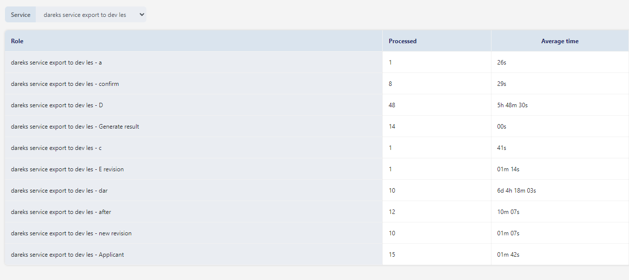
5. Times per operator#
The purpose of the Times per operator tab is to provide information about how much time every operator did spend processing files in a given role.
It is displayed in the following schema.
Service name-> role
List of operators that were processing files in this role
It can be filtered by the service name
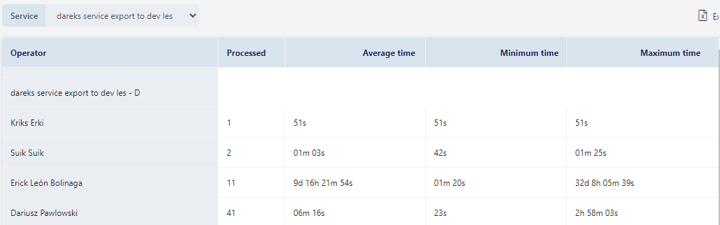
Average time, minimum time and maximum time calculated values are shown.
6. Rejection reasons#
This tab provides rejection reasons for files processed and rejected or sent back for correction in part B revision role.
You can filter them by service name and Status.Statuses are rejected or sent back.
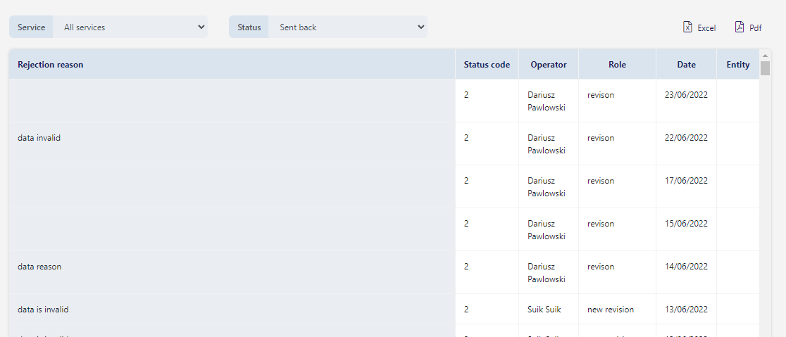
What you see in the dashboard:
| Rejection reason(s) provided by the operator. Stat . |
| There are two status codes available in the system 2- Sent back 3- Rejected |
| Operator that provided the reason |
| Name of the role that provided the reason |
| The date on which the rejection occurred |

UN Trade and Development (UNCTAD) - Digital Government Programme, 2025